30 Bathroom Color Ideas That Turn a Forgotten Room Into the Star of Your Home
Most homeowners treat their bathroom like an afterthought. Walls get whatever leftover paint sits in the garage. Fixtures get whatever was cheapest at the hardware store. Yet bathroom color ideas done right can transform the smallest, most overlooked room into the single most complimented space in your entire house.
According to a 2024 Houzz renovation survey, bathroom remodels consistently rank among the highest-return home improvement projects, and color choice plays a measurable role in that return. This guide breaks down every angle — small space tricks, resale strategy, trending palettes, and timeless choices — so your next bathroom decision actually pays off.
The Color Mistake Quietly Making Your Bathroom Feel Smaller Than It Is
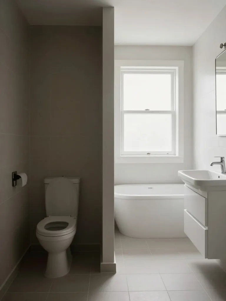
The single biggest error homeowners make is choosing bathroom paint colors based on what looks good in a showroom rather than what works under their specific lighting and square footage. A rich, dark color that feels luxurious in a 200-square-foot bedroom can feel suffocating in a 40-square-foot bathroom with no natural light source.
Small bathroom color schemes fail most often when chosen in isolation from the existing tile, vanity and fixtures already in the room. Bathroom wall color ideas need context — what’s the floor color, where does light enter, how tall are the ceilings. Skipping that assessment is exactly why so many bathrooms end up feeling cramped, dim and unfinished despite a fresh coat of paint.
Bathroom Color Ideas That Trick the Eye Into Seeing More Square Footage

What colors make a bathroom look bigger is one of the most searched questions in home design, and the answer involves more than just “go lighter.” Soft, cool-toned whites and pale greys reflect available light more efficiently than warm tones, creating an airy, expanded feeling even in genuinely tiny footprints.
How to make a small bathroom feel bigger with color also depends on minimizing contrast between walls, ceiling and trim. When all three surfaces sit close on the color spectrum, the eye doesn’t catch hard stopping points, and the room reads as continuous rather than boxed in. Bathroom color ideas for small spaces built around this low-contrast principle consistently outperform busy, multi-color schemes that visually chop the room into smaller perceived sections.
Why Windowless Bathrooms Demand a Completely Different Color Strategy
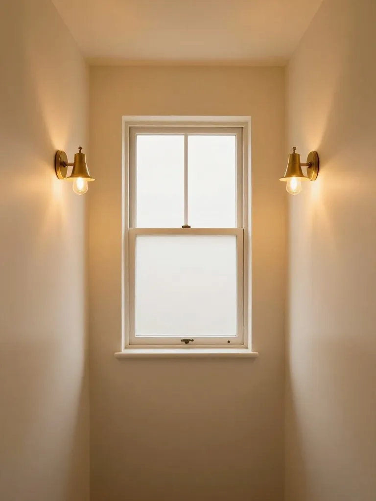
A bathroom with zero natural light source needs an entirely different color logic than one bathed in morning sun. How to pick paint color for windowless bathroom spaces means compensating for the absence of daylight’s natural color-correcting effect, since artificial lighting alone can shift how a paint color actually reads on the wall.
Bathroom color ideas windowless room strategies generally favor warmer whites and soft creams over stark cool tones, since cool colors can read flat or even slightly grey under artificial bulbs alone. How to choose bathroom colors for no windows also benefits from glossier sheens that bounce available light around the room more effectively, and from supplementing with warm LED fixtures rated around 2700K to prevent the space from feeling clinical or cave-like.
Sherwin Williams Sea Salt and the Spa Palette Everyone Keeps Copying
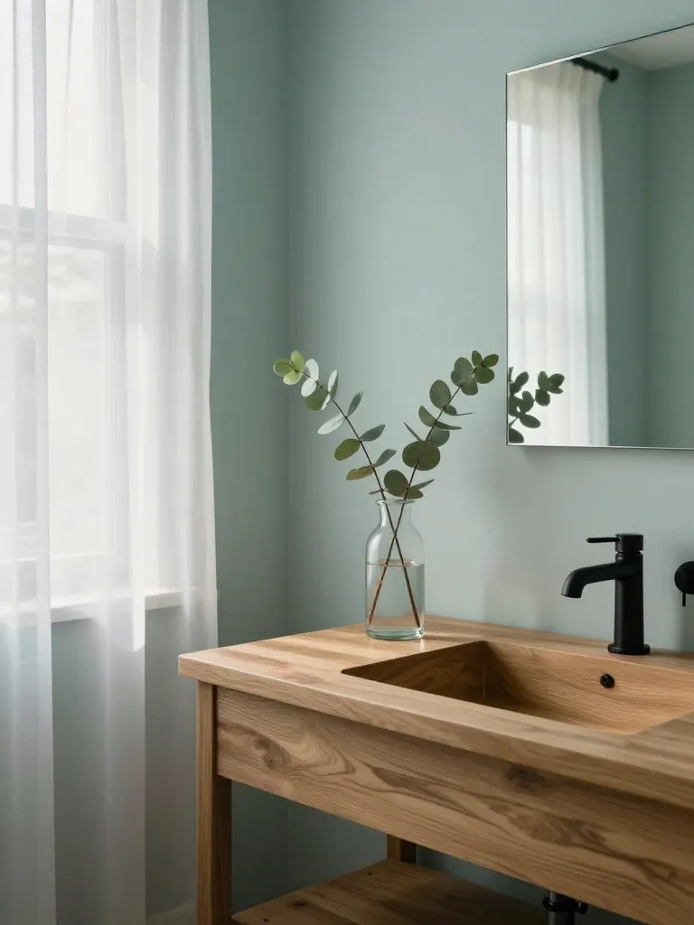
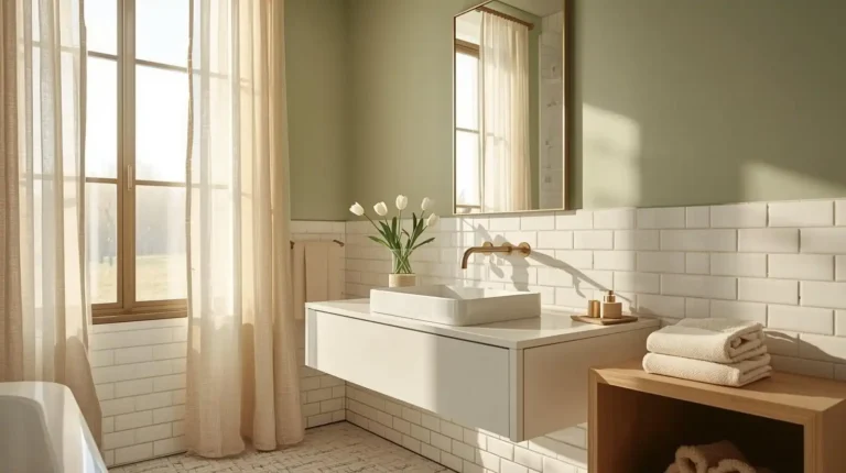
Few paint colors have achieved the cult following that Sherwin Williams Sea Salt bathroom applications have earned over the past several years. This soft, chameleon-like green-grey shifts subtly depending on lighting, reading blue in cooler light and green in warmer light, which is exactly why it photographs so beautifully across countless renovation accounts.
Spa like bathroom design built around Sea Salt consistently pairs it with natural wood vanities, brushed gold or matte black fixtures, and simple white subway tile. HGTV bathroom color ideas features have showcased this exact combination repeatedly because it delivers a calm, hotel-like atmosphere without requiring any bold commitment. Relaxing bathroom design principles lean heavily on this kind of muted, nature-inspired palette precisely because it lowers visual stimulation and supports genuine unwinding.
The Resale Secret Realtors Won’t Tell You About Bathroom Wall Color
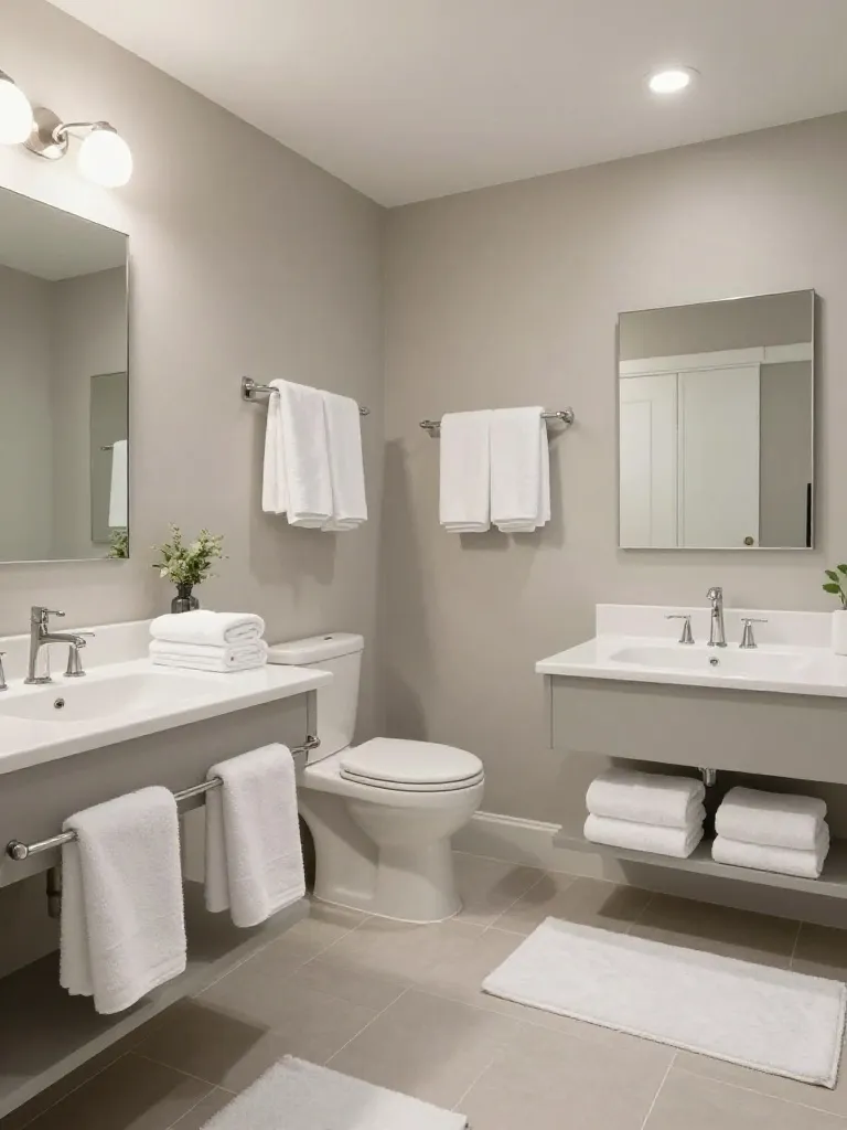
Best bathroom colors for resale value consistently point toward neutral, broadly appealing palettes rather than bold personal statements, no matter how beautiful that statement might look in your own daily life. What color bathroom increases home value research from multiple real estate studies points specifically to soft greys, warm whites and pale blues as the safest, most universally appealing choices for potential buyers.
Bathroom color ideas resale value impact matters because buyers struggle to see past strong color choices, even temporarily, during a walkthrough. What color bathroom is best for resale doesn’t mean boring — Sherwin Williams Agreeable Gray bathroom applications, for example, deliver warmth and sophistication while remaining neutral enough that most buyers can mentally move right in without needing to repaint anything before settling.
| Color Family | Resale Appeal | Best Used In |
|---|---|---|
| Soft grey | Very high | Guest, master bathrooms |
| Warm white | Very high | All bathroom types |
| Pale blue | High | Coastal, traditional homes |
| Greige | High | Modern, transitional homes |
| Bold jewel tones | Lower for resale | Powder rooms only |
Dark Moody Bathrooms: The Bold Trend Quietly Taking Over American Homes
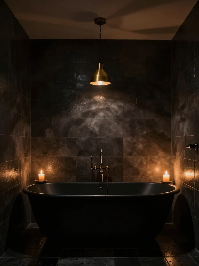
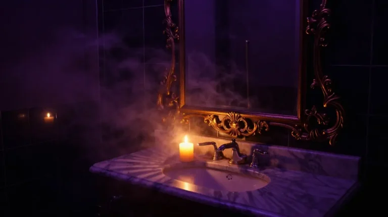
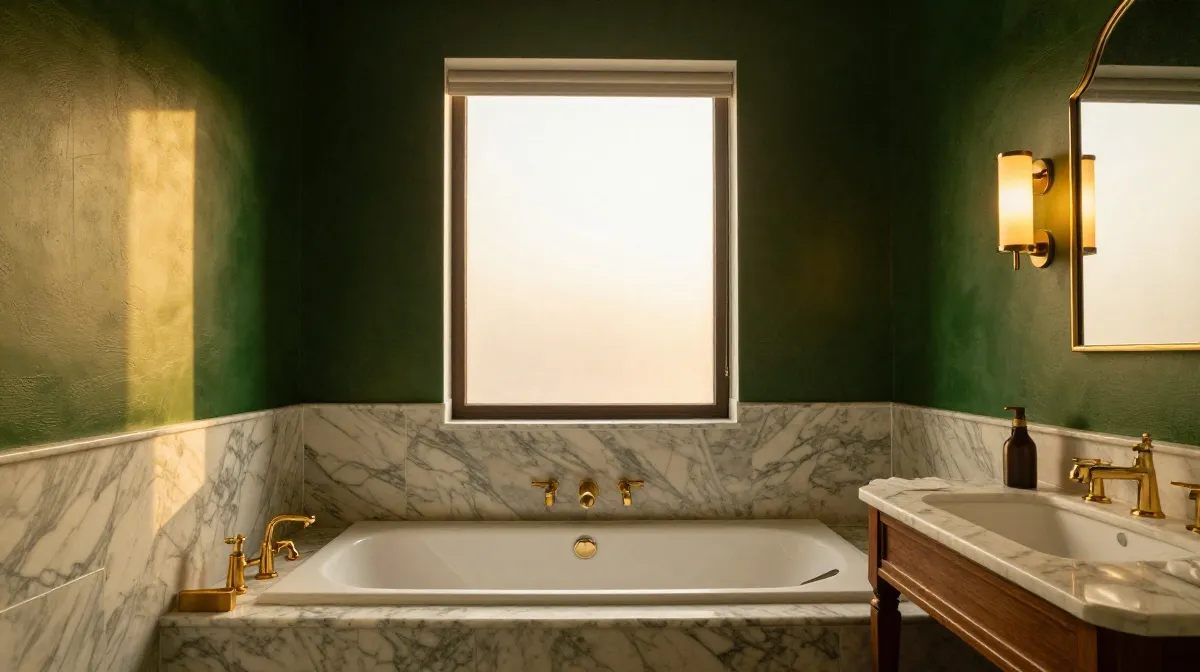
Dark bathroom color ideas have moved from a niche design statement into genuine mainstream popularity, particularly in master bathrooms and powder rooms where homeowners aren’t worried about resale neutrality. Moody bathroom color ideas built around deep charcoal, forest green or navy create an enveloping, almost cocoon-like atmosphere that reads as intentional luxury rather than gloomy.
Bathroom color ideas dark moody aesthetic choices work best when paired with adequate lighting compensation, since dark walls absorb significantly more light than pale alternatives. Luxury bathroom design ideas featured in Architectural Digest bathroom design spreads frequently showcase this exact dark, dramatic approach, proving that boldness and sophistication aren’t mutually exclusive when executed with the right fixtures, brass accents and layered lighting plan.
Bathroom Color Ideas Built Around Tile You Already Hate Replacing
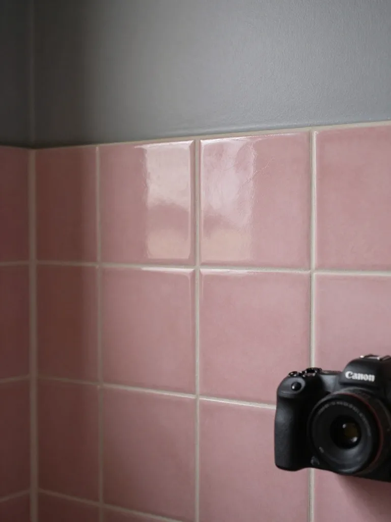
Not everyone has the budget to rip out existing tile, and that’s precisely where smart bathroom tile color ideas strategy becomes essential. What color goes with white bathroom tile is the most common starting point, since white subway and white ceramic tile remain the most prevalent existing tile across American homes.
For outdated pink, beige or mint tile that’s structurally fine but aesthetically stuck in a previous decade, what colors work with dark bathroom tile or vintage colored tile requires choosing wall colors that either complement or deliberately contrast the existing undertone rather than fighting it. Bathroom tile and paint pairing done thoughtfully — warm grey walls against pink vintage tile, for example — can make even outdated tile feel like a deliberate retro design choice rather than something waiting to be replaced.
Grout Color Decisions That Make or Break an Entire Bathroom Palette
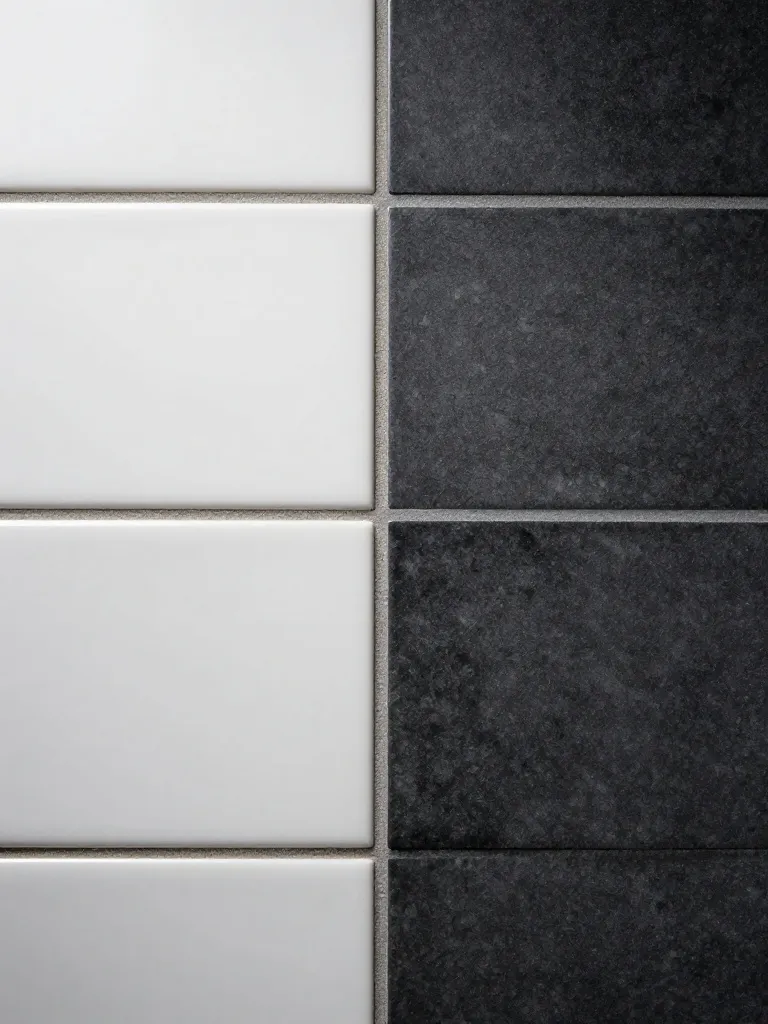
Grout is the most overlooked variable in any bathroom color plan, yet how to choose grout color for bathroom tile decisions affect the entire room’s visual texture more than most homeowners realize before they’re staring at the finished result. White grout against white tile creates a seamless, expansive look, while dark grout against the same tile creates a graphic, gridded pattern that draws significant visual attention.
Bathroom color ideas tile grout pairing should always be considered before installation, not after, since grout color is far harder and more expensive to change than wall paint. Bathroom finishes and fixtures coordination extends to grout specifically because a mismatched grout choice can undercut an otherwise perfectly planned color scheme, making the whole room feel slightly off without an obvious explanation why.
The Two Tone Wall Trick Designers Use to Add Drama Without Risk
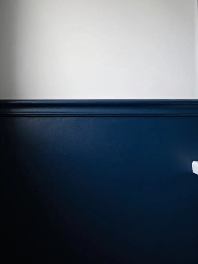
Two tone bathroom color ideas offer a clever middle ground between playing it completely safe and committing to a single bold statement color across every surface. The technique typically involves a darker, richer tone on the lower half of the wall paired with a lighter shade above, divided by a chair rail or simple painted line.
Bathroom color ideas two tone wall technique applications work particularly well in bathrooms with beadboard or wainscoting already installed, since the architectural division gives the color transition a natural, finished stopping point. Bathroom accent wall ideas using this two tone approach let homeowners experiment with bolder colors below eye level while keeping the upper portion and ceiling lighter, preserving the room’s sense of height and openness simultaneously.
Color Drenching: The Viral Trend Transforming Tiny Powder Rooms Completely
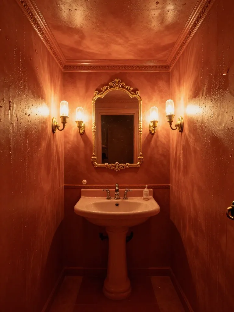
Bathroom color ideas color drenching trend has exploded across design social media over the past two years, and powder rooms have become its favorite testing ground. Color drenching means painting walls, ceiling, trim and sometimes even the vanity in one single, often saturated color, eliminating all contrast points entirely.
Powder room color ideas built around drenching create a genuinely immersive, jewel-box effect that small spaces handle surprisingly well, since there’s no competing trim color to break up the room visually. Bathroom color ideas powder room drama thrives specifically because powder rooms are typically used briefly and viewed as a singular design moment rather than a daily-use functional space, giving homeowners genuine freedom to go bold without daily-living regret.
Bathroom Ceiling Color Ideas Nobody Thinks About Until It’s Too Late
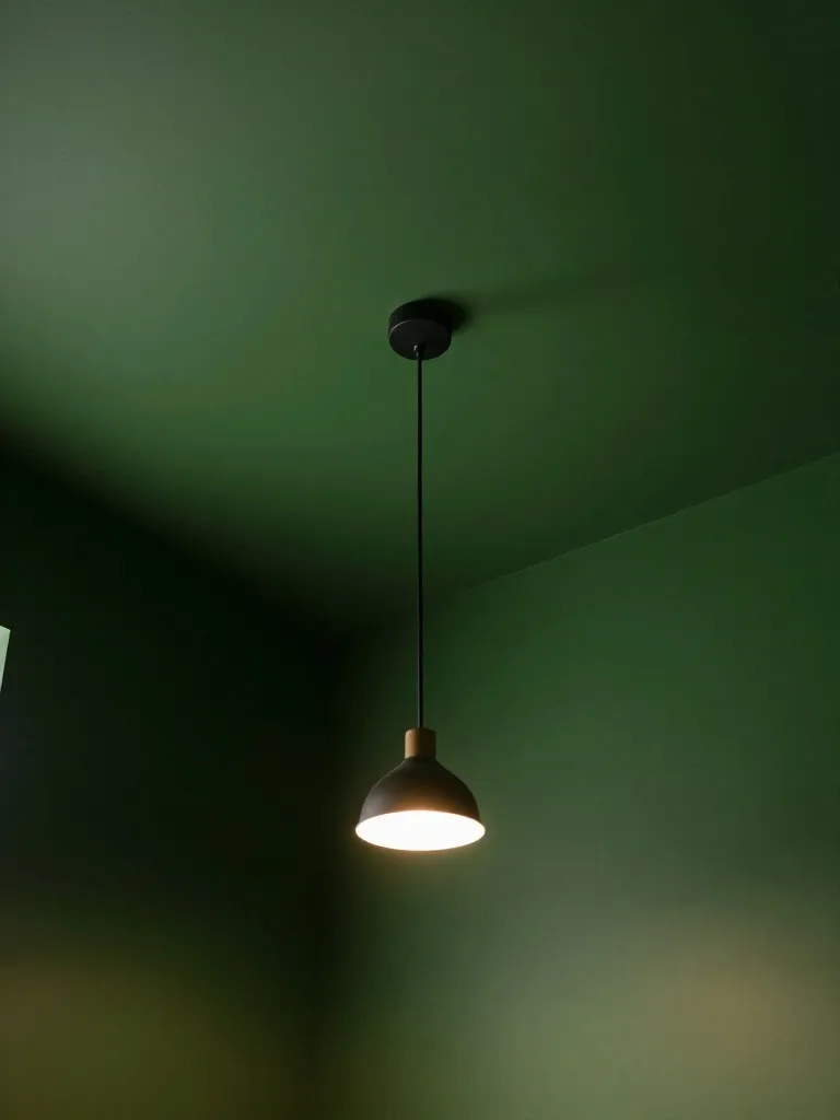
Bathroom ceiling color ideas get ignored constantly, with most homeowners defaulting to standard flat white without considering whether that choice actually serves the room. How to choose color for bathroom ceiling decisions should factor in ceiling height first — low ceilings generally benefit from a ceiling color that matches or closely relates to the wall color, visually pushing the boundary upward.
Bathroom color ideas ceiling treatment in taller bathrooms offers more creative freedom, including painting the ceiling the same bold color as an accent wall to create a dramatic, enveloping effect overhead. Bathroom wall treatment ideas that extend intentionally onto the ceiling, rather than stopping abruptly at the crown line, consistently photograph better and feel more deliberately designed than rooms where the ceiling was clearly an afterthought.
Warm Versus Cool Undertones and the Test That Settles the Debate
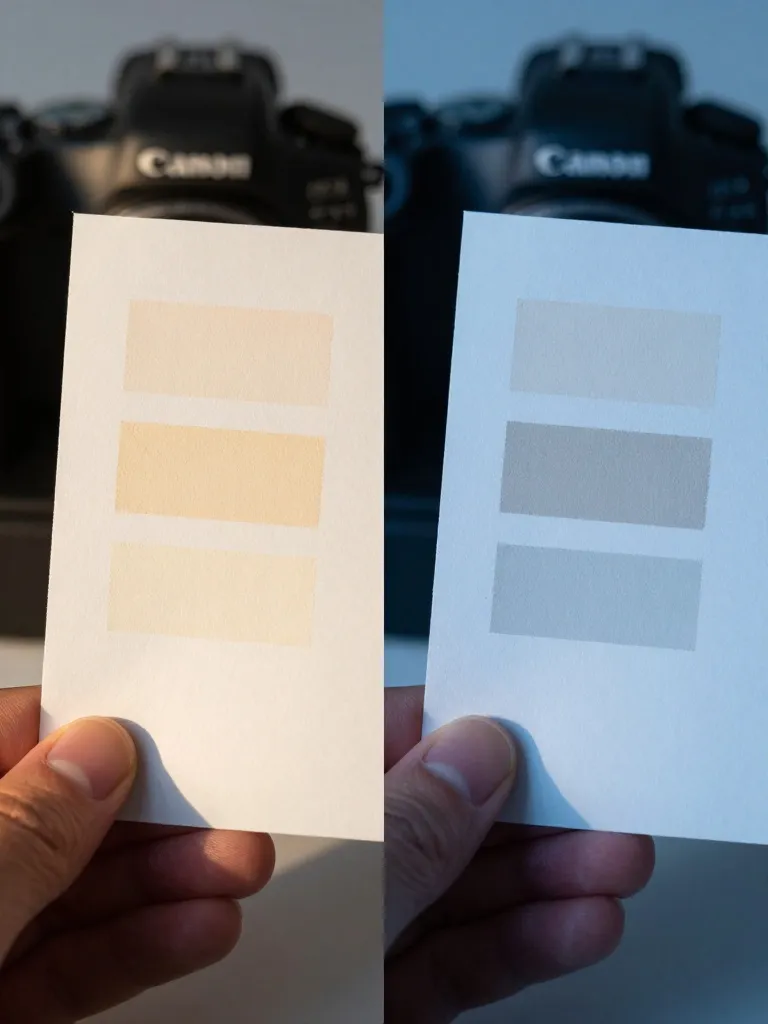
Every neutral paint color carries an underlying undertone, and identifying whether you’re working with warm or cool prevents the frustrating experience of a “white” paint reading oddly pink, green or blue once it’s actually on your walls. Bathroom color ideas warm versus cool undertones confusion is the number one reason paint swatches look completely different at home than they did in the store.
you may also like this:16 Halloween Bathroom Ideas That Make Your Mirror Feel Like It’s Watching
The reliable test: hold your paint swatch against a pure white sheet of paper in the actual bathroom at different times of day. If it leans yellow, pink or orange, you’re dealing with warm undertones; if it leans blue, green or purple, that’s cool. Best bathroom colors for natural light spaces have more flexibility here, while windowless or north-facing bathrooms should generally lean warm to avoid an unintentionally cold, sterile feeling.
Black Fixtures and the Colors That Actually Complement Matte Hardware
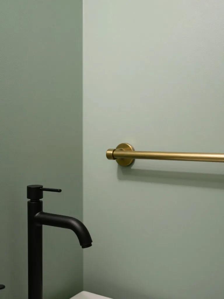
Matte black fixtures have dominated bathroom renovations for nearly a decade now, and what color goes well with black bathroom fixtures remains one of the most practically important questions homeowners ask before finalizing their palette. Black hardware reads as strikingly modern against almost any wall color, but certain pairings genuinely elevate the combination further.
Bathroom color ideas fixture metal coordination with black hardware works exceptionally well against warm whites, soft sage greens and deep charcoal walls, since black provides strong graphic contrast against both light and dark backdrops equally. Modern bathroom color schemes built around black fixtures often incorporate brass or warm wood accents specifically to soften black’s potential starkness, preventing the overall palette from feeling cold or overly industrial.
Guest Bathroom Color Ideas That Impress Without Overwhelming Visitors
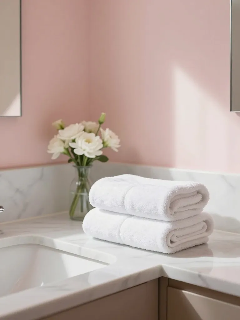
Guest bathroom color ideas carry a unique pressure — you want the space to feel intentional and welcoming without reflecting such strong personal taste that it feels presumptuous to overnight visitors. Best bathroom colors for guest bathroom spaces generally favor soft, universally flattering tones that work well in photographs, since guest bathrooms often double as the space where visitors check their appearance before heading out.
Soft blush, pale sage and warm white consistently perform well here because they’re flattering under typical bathroom lighting while still feeling distinctly more considered than builder-grade white. Bathroom decor inspiration for guest spaces from Pinterest bathroom color ideas boards frequently emphasizes layering in soft textiles and greenery alongside the wall color, creating warmth without requiring any bold or risky color commitment.
Master Bathroom Color Ideas Built for Daily Calm Not Quick Trends
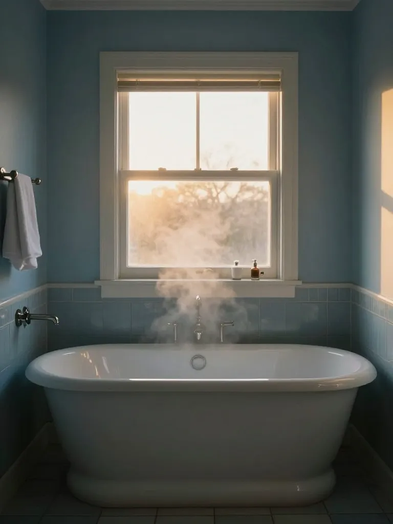
Master bathroom color ideas deserve a different planning approach than any other bathroom in the house, since this is the space you’ll interact with every single morning and evening for years. Bathroom mood and atmosphere considerations matter most here, since the goal is sustained daily comfort rather than a brief impression made on occasional guests.
Soft, muted tones — dusty blues, warm taupe, gentle sage — tend to outlast trendier, more saturated choices specifically because they don’t demand constant visual attention. Bathroom color psychology research consistently shows that cooler, desaturated tones support relaxation and lower cortisol response, making them genuinely functional choices rather than purely aesthetic ones for a space tied so closely to your daily routine and personal downtime.
Coastal Bathroom Color Ideas That Skip the Predictable Beach Cliches
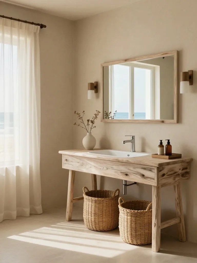
Coastal bathroom color ideas too often default to navy and white stripes or anchor motifs that feel more like a souvenir shop than a sophisticated home. A genuinely elevated coastal palette leans instead into the actual colors of sand, weathered driftwood and sea glass — soft sandy beige, pale seafoam, and bleached wood tones.
This more nuanced approach to coastal design creates a sense of place without resorting to literal nautical clichés that can feel dated within a few years. Bathroom design trends in genuinely high-end coastal homes, as frequently shown in Better Homes and Gardens bathroom colors features, favor this textural, tonal approach over anything overtly thematic, proving that coastal can mean genuinely sophisticated rather than predictably beachy.
Farmhouse Bathroom Color Ideas That Feel Lived In Not Staged
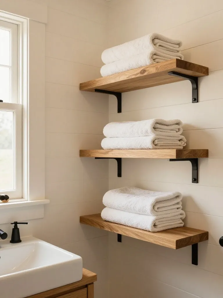
Farmhouse bathroom color ideas have become almost synonymous with one specific aesthetic — shiplap, black fixtures, white walls — largely thanks to Joanna Gaines bathroom color palette influence over the past several years. However, genuinely well-executed farmhouse style goes deeper than just copying that exact formula room for room.
The real foundation of farmhouse color philosophy is warmth and approachability — soft, slightly imperfect whites rather than stark, clinical ones, paired with natural wood tones and aged brass or black hardware. Bathroom aesthetic ideas rooted in genuine farmhouse history favor Behr Swiss Coffee bathroom applications and similarly warm off-whites that feel collected over time rather than precisely curated for a single Instagram moment.
Vanity and Cabinet Color Choices That Anchor an Entire Room
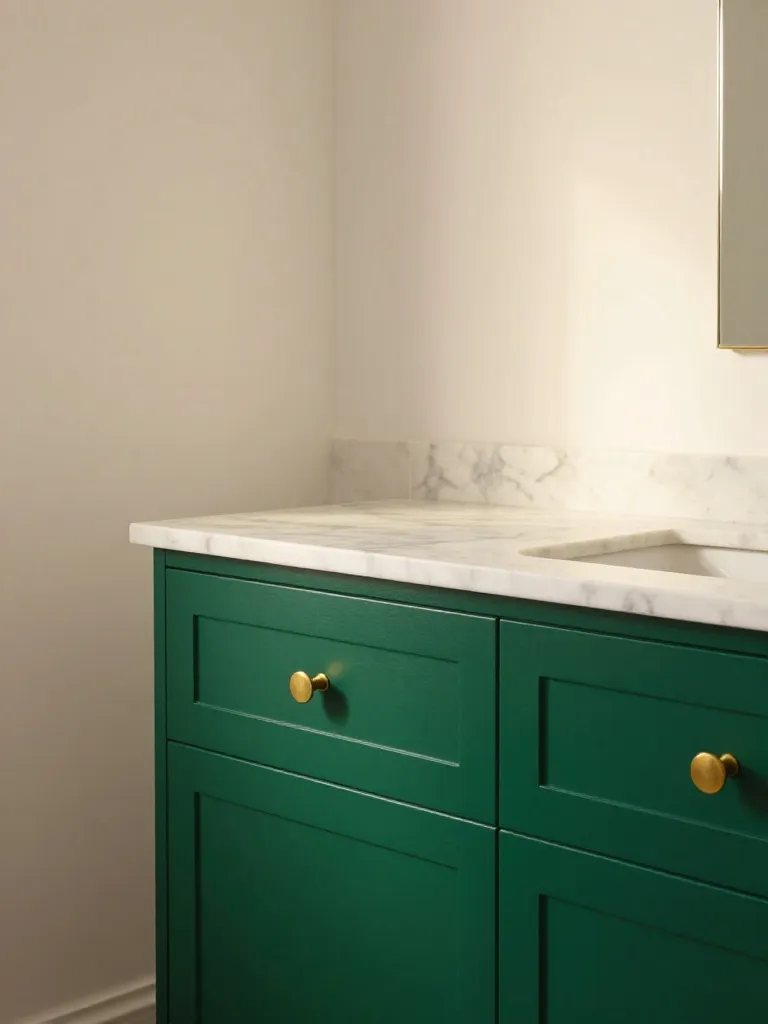
Bathroom vanity color ideas function as the visual anchor of most bathroom designs, often carrying more weight in the room’s overall impression than the wall color itself. What color bathroom vanity is timeless consistently points toward natural wood tones, soft white, or deep navy as choices that age gracefully across changing trend cycles.
Bathroom cabinet color ideas that genuinely commit to a contrasting tone against the walls — a deep green vanity against warm white walls, for instance — create the kind of intentional, designed-on-purpose feeling that flat, matching schemes often lack. Bathroom color ideas vanity cabinet contrast strategy works because it gives the eye a clear focal point upon entering the room, rather than letting every surface compete equally for attention.
The Matte Versus Glossy Finish Decision That Changes Everything
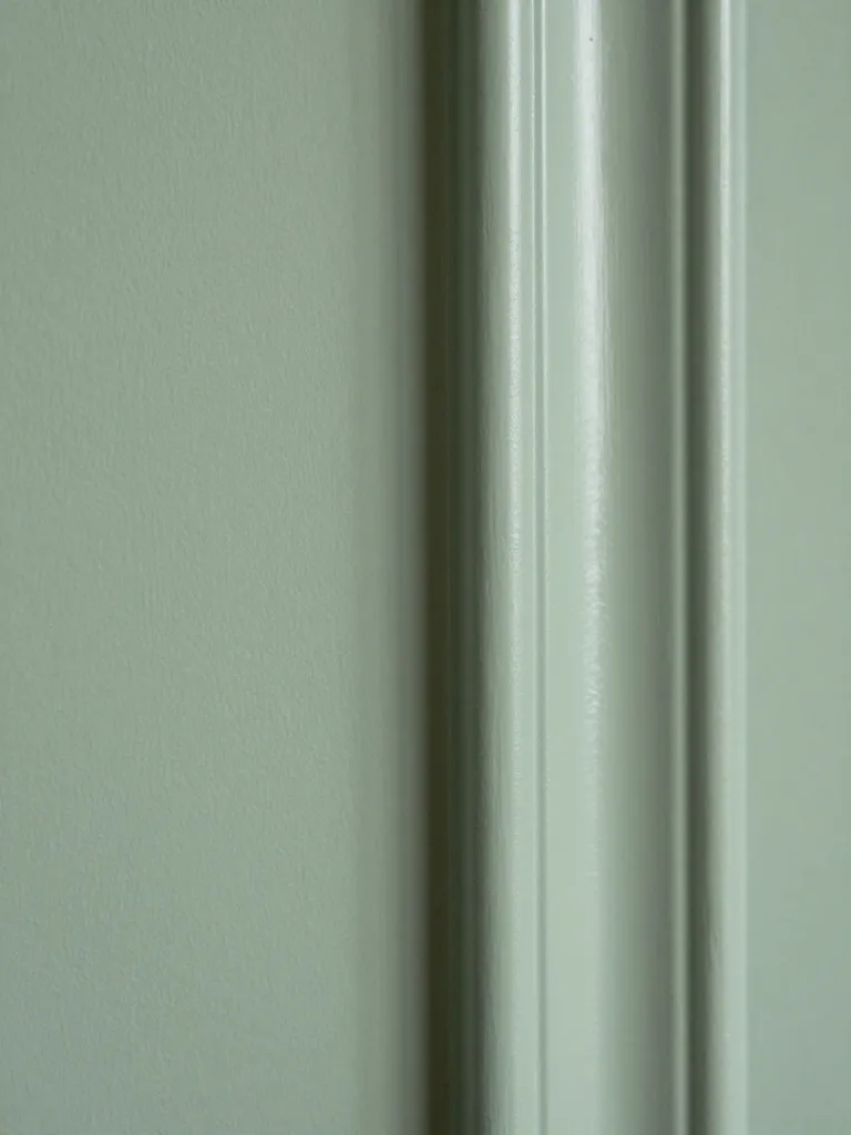
Best paint finish for bathroom walls is a question that trips up even experienced renovators, since finish affects both the room’s appearance and its practical performance in a consistently humid environment. Bathroom color ideas matte versus glossy finish decisions should weigh both aesthetic preference and genuine moisture resistance needs.
Eggshell and satin finishes have become the standard recommendation for bathroom walls specifically because they offer meaningfully better moisture and mildew resistance than flat matte paint while avoiding the harsh glare that full gloss can create under bathroom lighting. Bathroom color ideas paint sheen selection for trim and cabinetry typically goes glossier still — semi-gloss or full gloss — since those surfaces face even more direct moisture exposure and benefit from easier wipe-down cleaning.
Bathroom Color Ideas for Small Spaces Designers Swear By
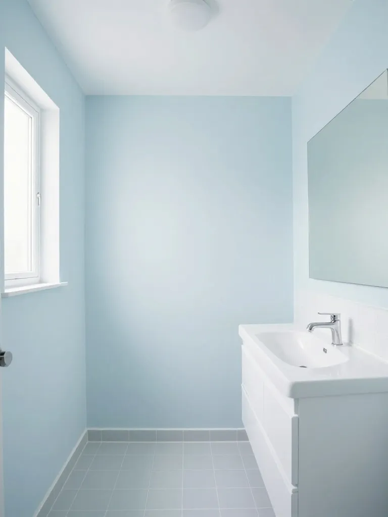
Professional designers consistently return to a handful of reliable strategies when tackling bathroom color ideas for small spaces, and the common thread across all of them is minimizing visual interruption. Small space design solutions favor continuous color across walls, trim and even ceiling, since breaking the room into multiple distinct color zones makes a small footprint feel more chopped up and cramped.
Mirrors strategically placed to reflect window light or fixture lighting amplify whatever color choice you’ve made, while keeping the overall palette light enough to bounce that reflected light effectively throughout the room. Bathroom color ideas small space visual expansion techniques also favor larger-format tile in coordinating tones, since fewer grout lines read as more visually continuous than busy, small-format patterns that can overwhelm limited square footage.
Bold Statement Colors That Surprisingly Work in Tiny Bathrooms
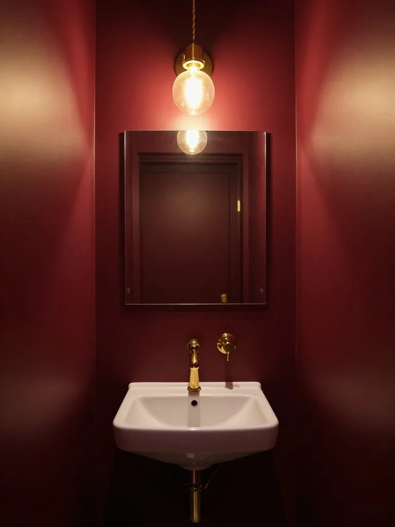
Conventional wisdom says small bathrooms need pale colors exclusively, but bathroom color ideas bold statement choice decisions actually work beautifully in tiny spaces when executed with confidence rather than half-measures. A small bathroom fully committed to a deep emerald or rich terracotta can feel genuinely luxurious rather than cramped.
Bold bathroom color ideas succeed in small spaces specifically because there’s less total wall area for the eye to process, meaning a saturated color doesn’t become visually exhausting the way it might across a larger room. Apartment Therapy bathroom colors features have repeatedly highlighted exactly this phenomenon — tiny powder rooms drenched in confident, saturated color frequently outperform their larger, more cautiously decorated counterparts in both visual impact and genuine personality.
Monochrome Bathroom Schemes That Feel Curated Not Boring
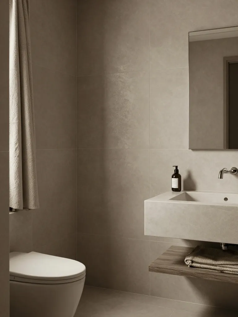
Bathroom color ideas monochrome scheme approaches sometimes get unfairly dismissed as boring, but a well-executed single-color palette built across varying tones and textures of the same hue creates a genuinely sophisticated, curated effect. The key lies in texture variation rather than color variation.
Pairing matte wall paint with glossy tile in the same general color family, then layering in natural materials like wood, stone or woven textiles, prevents a monochrome scheme from reading as flat or one-dimensional. Minimalist bathroom design built on this principle has gained significant traction precisely because it photographs beautifully while requiring genuinely less decision fatigue than coordinating multiple distinct colors across a small space.
Benjamin Moore Hale Navy and the Power of a Confident Color Choice
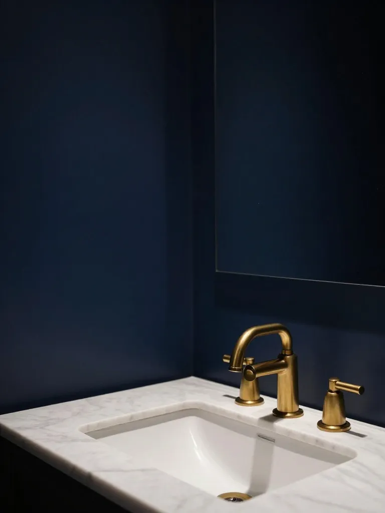
Benjamin Moore Hale Navy bathroom applications have become something of a design world phenomenon, frequently cited across professional designer portfolios as proof that deep, saturated color can feel timeless rather than trendy when chosen with genuine confidence. This particular navy reads sophisticated rather than dark or heavy thanks to its subtle warmth.
Bathroom paint color trends that favor confident, fully committed color choices over timid half-measures consistently photograph and age better over time. Studio McGee bathroom colors projects frequently showcase this exact navy alongside brass fixtures and white marble, proving that a single bold, well-chosen color can carry an entire room’s design identity far more effectively than a scattered collection of safer, less memorable choices.
Lighting and Color: Why Your Bathroom Paint Looks Different at Night
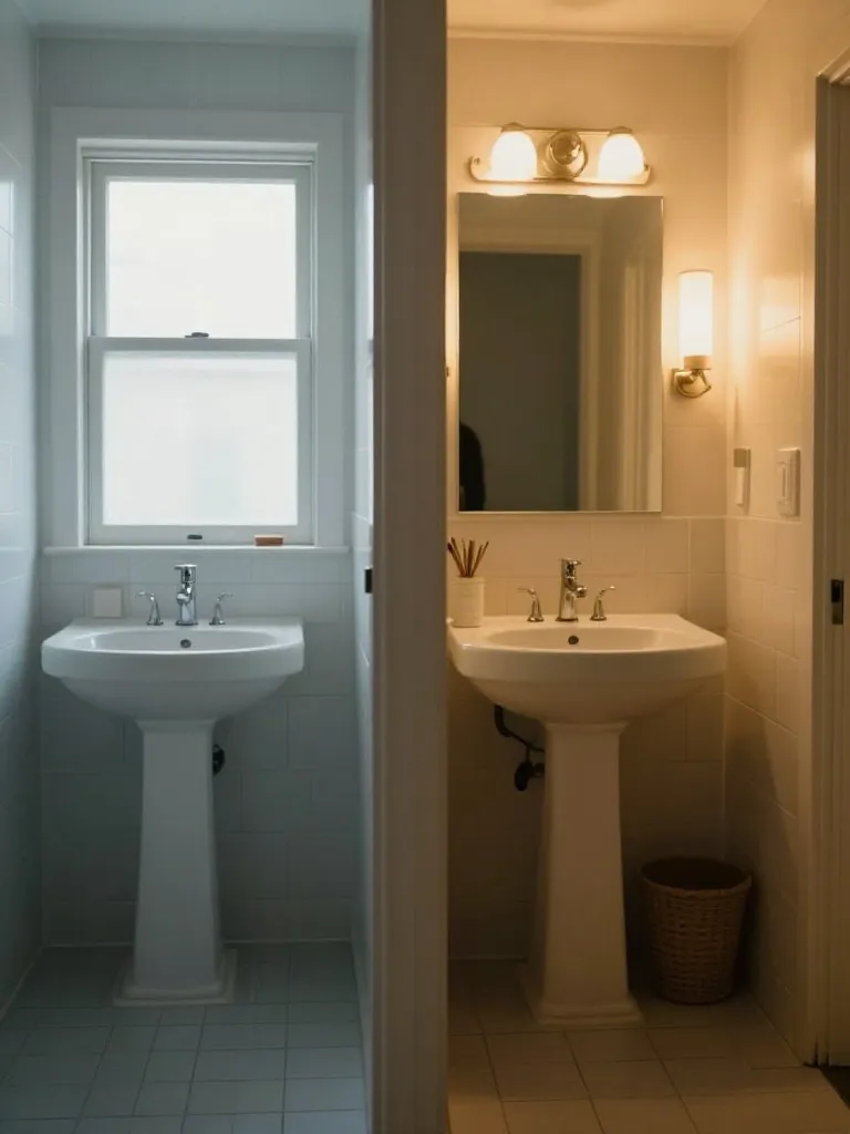
Bathroom lighting and color interaction explains why so many homeowners feel genuinely confused when their carefully chosen daytime paint color suddenly looks completely different under evening lighting. Bathroom color ideas mood lighting interaction depends heavily on your bulb’s color temperature, measured in Kelvin.
Warm white bulbs around 2700K to 3000K enhance warm undertones in paint while muting cooler ones, while cooler bulbs around 4000K to 5000K do the opposite, often making warm paint colors read slightly washed out or flat. Testing your chosen paint swatch under your actual bathroom’s evening lighting setup, not just daylight, prevents the unpleasant surprise of a color that looks completely different once the sun goes down and your fixtures take over.
Bathroom Color Trends 2024 Designers Are Already Moving Past
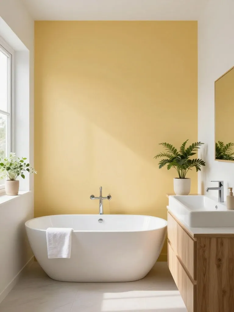
Bathroom color trends 2024 data shows a clear shift away from the all-white, all-grey minimalism that dominated the previous decade, replaced increasingly by warmer, more saturated and personality-driven choices. Bathroom decor trends 2024 consistently point toward earthy terracotta, deep forest green, and warm, buttery yellows gaining significant traction.
However, designers interviewed across multiple HGTV bathroom color ideas and Houzz bathroom color inspiration features note that even as trends shift, the underlying principle stays constant — homeowners increasingly want bathrooms that feel personal and considered rather than generically neutral. What colors are trending for bathrooms right now reflects a broader cultural shift toward warmth and individuality across home design generally, not just within bathroom spaces specifically.
Timeless Bathroom Palettes That Will Never Make You Want to Repaint
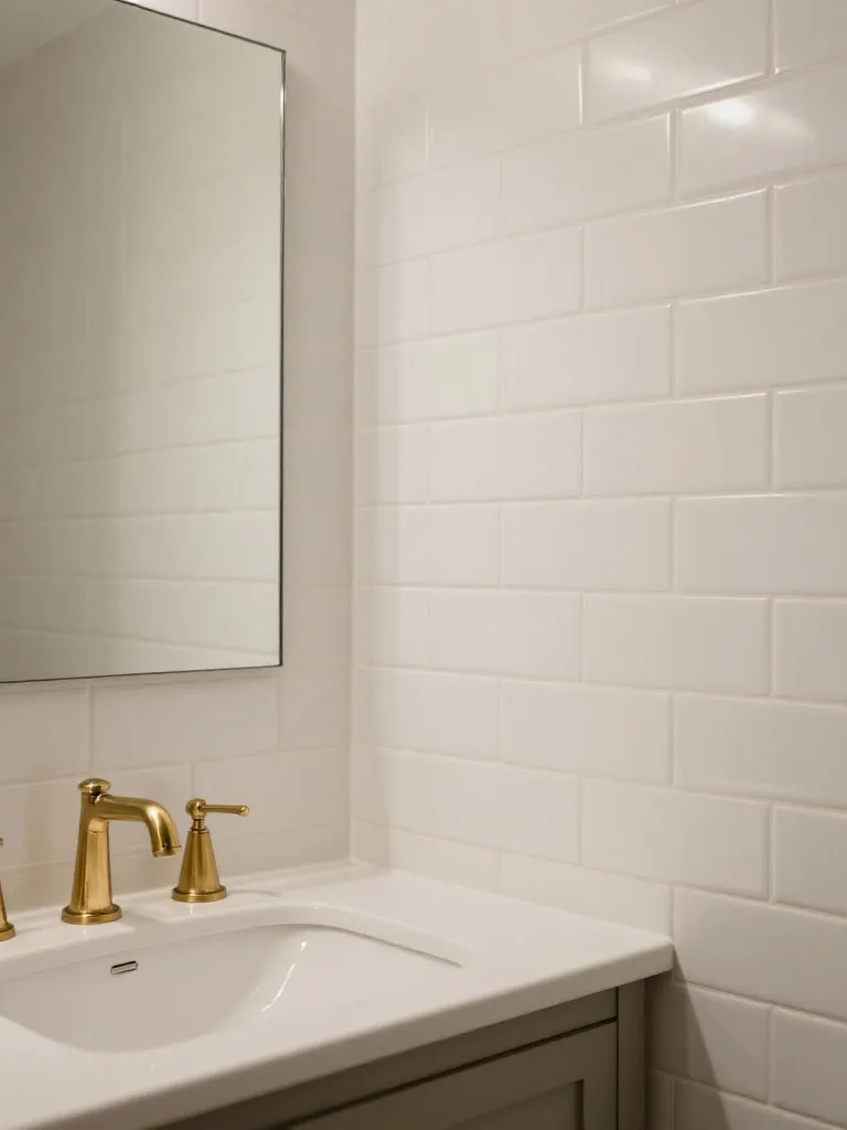
Timeless bathroom design and bathroom color ideas neutral timeless palette thinking prioritizes longevity over chasing whatever color is dominating design media this particular year. What bathroom colors never go out of style consistently points toward soft greige, warm white, pale blue and deep navy as the four pillars of genuinely enduring bathroom color choices.
Benjamin Moore Simply White bathroom applications remain a perennial favorite specifically because true whites with balanced undertones never read as dated the way trendier, more specific shades eventually can. Neutral bathroom colors built around this restrained, classic approach allow homeowners to update the room’s personality through swappable elements — towels, art, hardware — without ever needing to repaint the actual walls every few years.
Humidity Resistant Paint Choices That Protect Your Color Investment
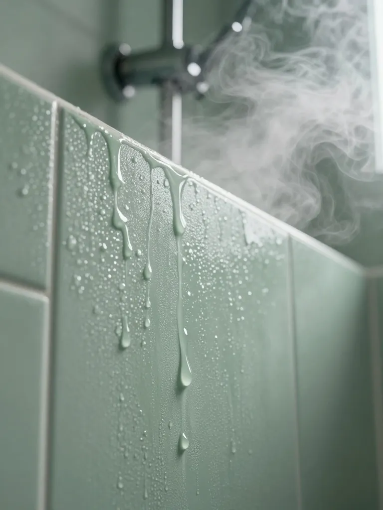
Humidity resistant paint selection matters enormously in bathrooms specifically because standard interior paint formulations weren’t engineered to handle the repeated moisture cycling that showers and baths create daily. Bathroom color ideas humidity resistant paint choices should always specify bathroom or kitchen-rated formulations rather than standard wall paint, regardless of how perfect the color itself looks on the swatch.
Both Sherwin Williams bathroom paint colors and Benjamin Moore bathroom paint colors lines offer dedicated bath and spa formulations built with mildew-resistant additives and tighter moisture sealing than their standard interior counterparts. Behr bathroom paint colors and Farrow and Ball bathroom colors similarly offer bathroom-specific lines, and choosing correctly here protects your entire color investment from premature peeling, bubbling or mildew staining within the first year or two.
Budget Friendly Bathroom Color Updates That Look Custom Designed
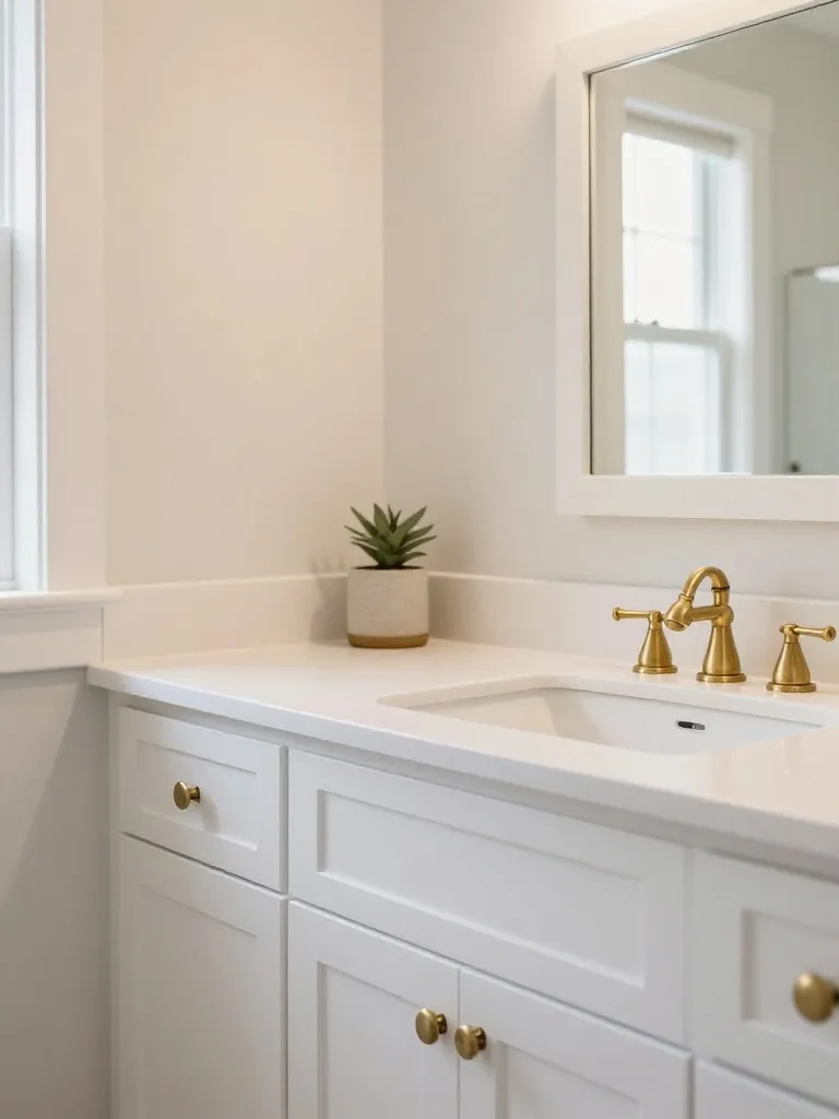
You don’t need a full renovation budget to achieve a genuinely custom-looking color transformation. Bathroom color ideas budget friendly update strategy centers on prioritizing the highest-impact, lowest-cost changes first — wall paint, cabinet hardware, and a single statement accessory like a mirror frame or light fixture.
Lowes bathroom paint colors and Home Depot bathroom paint colors sample pots cost just a few dollars and let you test multiple options directly on your actual walls before committing to a full gallon. Bathroom remodel ideas on a tight budget consistently show that strategic color choices paired with minor hardware swaps deliver dramatically more visual transformation per dollar spent than partial tile or fixture replacement projects that cost significantly more for comparatively modest visual impact.
Seasonal Color Refresh Strategies That Don’t Require a Full Renovation
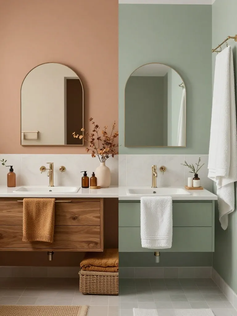
Bathroom color ideas seasonal refresh strategy offers a clever middle path between permanent commitment and constant renovation. Rather than repainting walls seasonally, which is impractical and wasteful, this approach focuses on swappable elements that shift the room’s overall feeling.
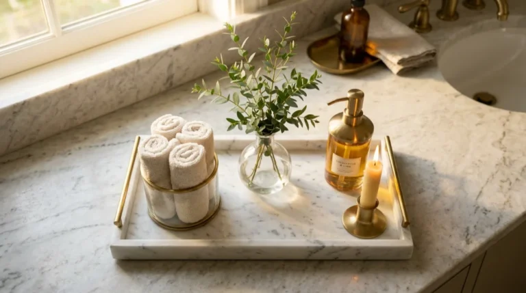
Towels, bath mats, shower curtains and small decor accents in seasonally appropriate tones — warmer terracotta and amber in fall, cooler sage and white in spring — let homeowners refresh their bathroom’s mood multiple times yearly without touching the actual wall color at all. Cohesive home color scheme thinking ensures these seasonal swaps still relate logically to the permanent wall color underneath, preventing the room from feeling visually disjointed during any particular seasonal rotation.
How Joanna Gaines and Studio McGee Approach Bathroom Color Differently
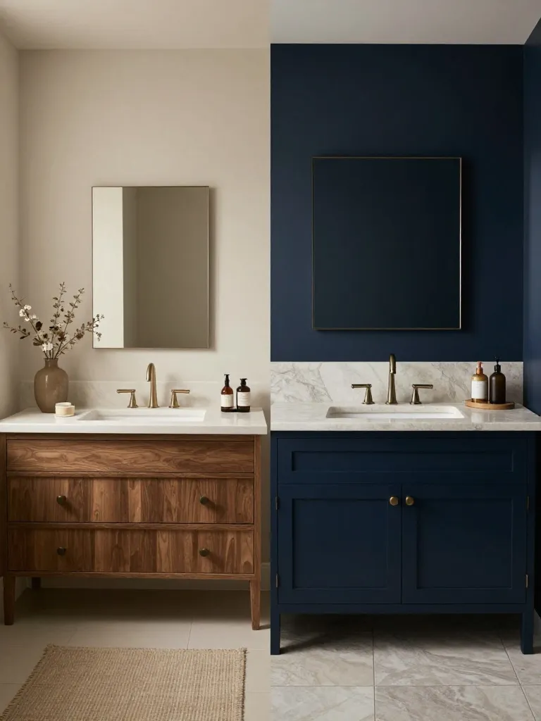
Joanna Gaines bathroom color palette philosophy consistently favors warm, approachable neutrals — soft whites, warm taupe, natural wood tones — that prioritize comfort and timeless livability over dramatic statement-making. Her Magnolia Home bathroom colors line reflects this exact sensibility, built around colors that feel collected and lived-in rather than precisely staged.
Studio McGee bathroom colors projects, by contrast, lean more frequently into confident, saturated choices — deep blues, rich greens — balanced against crisp white trim and natural stone. Restoration Hardware bathroom palette and West Elm bathroom color inspiration sit somewhere between these two design philosophies, while Crate and Barrel bathroom aesthetic and Pottery Barn bathroom color palette both lean toward the warmer, more accessible end of the spectrum that Gaines’ work helped popularize across mainstream American homes.
FAQ Section
Q1. What color should I paint a small bathroom to make it look bigger?
Soft, cool-toned whites and pale greys work best for small bathrooms since they reflect available light efficiently and minimize visual contrast between surfaces. Keeping walls, trim and ceiling close in tone, rather than introducing multiple distinct colors, prevents the room from feeling chopped into smaller visual sections.
Q2. What is the best bathroom color for resale value?
Soft greys, warm whites and pale blues consistently rank highest for resale appeal since they read as neutral and broadly likable to the widest range of potential buyers. Bold, highly personal color choices can make it harder for buyers to envision the space as their own during a walkthrough.
Q3. What colors work best in a windowless bathroom?
Warmer whites and soft creams generally outperform stark cool tones in windowless spaces, since cool colors can read flat or grey without natural daylight to balance them. Pairing the right wall color with warm LED lighting around 2700K helps prevent the room from feeling clinical or cave-like.
Q4. Should bathroom walls be glossy or matte paint?
Eggshell or satin finishes are generally the best choice for bathroom walls, offering meaningfully better moisture and mildew resistance than flat matte paint while avoiding the harsh glare of full gloss. Trim and cabinetry typically benefit from a glossier finish since they face more direct moisture exposure.
Q5. What color goes best with black bathroom fixtures?
Black fixtures pair exceptionally well with warm whites, soft sage greens and deep charcoal walls, since black creates strong graphic contrast against both light and dark backdrops. Adding brass or warm wood accents alongside black hardware helps soften any potential starkness in the overall palette.
Conclusion
A bathroom doesn’t need a complete renovation to become the most striking room in your home. The right bathroom color ideas — chosen with genuine attention to your lighting, square footage, fixtures and daily routine — can transform even the smallest, most forgotten space into something you genuinely look forward to using every single day.
Start with a sample pot before committing to a full gallon. Test it under both daylight and your bathroom’s actual evening lighting. Whether you land on a confident navy, a soft spa green, or a timeless warm white, the most important factor is choosing with intention rather than settling for whatever felt safest. That intentionality is exactly what separates a forgotten bathroom from the star of your home.