17 Living Room Gallery Wall Ideas to Showcase Your Style Beautifully
A bare wall wastes potential. It sits there, quiet and forgettable, while the rest of the room does all the work. Living room gallery wall ideas solve that problem fast. They turn empty space into a curated story that guests actually stop and look at.
This guide walks through every stage of building one, from the first sketch to the final nail. You’ll find layout tricks, spacing rules, and styling advice that feels personal instead of copied from a catalog. Whether your wall is huge or narrow, these ideas adapt to real rooms.
The Hidden Formula Behind Gallery Walls That Feel Effortlessly Curated
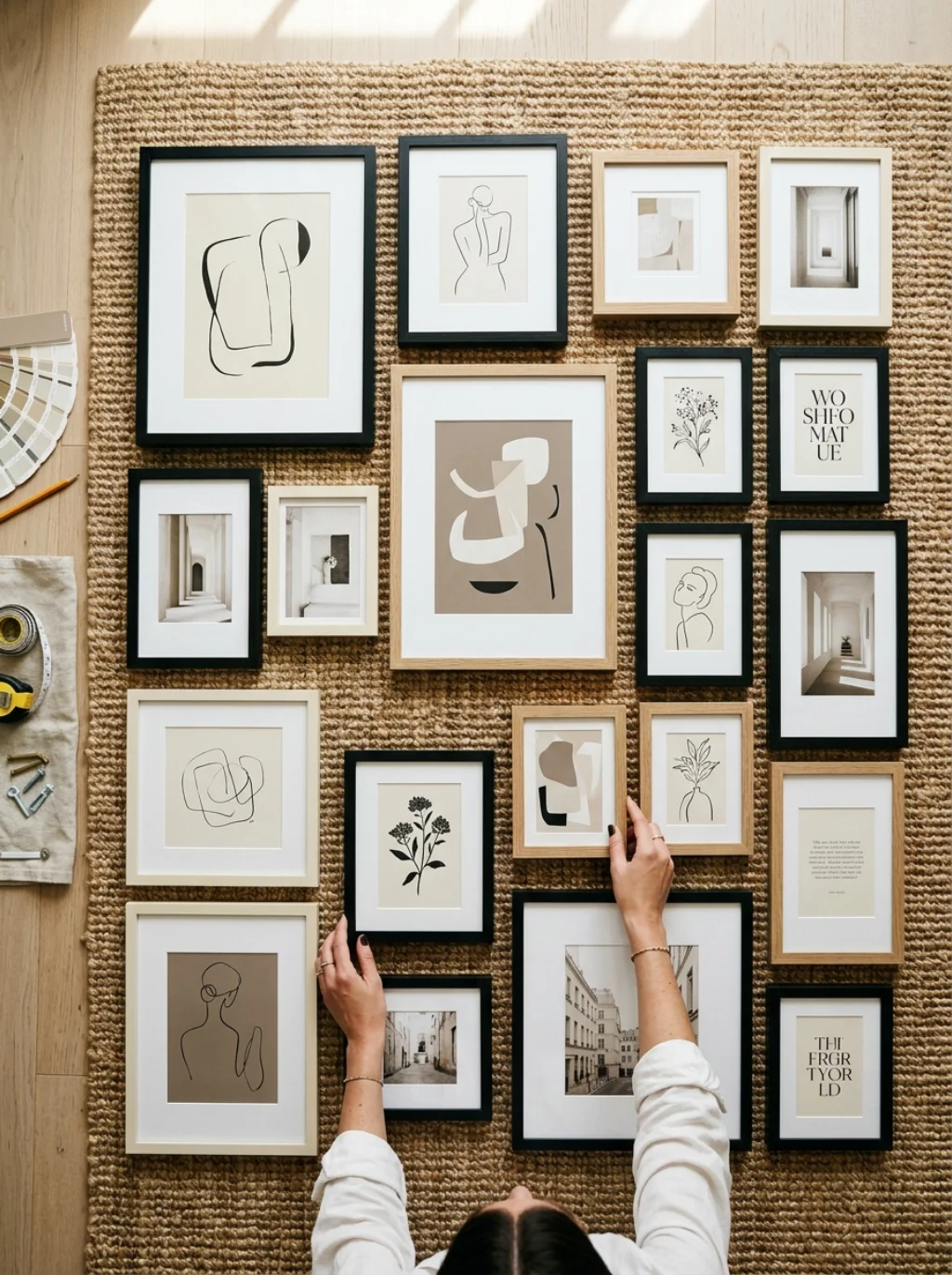
Great walls rarely happen by accident. A strong gallery wall layout starts on the floor, not the wall itself. Lay your frames out on a rug first. Move pieces around until the spacing feels balanced rather than forced.
This process reveals a curated wall collection before you commit to a single hole. Picture frame arrangement works best when you group by size first, then color. Once the floor version feels right, the actual hanging becomes almost mechanical and stress free.
A Bold Layout Trick Designers Use to Break the Predictable Grid
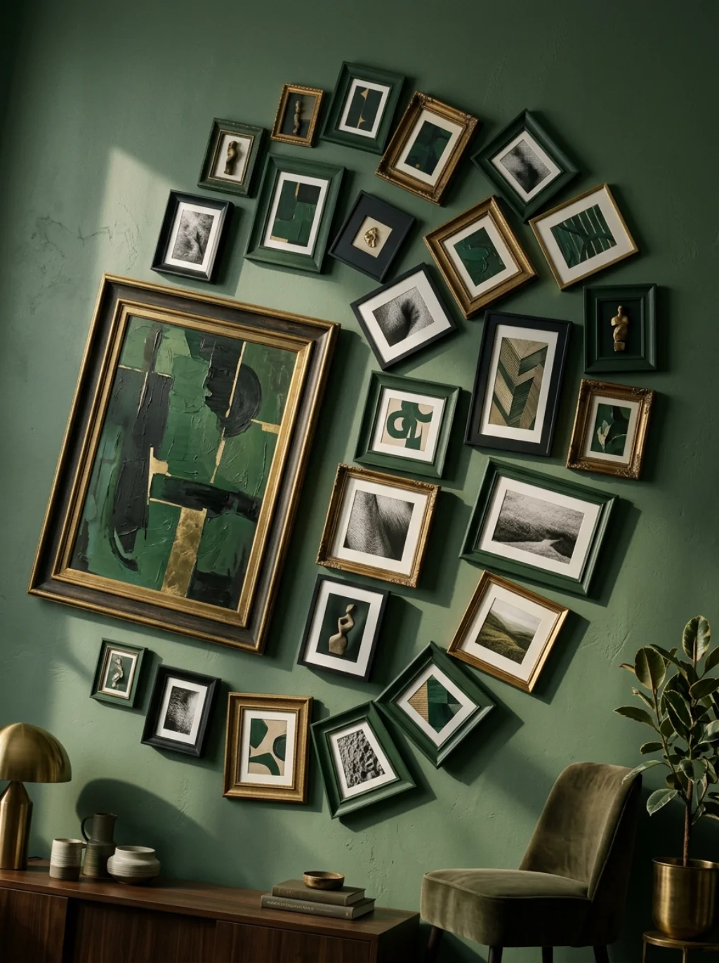
Grids feel safe but they rarely feel exciting. An asymmetrical gallery wall breaks that pattern by mixing frame heights and widths deliberately. Designers often anchor one large piece off center, then build smaller frames around it in a loose spiral.
This creates visual rhythm wall art that pulls the eye across the whole wall instead of stopping in one spot. However, a symmetrical gallery wall still works beautifully for formal rooms. Choose the style that matches your room’s overall energy and stick with it.
Mixing Frame Styles Without Turning the Wall Into Visual Chaos
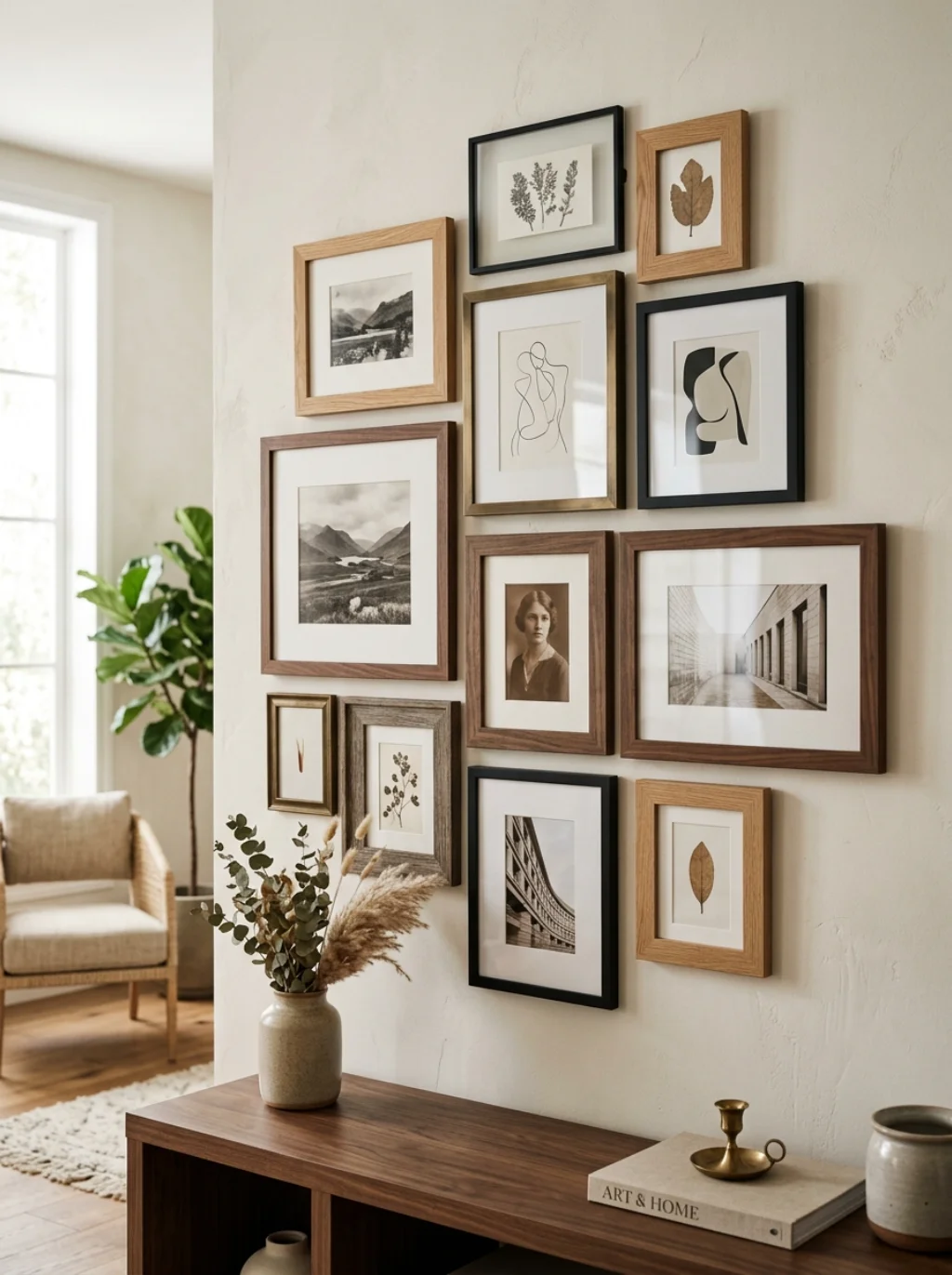
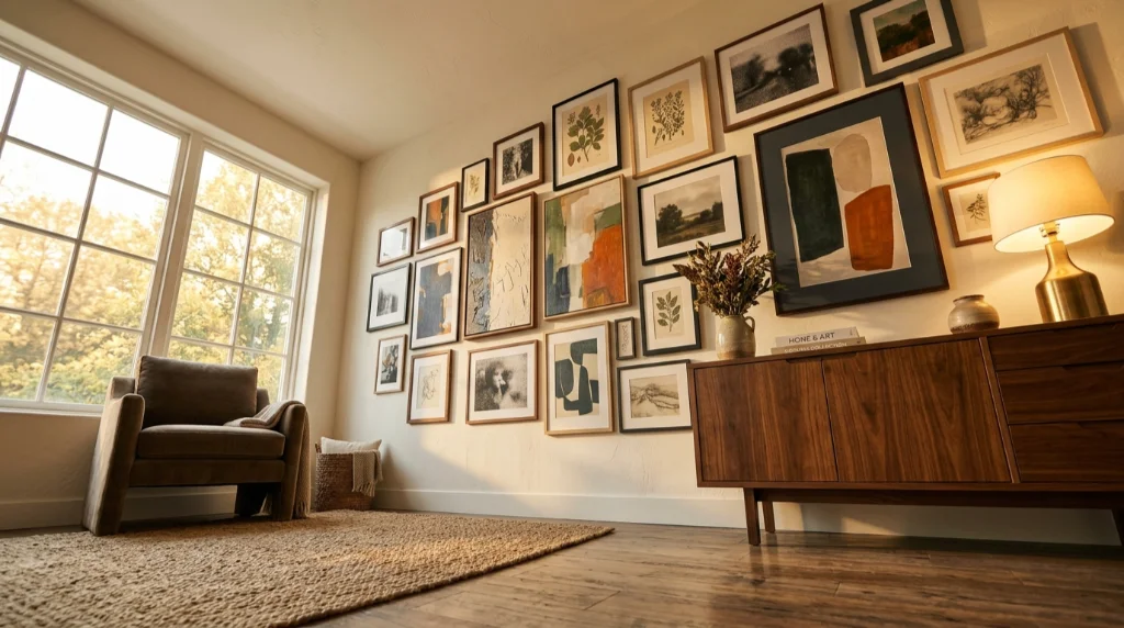
Mixing frames sounds risky, yet it’s one of the easiest ways to add depth. A mixed frame gallery wall works when you set a rule first, like all wood tones or all black frames. This keeps the variety from turning into clutter.
Gallery wall frame styles from West Elm or CB2 often blend well since their finishes share similar undertones. For a bolder look, add one vintage frame display piece into an otherwise modern set. That single contrast point often becomes the wall’s most talked about detail.
The Sofa Backdrop Idea That Instantly Anchors an Entire Room
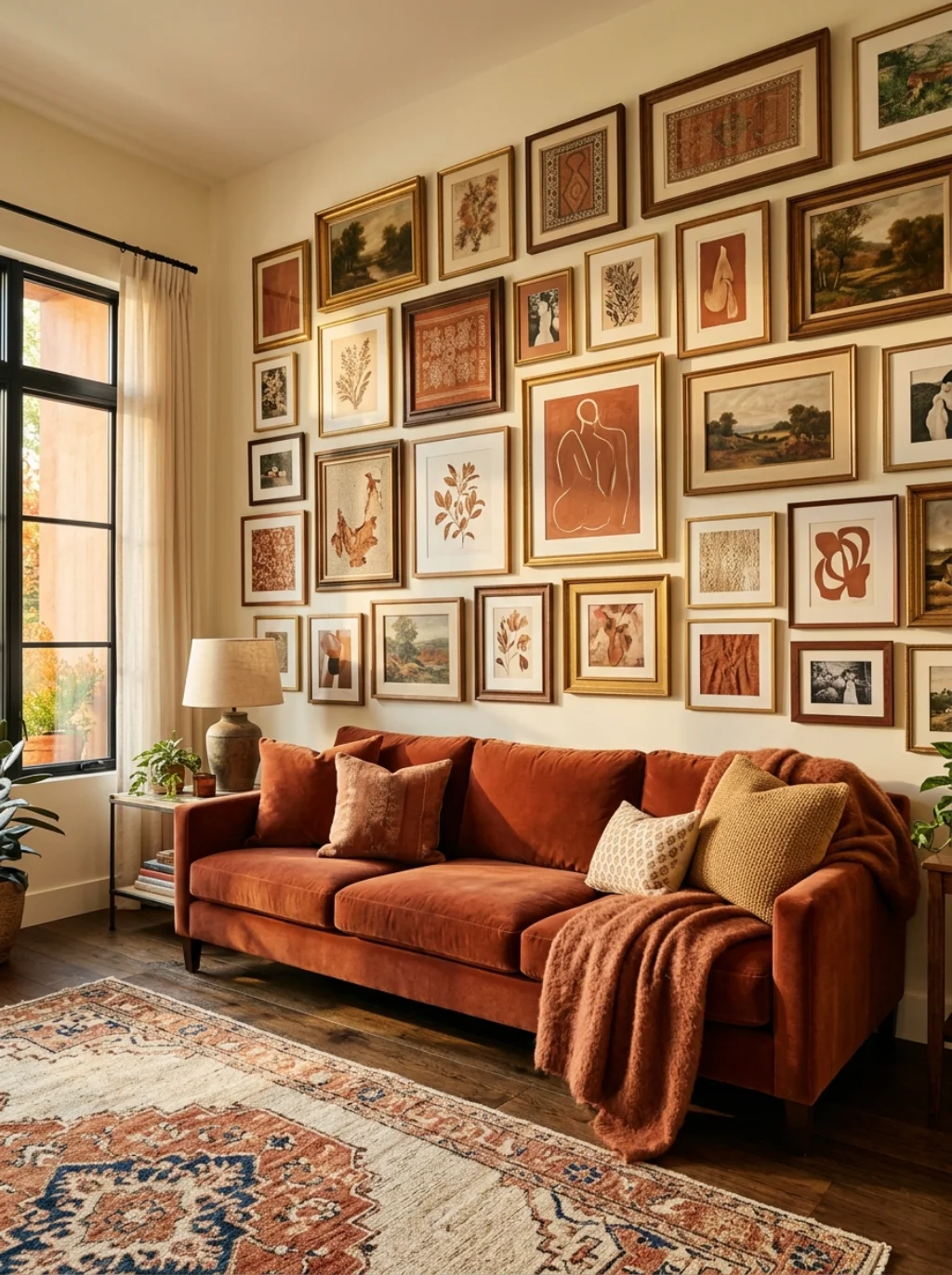
A gallery wall above couch placement remains one of the most requested layouts, and for good reason. It gives the seating area an obvious focal point. The rule of thumb keeps the arrangement two thirds the width of the sofa below it.
This gallery wall behind sofa approach also solves an awkward tall wall problem instantly. Hang the lowest row about six inches above the cushions. That small gap keeps the living room wall art feeling connected to the furniture instead of floating aimlessly above it.
Spacing Secrets That Separate Amateur Walls From Professional Displays

Spacing makes or breaks a gallery wall faster than frame choice ever will. A consistent gallery wall spacing of two to three inches between frames reads as intentional. Wider gaps start to feel disconnected, while tighter gaps feel cramped.
Professionals often use painter’s tape to map out gallery wall spacing guide lines before drilling anything. This gallery wall size guide trick prevents crooked rows and mismatched gaps. A little patience here saves you from patching unnecessary holes later.
Gallery Wall Ideas Homeowners Wish They Had Tried Years Earlier
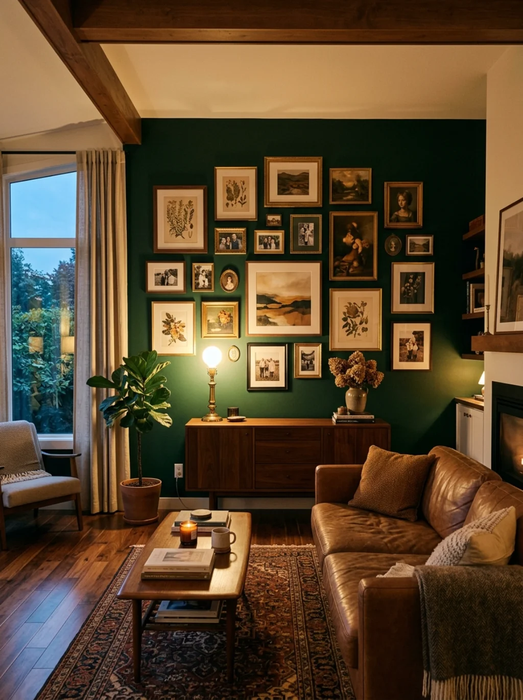
Many homeowners start with one framed print, then slowly add pieces without a real plan. Years later, the wall feels random instead of intentional. A little upfront planning avoids that scattered outcome entirely.
Gallery wall inspiration often comes from unexpected sources, like a hotel lobby or a favorite Architectural Digest feature. Save examples that catch your eye. This gallery wall planning tips habit keeps your final choices cohesive rather than impulsive.
Turning a Narrow Hallway Wall Into a Striking Visual Story
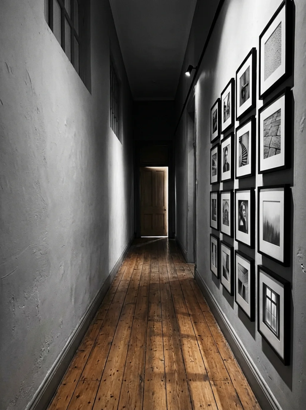
Narrow walls seem limiting, yet they often make the strongest storytelling wall display spaces in a home. A gallery wall for narrow wall layout works well as a single vertical column instead of a wide spread. This keeps the composition tidy in tight quarters.
you may also like this:17 Bunk Room Ideas for Boys to Maximize Fun and Functionality
Add a runner rug beneath it to ground the space visually. This frame collage ideas approach turns a plain hallway into a mini museum walk. Guests naturally slow down to look, which makes even a small hallway feel intentional.
Color Palette Tricks That Make Every Frame Feel Intentional
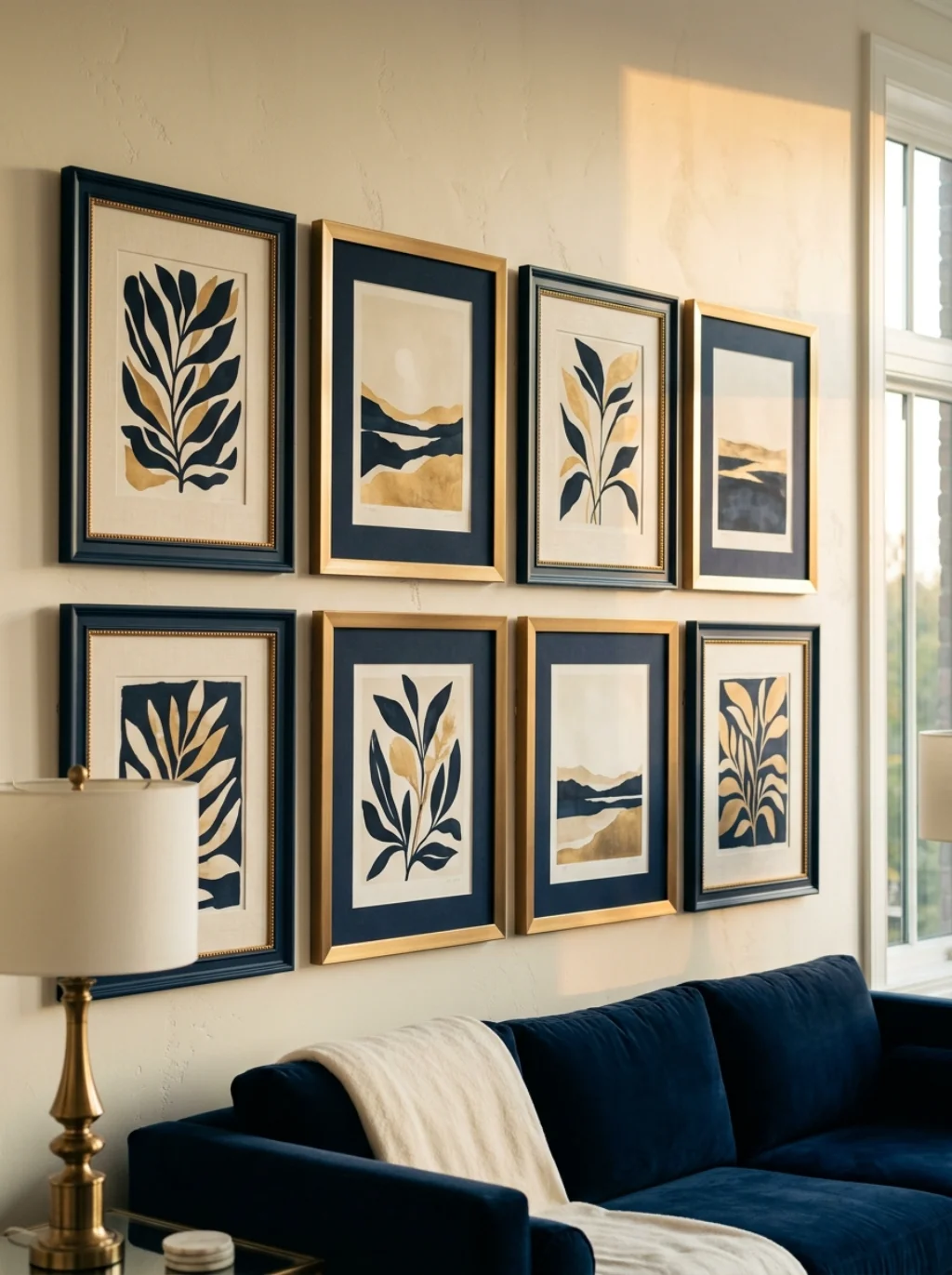
Color ties a scattered set of frames into one cohesive story. A tight gallery wall color scheme built around two or three shades keeps everything feeling connected. Black and white photography paired with one bold colored print often works beautifully.
Gallery wall color palette ideas should echo something already in the room, like a throw pillow or rug accent. This wall design harmony approach prevents the wall from feeling disconnected from everything else. Consistency here matters more than variety.
Salon Style Arrangements That Feel Rich Without Looking Cluttered
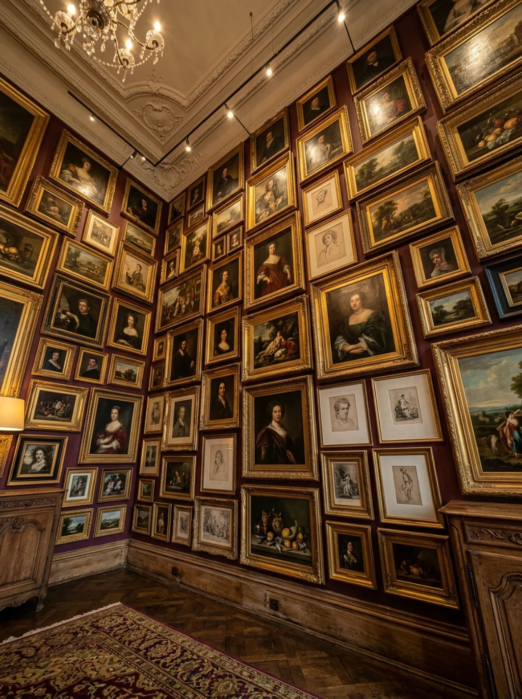
Salon style wall display arrangements pack frames closely together, floor to ceiling in some cases. This dense, layered look works surprisingly well in rooms with high ceilings or minimal other decor. It creates an instant sense of richness.
The trick lies in layered wall composition planning before hanging a single piece. Group by theme rather than randomly filling gaps. This eclectic gallery wall style feels bold yet controlled when the underlying structure stays organized.
Blending Mirrors and Art for Depth You Can Actually Feel
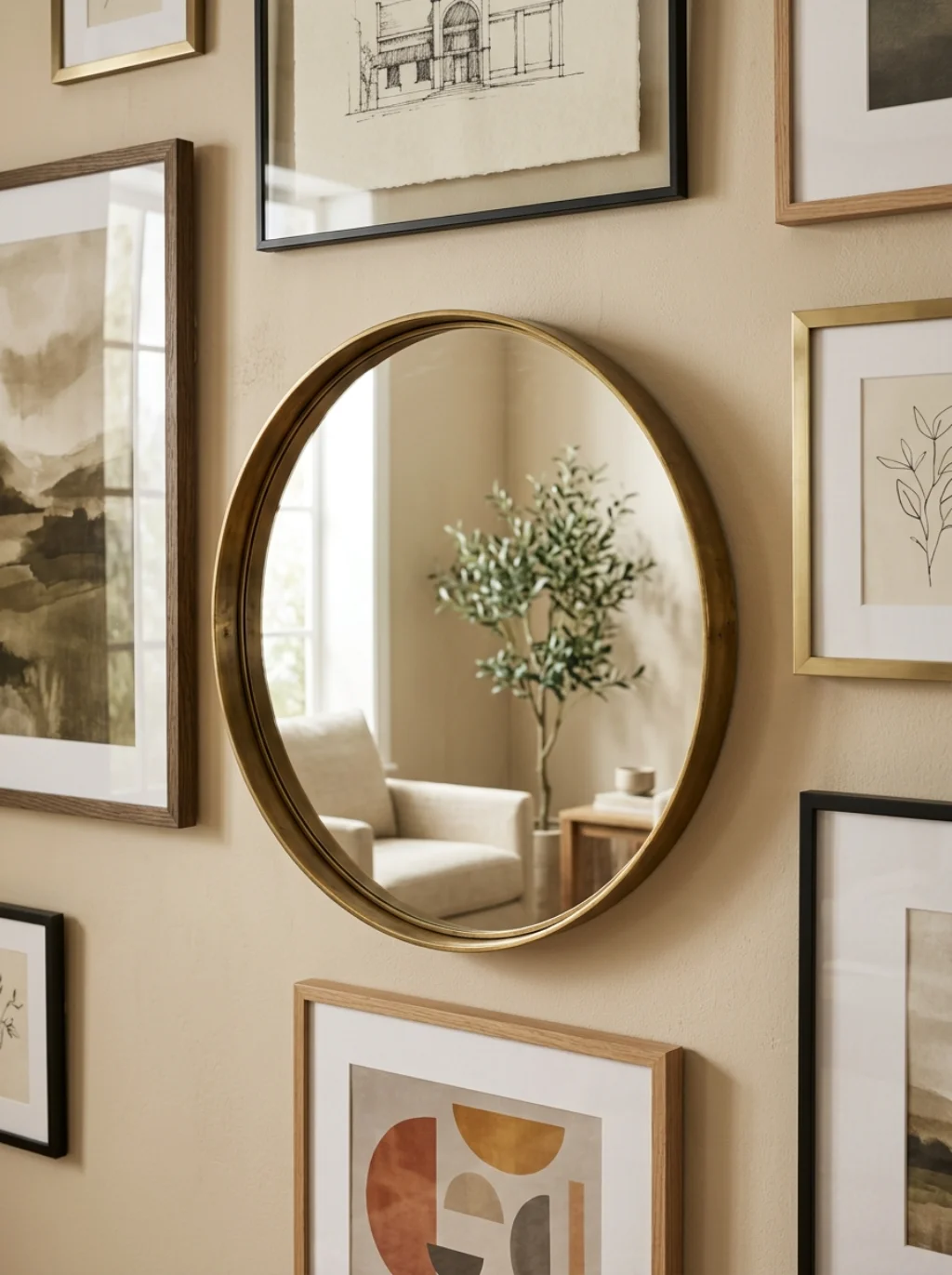
A gallery wall with mirrors adds something frames alone cannot, which is reflected light and a sense of extra depth. Placing one mirror among framed prints bounces natural light across the room, making the whole space feel brighter.
This dimensional wall display trick works especially well in smaller living rooms lacking big windows. Mirrors from Pottery Barn or HomeGoods offer frame styles that blend easily with existing art. The reflection adds movement that static frames simply can’t replicate.
Budget Friendly Gallery Wall Ideas That Look Custom Designed
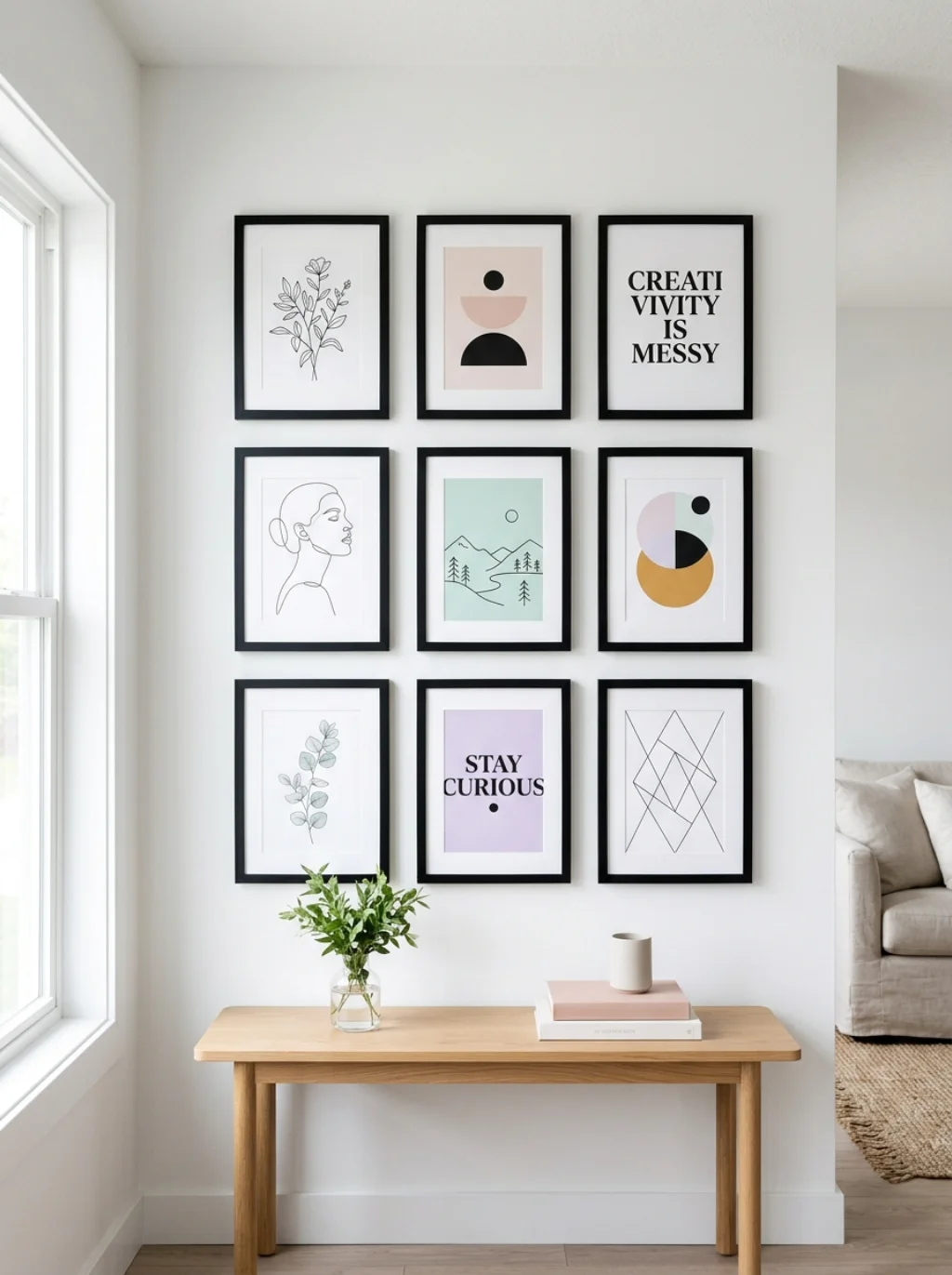
You don’t need a big budget to build something that looks professionally styled. Affordable gallery wall ideas often rely on print downloads from Etsy or Society6 paired with basic frames from IKEA or Target. Quality framing matters more than expensive art.
Diy gallery wall ideas also stretch further when you mix in personal items like postcards or small textiles. This eclectic art mix approach adds character without adding cost. A thoughtfully arranged budget wall often outshines an expensive but poorly planned one.
| Budget Level | Focus Area | Example Source |
|---|---|---|
| Low | Printable art and basic frames | Etsy prints, IKEA frames |
| Medium | Mixed frame sets | Wayfair, Amazon |
| High | Custom framed prints | Frame Bridge, Minted |
Turning Family Memories Into a Wall That Tells a Real Story
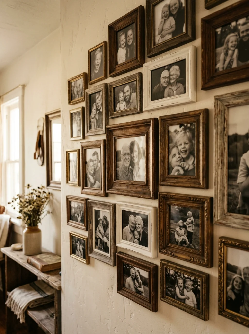
A family photo wall turns a hallway or living room into a warm, personal timeline. Mixing candid shots with a few professional portraits keeps the wall feeling natural rather than staged. This personal memory wall style resonates with visitors instantly.
Print a few photos in black and white for consistency. This small choice creates a museum style hanging feel even with casual snapshots. Family walls often become the most emotionally meaningful spot in the entire home over time.
Sculptural Wall Pieces That Add Texture Beyond Flat Frames
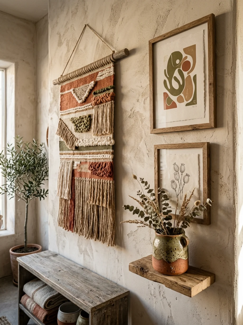
Flat frames tell part of the story, but sculptural wall pieces add dimension that photos alone cannot achieve. Woven wall hangings, small shelves, or ceramic pieces break up the flatness and add tactile interest to the overall display.
Mixed media wall art from stores like Crate and Barrel or World Market pairs naturally with framed prints. This textured wall art approach gives the eye something new to notice each time someone walks past. Texture turns a good wall into a memorable one.
Creating Balance on an Oddly Shaped or Angled Wall
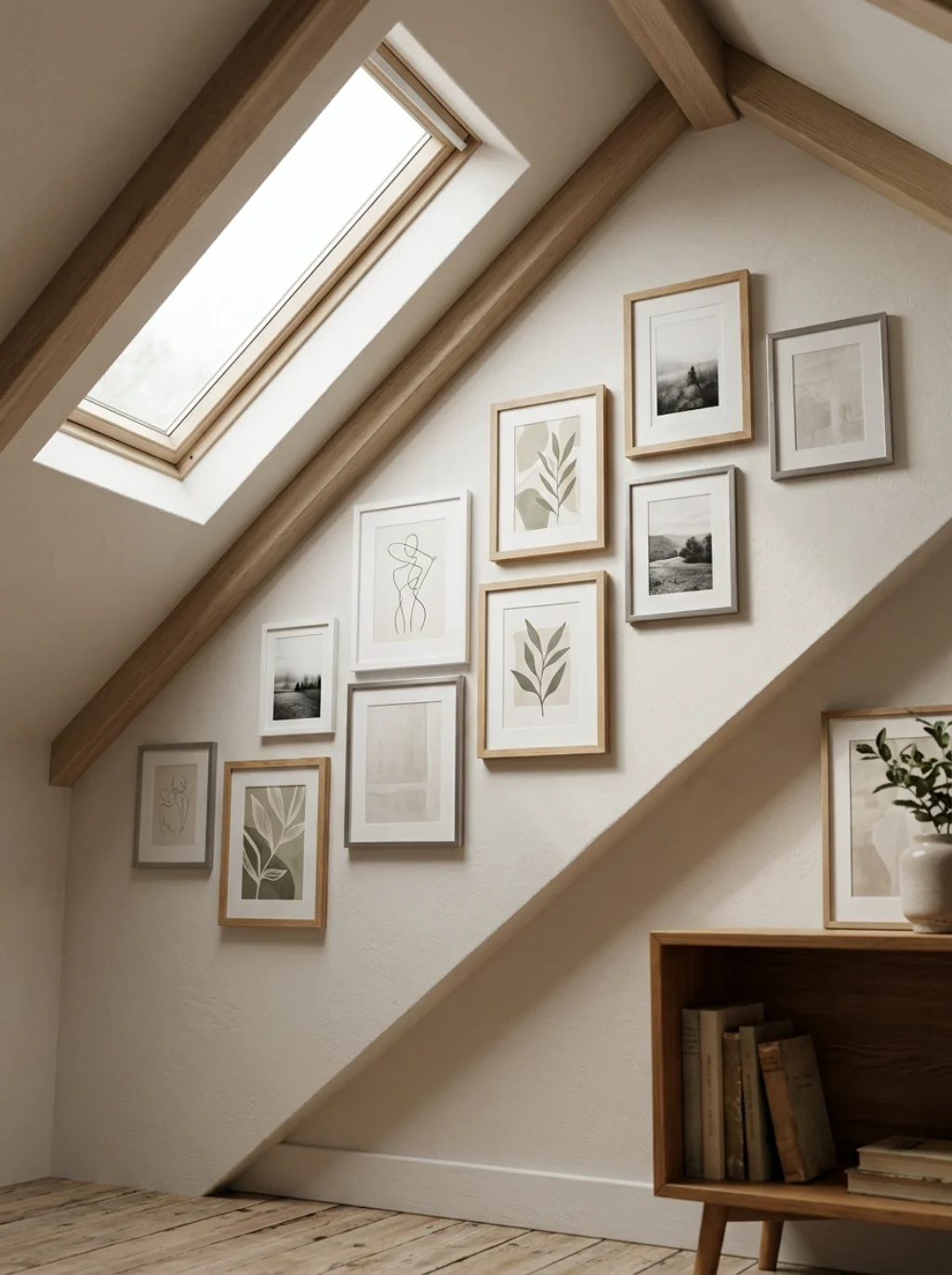
Not every wall offers a clean rectangle to work with. Angled ceilings, doorways, or windows interrupt the space and complicate planning. A thoughtful gallery wall furniture placement approach works around these obstacles rather than fighting them.
Start with the largest usable section and build outward from there. Wall composition balance matters more than filling every inch. This negative space wall art principle proves that empty gaps, used intentionally, often strengthen the overall design.
Staircase Displays That Turn a Forgotten Space Into a Feature
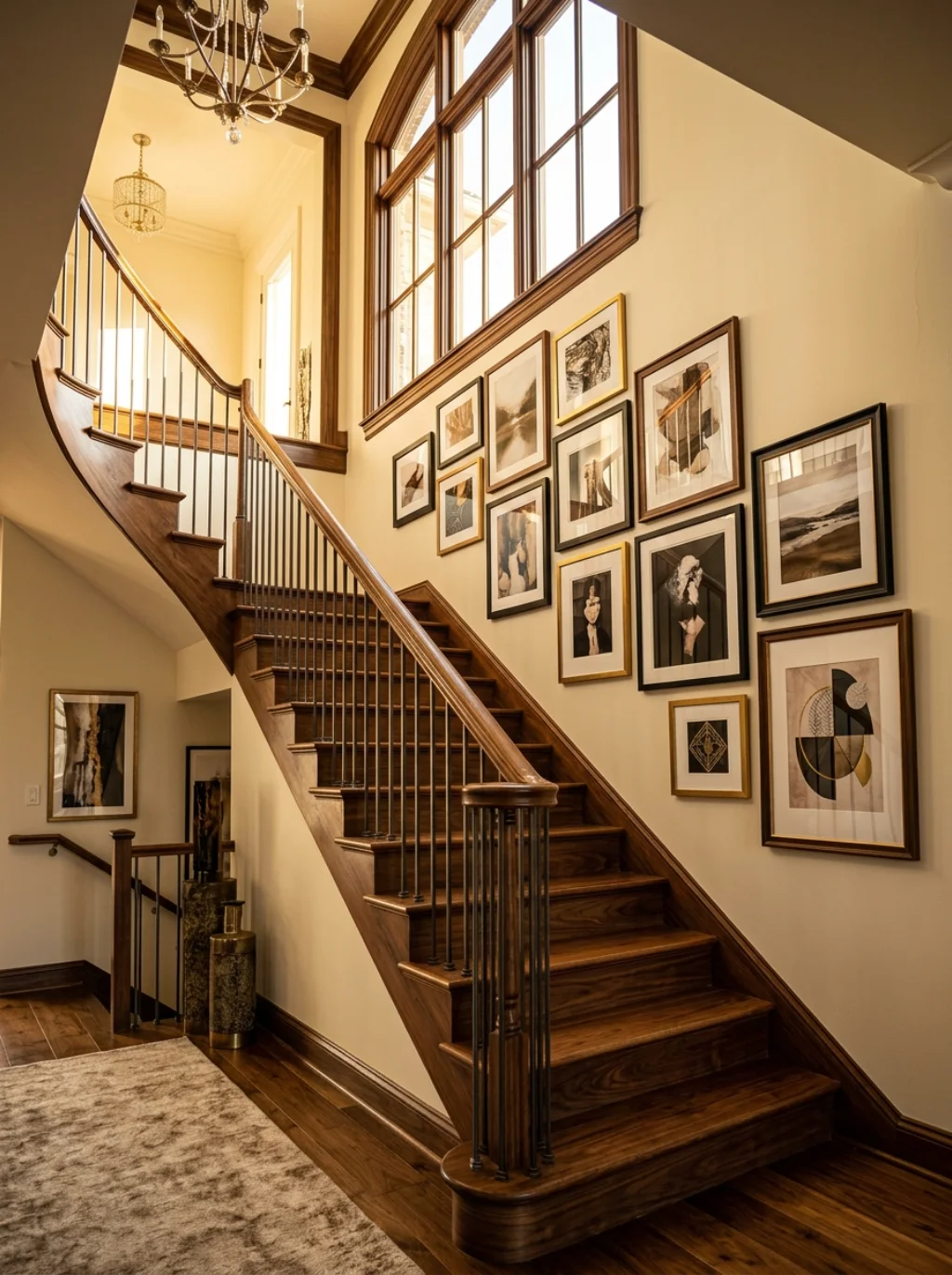
A staircase gallery wall transforms one of the most overlooked areas in a home into a genuine showpiece. Frames follow the angle of the stairs, creating a diagonal line that feels dynamic rather than static.
Measure carefully before hanging, since staircase walls involve varying heights along the incline. This gallery wall hanging guide step prevents an uneven, off kilter result. Done well, a staircase display becomes one of the first things guests notice entering the home.
Small Living Room Layouts That Make Ceilings Feel Taller
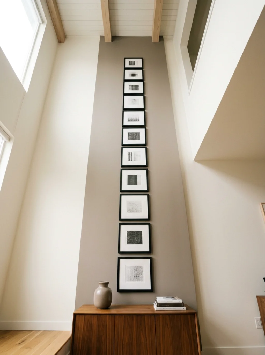
A gallery wall for small living room spaces benefits from a vertical arrangement rather than a wide horizontal spread. Stacking frames upward draws the eye toward the ceiling, creating an illusion of extra height in a compact room.
Keep the minimalist gallery wall count lower in tight spaces to avoid visual crowding. This gallery wall for large wall contrast shows how the same core principles simply scale differently. Smaller rooms reward restraint far more than larger ones do.
Choosing a Focal Point Before Placing a Single Frame

Every strong wall needs one clear anchor before anything else gets hung. A focal point wall design approach starts with the largest or boldest piece placed first. Everything else builds around that central anchor afterward.
This statement wall art piece could come from Restoration Hardware or a bold print from Minted. Artistic wall grouping decisions become far easier once that anchor exists. Skipping this step often leads to a wall that feels busy without any real center.
Frequently Asked Questions
What size frames work best for a living room gallery wall?
A mix of small, medium, and one larger anchor frame creates the best balance. Avoid using only one size, since that often looks flat and predictable.
How far apart should frames be spaced on a gallery wall?
Two to three inches between frames reads as consistent and intentional. This spacing works across most layouts, from grids to asymmetrical designs.
What is the best layout for a small living room gallery wall?
A vertical column layout works best in tight spaces. It draws the eye upward and makes the ceiling feel taller than it actually is.
How do I arrange a gallery wall without nail holes?
Command Strips and Command Hooks offer damage free hanging for most lightweight frames. Always check weight limits before finalizing your layout.
Can a gallery wall include mirrors and shelves together?
Yes, mixing mirrors and small shelves adds depth and function. This combination works especially well in living rooms lacking natural light.
What is the ideal height to hang a gallery wall?
The center of the arrangement should sit around eye level, roughly fifty seven to sixty inches from the floor, for the most natural viewing experience.
Conclusion
Building a great gallery wall takes more thought than most people expect, yet the payoff makes every measurement worth it. From spacing and color to mixing frame styles and choosing a focal point, small decisions add up to something memorable. Whether you’re working with a narrow hallway, a space above the sofa, or a full living room decor overhaul, the same principles apply. Plan first, commit to a palette, and let the wall tell a story worth stopping for.