
Bring Warmth to the Table: Dining Room Colors Ideas That Feel Fresh and Inviting
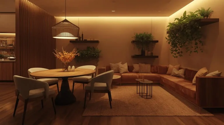
Color is the most powerful and most affordable design tool in your entire home. Nowhere does that truth reveal itself more dramatically than in the dining room — a space where people gather, linger, laugh, and share the kind of conversations that actually matter. The right dining room colors transform an ordinary meal into an experience worth savoring. The wrong ones make even a beautifully set table feel somehow flat and uninspiring. Whether you’re starting from scratch or finally ready to move on from that builder-beige you’ve been tolerating for six years, this guide gives you every color direction you need to create a dining room that feels genuinely alive.
Why Dining Room Color Sets the Entire Mood for Every Meal
Color psychology in dining spaces is genuinely fascinating and remarkably well-documented. Warm colors — reds, oranges, deep yellows, and rich terracottas — actively stimulate appetite and encourage conversation according to research published in the Journal of Sensory Studies, which is precisely why so many successful restaurants globally lean toward warm, enveloping color palettes rather than cool clinical alternatives. Your dining room paint colors decision isn’t just an aesthetic choice — it’s a behavioral one that directly shapes how long your guests linger at the table, how animated your dinner conversations become, and how much everyone actually enjoys the experience of being in that room together.
Dining room color schemes also profoundly affect perceived formality, spatial generosity, and temporal atmosphere — three qualities that determine whether your dining room feels like a place people rush through or one they genuinely want to stay in. A deep forest green dining room communicates refined intimacy that makes every dinner feel like a special occasion. A bright white coastal dining room communicates relaxed effortless entertaining where nobody worries about the wine glass too close to the edge. How to choose dining room wall colors starts with answering one honest question — how do you want people to feel when they sit at your table? That answer guides every color decision that follows.
Warm Neutral Dining Room Colors That Always Feel Inviting
Warm neutrals are the dining room color equivalent of a great cashmere sweater — universally flattering, endlessly versatile, and never wrong for the occasion. Neutral dining room colors in the warm family — creamy whites, soft warm beiges, honey taupes, and buttery ivories — create dining environments that feel simultaneously sophisticated and deeply comfortable, a combination that more dramatic color choices frequently struggle to achieve. They work equally well with dark walnut furniture, light oak pieces, painted white dining sets, and upholstered chairs in any fabric color, making them the most universally safe and consistently beautiful dining room paint colors choice available to American homeowners.
| Warm Neutral Color | Brand | Undertone | Best Style |
|---|---|---|---|
| White Dove OC-17 | Benjamin Moore | Warm yellow | Traditional, transitional |
| Accessible Beige SW 7036 | Sherwin-Williams | Sandy warm | Any style |
| Setting Plaster No.231 | Farrow & Ball | Blush taupe | Elegant, formal |
| Pale Oak OC-20 | Benjamin Moore | Greige warm | Modern, Scandinavian |
| Antique White SW 6119 | Sherwin-Williams | Cream yellow | Farmhouse, cottage |
Bold and Moody Dining Room Colors That Make a Statement
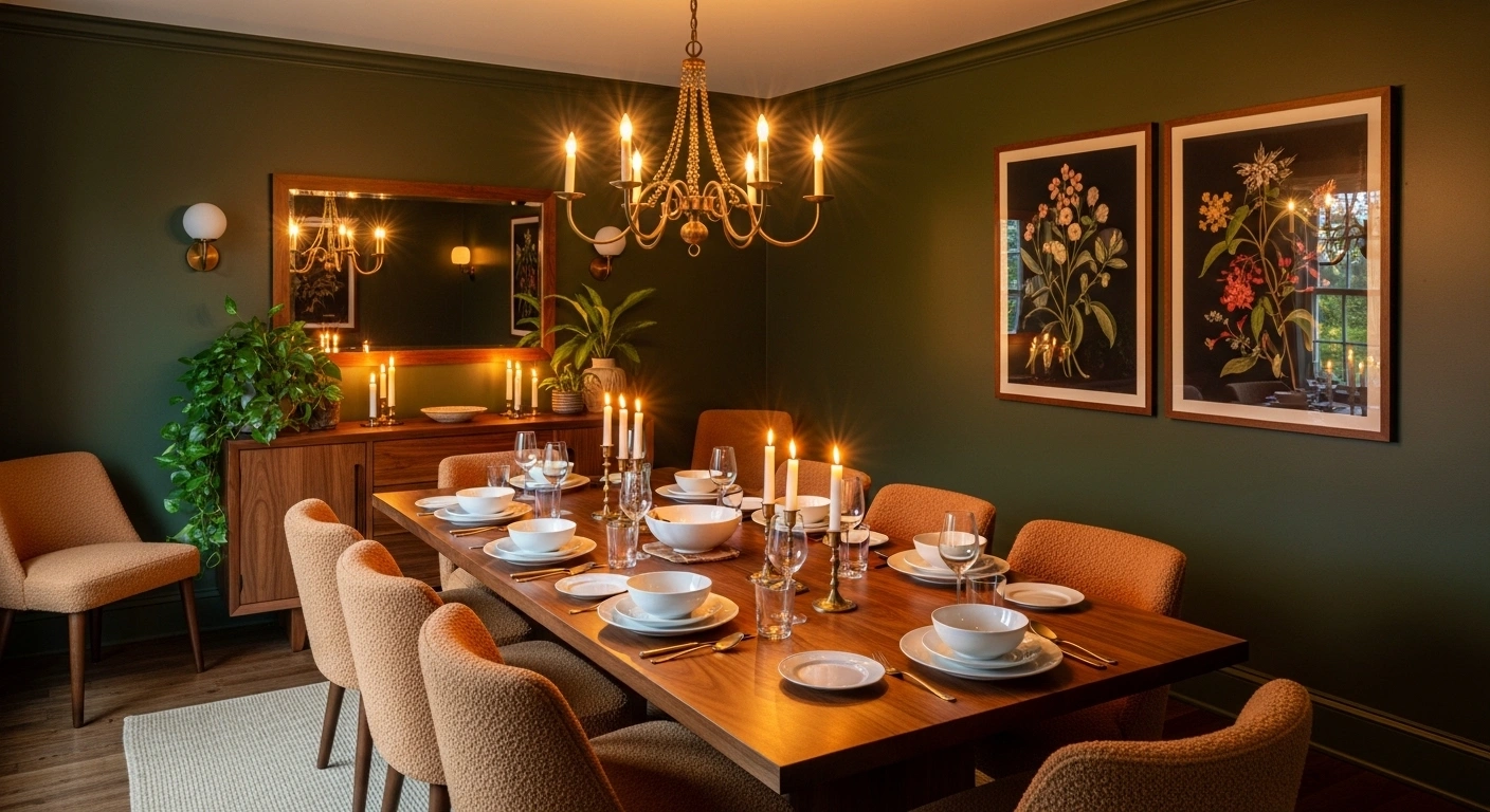
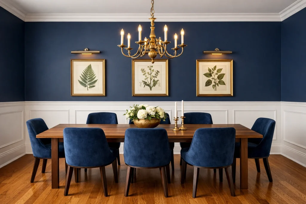
Bold colors belong in dining rooms more than anywhere else in the house — and confident designers have known this for decades. The dining room is the one space where dramatic, enveloping color feels completely appropriate rather than overwhelming, because the room typically has defined boundaries, specific furniture that anchors the color, and a social function that benefits enormously from the sense of occasion that bold color creates. Bold dining room wall colors like deep emerald green, rich navy blue, saturated burgundy, and inky forest green transform an ordinary dinner party into something that feels genuinely curated and considered. How to use bold colors in a dining room successfully starts with trusting the color fully — half-measures with bold colors rarely work well.
you may also like this:Turning Forgotten Living Room Areas into Purposeful Places
| Bold Color | Brand | Best Furniture Pairing | Vibe |
|---|---|---|---|
| Black Forest Green 2047-10 | Benjamin Moore | White, brass, natural oak | Botanical, dramatic |
| Anchors Aweigh SW 7611 | Sherwin-Williams | Natural wood, brass | Nautical, sophisticated |
| Burgundy 2083-10 | Benjamin Moore | Dark walnut, gold | Formal, rich |
| Naval SW 6244 | Sherwin-Williams | White, chrome, light wood | Bold, modern |
| Radicchio 96 | Farrow & Ball | Brass, dark wood | Moody, Italian |
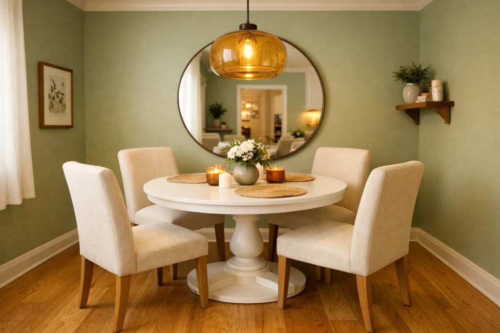
Fresh and Airy Dining Room Colors for a Light Filled Space
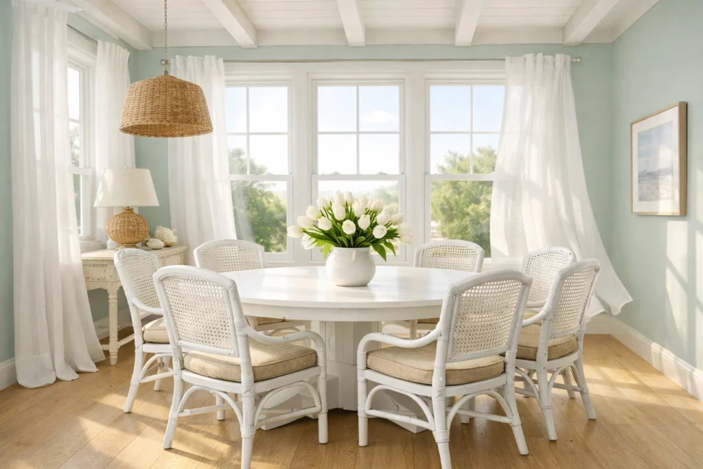
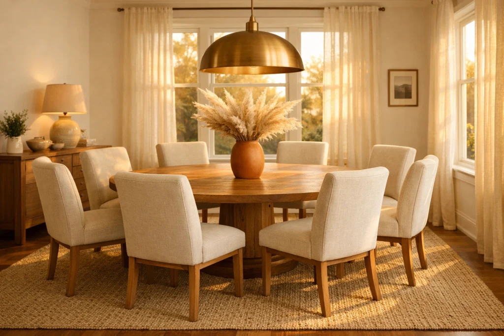
Light, fresh dining room colors create the dining room equivalent of Sunday brunch energy — relaxed, bright, unhurried, and genuinely pleasant without trying too hard. Coastal dining room color ideas and Scandinavian dining room colors both draw from this fresh, airy palette, favoring soft whites, pale powder blues, gentle sage greens, and barely-there blush tones that maximize the feeling of natural light and open spaciousness throughout the room. These colors work especially brilliantly in dining rooms with significant natural light exposure — south or east-facing dining rooms that receive direct morning or afternoon sun genuinely sing when painted in soft, light-reflective colors that bounce daylight around every surface.
Best dining room colors for natural light in the fresh and airy category include Benjamin Moore’s Pale Sky 2165-60 — a soft powdery blue that transforms with natural light throughout the day, appearing almost white in bright afternoon sun and taking on a gentle purple-blue cast in cooler morning light — and Sherwin-Williams Sea Salt SW 6204, a perennially popular grey-green that feels simultaneously coastal and Scandinavian depending on the furniture it’s paired with. Dining room colors that pair well with white trim reach their most beautiful expression in this fresh airy palette because the contrast between soft colored walls and crisp white woodwork creates the clean, defined aesthetic that makes both elements look intentional and precisely chosen rather than accidentally coordinated.
Earthy and Nature Inspired Dining Room Color Palettes
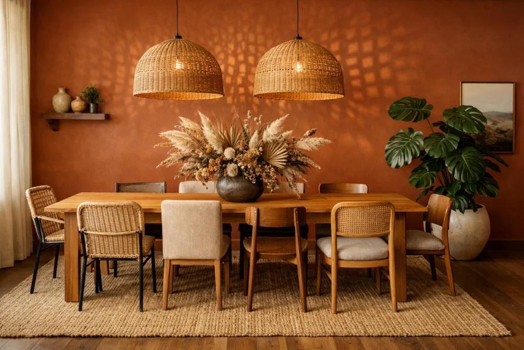
Earthy dining room colors are having their most significant cultural moment in decades and for genuinely compelling reasons. The broader design world’s embrace of biophilic principles — the human need for visual and sensory connection to the natural world — has pushed warm terracottas, dusty olives, clay pinks, mushroom browns, and muted sages from niche designer preferences into mainstream American dining room consciousness. Earthy dining room color ideas create dining environments that feel simultaneously grounded, warm, and sophisticated — a rare combination that neither the ultra-neutral nor the dramatically bold palette easily achieves. These colors reference the natural world without literally depicting it, creating spaces that feel organically calming in a way that manufactured color trends rarely do.
Dining room color trends USA 2026 point decisively toward this earthy, nature-connected palette as the dominant direction for American dining rooms — a continuation and deepening of the organic modern trend that has dominated USA interior design since 2022. Specific standout earthy dining room paint colors include Sherwin-Williams Cavern Clay SW 7701 — a warm terracotta that performs brilliantly against white trim and natural wood furniture — Benjamin Moore’s Pale Avocado 2146-40 for a muted olive that references mid-century modern while feeling completely current, and Farrow & Ball’s Dead Salmon No.28 for a sophisticated clay pink that flatters candlelight extraordinarily well. Boho dining room color ideas draw heavily from this earthy palette, layering terracotta walls with rattan furniture, macramé accents, and global textile patterns for a rich, well-traveled aesthetic.
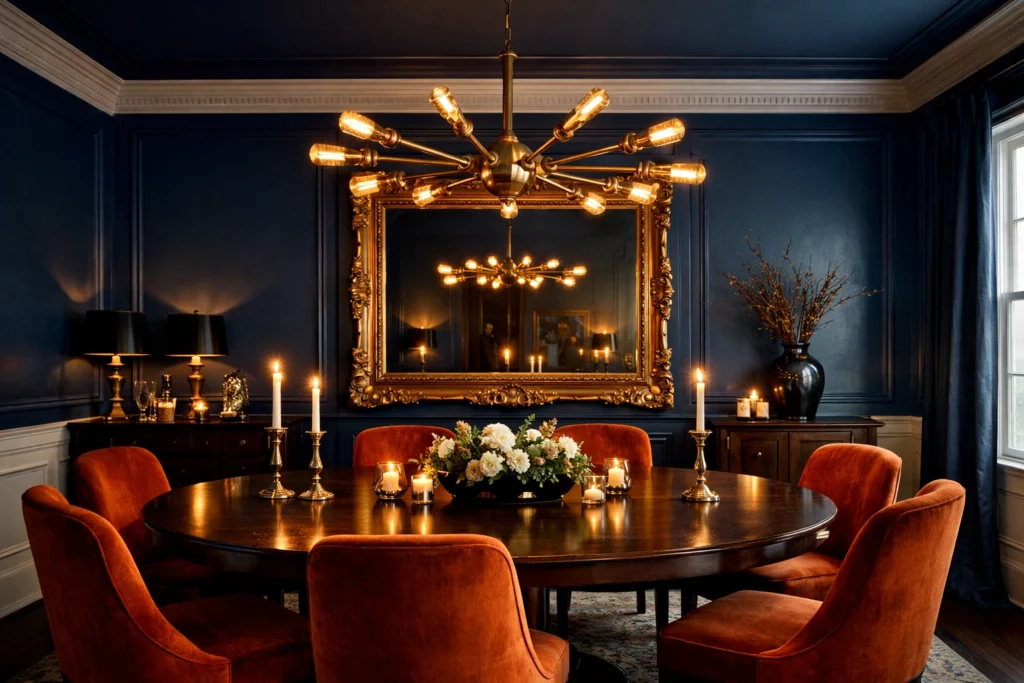
Dark and Dramatic Dining Room Paint Ideas Worth Trying
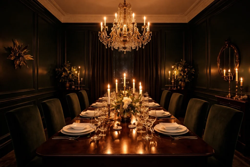
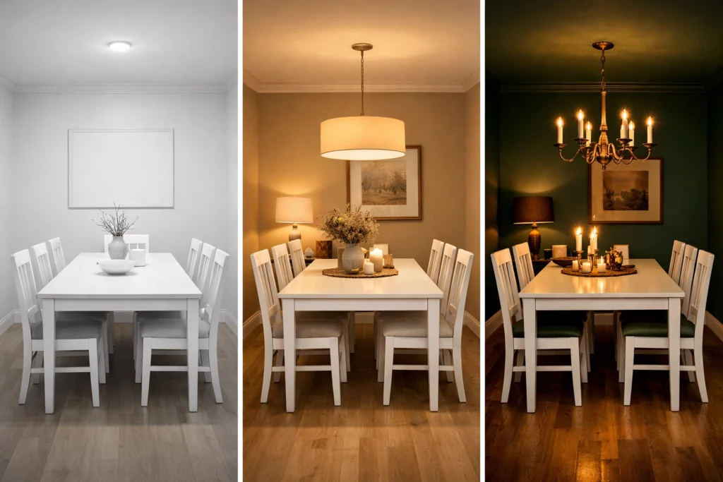
Dark dining rooms are not a bold experiment — they’re a proven design strategy that centuries of elegant home design have validated repeatedly. Think of the great manor houses of England, the sophisticated brownstones of New York, the refined Creole cottages of New Orleans — all employed dark, enveloping dining room colors to create spaces where meals felt like events rather than routines. Dark dining room paint ideas in contemporary American homes follow this same principle, using modern paint technology to achieve depths of color that earlier generations couldn’t access at residential price points. The key insight most homeowners miss — dark colors don’t shrink rooms that are used primarily at night or in artificial light. They enlarge them by eliminating the walls visually and creating a sense of infinite depth.
| Dark Color | Brand | Lighting Recommendation | Best Pairing |
|---|---|---|---|
| Hague Blue No.30 | Farrow & Ball | Warm brass fixtures | White trim, gold accents |
| Black Panther 2125-10 | Benjamin Moore | Abundant warm sources | White china, brass, marble |
| Cascades SW 6477 | Sherwin-Williams | Warm ambient layers | Natural wood, copper |
| Studio Green No.93 | Farrow & Ball | Candlelight, warm sconces | Brass, dark wood |
| Inkwell SW 6992 | Sherwin-Williams | Multiple warm sources | White, natural linen |
Best Dining Room Colors for Small and Low Light Spaces
Small dining rooms don’t need to surrender to beige — that tired advice has kept too many compact dining spaces imprisoned in timid, uninspiring color purgatory for far too long. Small dining room color ideas that genuinely work embrace a counterintuitive truth — a small dining room painted in a confident, well-chosen color often feels more spacious than the same room painted in a pale neutral, because the color creates a cohesive visual field that eliminates the busy, fragmented quality that pale rooms with contrasting trim and furniture frequently produce. Dining room colors that make a room feel bigger most effectively are actually warm mid-tones rather than stark whites — a warm sage green or a soft dusty blue creates more perceived spaciousness than brilliant white by reducing visual contrast between walls, ceiling, and trim.
Dining room color ideas for low light rooms require particular strategic care because low-light spaces amplify undertones dramatically — a paint color that reads as a clean warm beige in a well-lit showroom can turn distinctly orange or green in a north-facing dining room with minimal natural light. Best warm paint colors for a dining room with low natural light include Benjamin Moore’s Shaker Beige HC-45 — a warm honey beige that resists going muddy in low light — Sherwin-Williams Restrained Gold SW 6129 for a warm gilded quality that actually benefits from artificial light’s warm tones, and Benjamin Moore’s Pale Moon OC-108 for a soft warm white that reads consistently beautiful regardless of light quality. Supplement any low-light dining room color strategy with layered warm artificial lighting — a dimmer-controlled chandelier, wall sconces, and candles working together transform any dining room color from adequate to genuinely beautiful.
Two Tone Dining Room Color Ideas That Add Visual Depth
Two-tone dining room color design is one of the most architecturally sophisticated and visually rewarding approaches available to American homeowners — and it’s considerably more approachable than most people initially assume. Two tone dining room colors work by dividing the wall surface horizontally into distinct color zones — typically using a chair rail, picture rail, or wainscoting panel as the architectural dividing line — with a darker, more saturated color below and a lighter, softer tone above. This arrangement references centuries of traditional interior design practice while feeling completely current when executed with modern color combinations and clean architectural detailing.
| Two-Tone Combination | Lower Color | Upper Color | Style |
|---|---|---|---|
| Classic coastal | Deep navy | Warm white | Traditional, coastal |
| English country | Forest green | Warm cream | Formal, traditional |
| Earthy global | Terracotta | Sandy beige | Boho, organic |
| Modern drama | Charcoal | Pale grey | Modern, sophisticated |
| Farmhouse | Barn red | Soft ivory | Farmhouse, rustic |
How to Choose Dining Room Colors That Work With Your Furniture
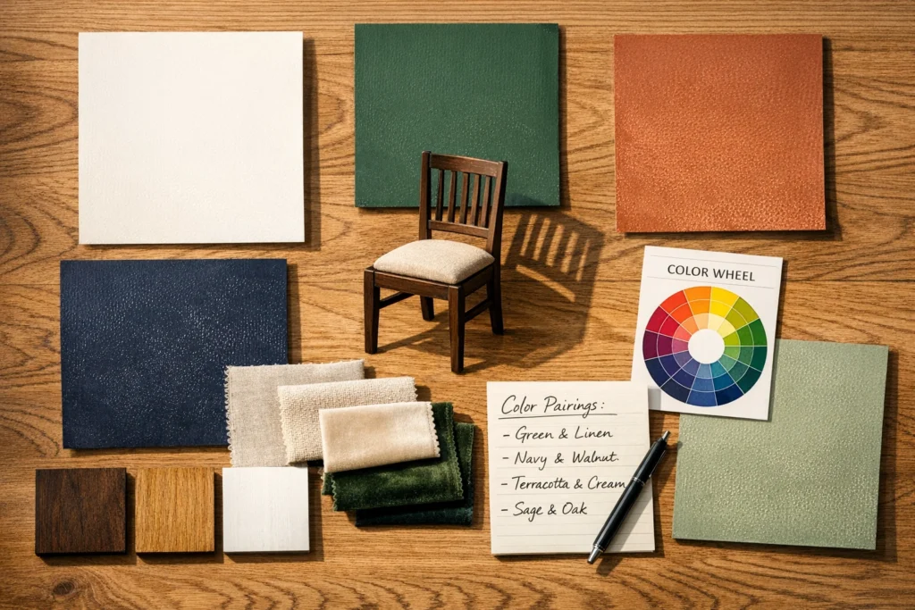
Your dining furniture is the permanent, most expensive element in the room — which means every dining room colors decision must start with and return to the specific finish, tone, and character of your table and chairs rather than working in the opposite direction. Dining room colors that go with wood furniture depend critically on the wood’s specific tone — cool-toned grey or white-washed wood furniture suits cooler wall colors including soft blues, sage greens, and cool whites while warm-toned walnut, cherry, and oak furniture demands warm wall companions including warm whites, terracottas, warm greens, and rich jewel tones that share similar warm undertones.
How to pick a color scheme for a dining room using the 60-30-10 rule — a foundational interior design principle — assigns 60% of the room’s color to the walls and floor, 30% to the furniture upholstery and large accessories, and 10% to accent colors in artwork, table accessories, and decorative objects. How to choose dining room colors with grey floors — an increasingly common scenario in American homes with LVP and grey-toned hardwood installations — works best with warm wall colors that counterbalance the floor’s coolness, preventing the overall space from reading as cold and clinical. Warm whites, soft greiges, terracottas, and warm sage greens all perform reliably against grey flooring while providing the visual warmth that makes a dining room feel genuinely inviting rather than architecturally interesting but emotionally flat.
Dining Room Accent Wall Colors That Instantly Elevate the Space
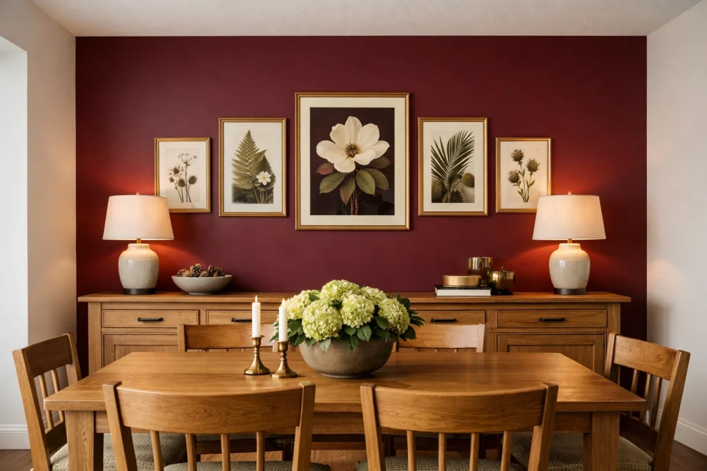
An accent wall in the dining room delivers the maximum color impact with the minimum commitment — a particularly appealing proposition for homeowners who love the idea of bold color but aren’t ready to surround themselves with it on all four walls simultaneously. Dining room accent wall colors work most effectively when the accent wall is positioned behind the primary visual focal point of the room — typically the buffet or sideboard wall, the wall behind the host’s chair, or the wall most visible from the dining room’s primary entry point. These locations ensure the accent color registers immediately upon entering the room and anchors the entire dining space’s visual composition without overwhelming it.
Best dining room accent wall color ideas that consistently deliver outstanding results include deep forest green behind a natural wood buffet styled with brass accessories, rich navy behind a traditional mirror and matching candlestick arrangement, warm terracotta behind an eclectic gallery wall of botanical prints, and moody charcoal behind a contemporary sideboard with sculptural ceramic accessories. Modern dining room colors for accent walls increasingly favor large-scale geometric or botanical wallpaper treatments rather than solid paint — a maximalist botanical wallpaper on a single accent wall surrounded by calm neutral paint on the remaining three walls creates a dining room that feels both curated and genuinely surprising, the design equivalent of discovering something wonderful that you didn’t expect to find.
Best Dining Room Color Trends in USA for 2026 and Beyond
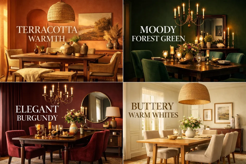
Dining room color trends USA 2026 tell a clear and coherent story about where American taste is moving — away from the cool grey neutrals that dominated the 2010s and decisively toward warmer, more saturated, more personally expressive color choices that reflect a broader cultural embrace of comfort, warmth, and genuine individuality in home design. Most popular dining room colors in USA 2026 according to major paint brand trend reports include warm terracotta and clay tones, deep forest and sage greens, rich burgundy and wine reds, and warm off-whites with strong yellow or pink undertones — all colors that share a common quality of warmth and organic rootedness that cool greys fundamentally lack.
Paint brand color of the year selections specifically relevant to dining room paint colors include Sherwin-Williams’ ongoing embrace of warm, grounded earth tones, Benjamin Moore’s consistent movement toward sophisticated warm neutrals with complex undertone profiles, and Farrow & Ball’s continued exploration of deep, historically-rooted colors that reference pre-industrial natural pigments. Best green paint colors for dining rooms represent perhaps the single strongest trend direction across all of these brands — from soft sage to deep forest to muted olive, green in all its warm variations has emerged as the defining dining room color of the current design era. Best blue paint colors for dining rooms maintain strong relevance in their warmer iterations — navy, indigo, and warm teal all perform beautifully while the cooler, greyer blues of previous years have noticeably faded from trending dining room palettes.
Conclusion
The right dining room colors do something quietly remarkable — they make every meal taste better, every conversation flow easier, and every gathering feel more worth having. From warm neutrals that welcome everyone to bold jewel tones that make dinner feel like an event, from earthy terracottas to fresh coastal blues, the perfect dining room color exists somewhere in this guide waiting for you to claim it. Buy a sample pot this weekend. Paint a large swatch on your wall. Live with it through a few meals and a dinner party. Your dining room — and everyone who sits at your table — will thank you.
Frequently Asked Questions
Q1: What is the best color for a dining room?
What color should I paint my dining room depends entirely on your style, light conditions, and furniture — but warm neutrals like Benjamin Moore White Dove and Sherwin-Williams Accessible Beige consistently deliver the most universally appealing and reliably beautiful dining room results across American homes.
Q2: What dining room colors make a room feel bigger?
Dining room colors that make a room feel bigger most effectively include warm mid-tone colors — soft sage green, warm greige, and dusty blue — which create cohesive visual fields that reduce contrast and increase perceived spaciousness more effectively than stark white.
Q3: Are dark colors good for dining rooms?
Absolutely. Dark dining room paint ideas create intimacy, drama, and a sense of occasion that makes every meal feel more special — particularly effective in dining rooms used primarily in evening artificial light where dark colors create beautiful depth rather than claustrophobic enclosure.
Q4: What colors go well with wood dining furniture?
Dining room colors that go with wood furniture depend on the wood’s tone — warm woods like walnut and oak pair beautifully with warm whites, terracottas, and warm greens while cool-toned grey or white-washed wood suits soft blues, cool sage, and crisp white wall colors.
Q5: What are the most popular dining room colors in 2026?
Most popular dining room colors in USA 2026 include warm terracotta, deep forest green, rich burgundy, warm off-white, and sophisticated navy — all sharing a warmth and organic quality that reflects the broader American design movement away from cool grey neutrals toward more expressive, emotionally resonant color choices.

One Comment