17 Neutral Kitchen Color Schemes for a Timeless Modern Look
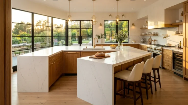
You walk into a kitchen and something just feels right. Nothing shouts. Nothing fights for attention. That calm you’re sensing comes from smart neutral kitchen color schemes, built on warm neutral kitchen tones and cool neutral kitchen tones working in quiet harmony. This isn’t an accident. It’s design psychology at work.
Across the USA, homeowners keep circling back to neutral kitchen colors because they age gracefully. Trends fade, but a well balanced neutral color palette kitchen never looks dated. That’s the real secret behind how neutral kitchens look timeless year after year.
The Silent Language Every Warm Cabinet Tone Speaks to Your Guests
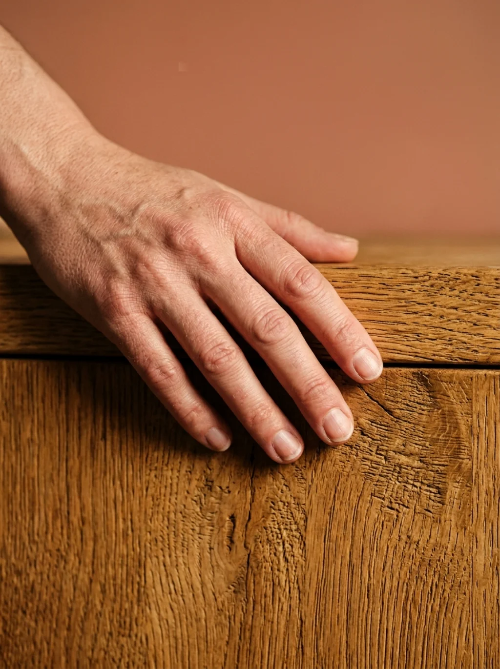
Cabinets talk before you say a word. A warm neutral kitchen with honeyed wood or soft cream speaks comfort instantly. Guests relax faster. It’s subtle, but it’s real, and it shapes first impressions in seconds.
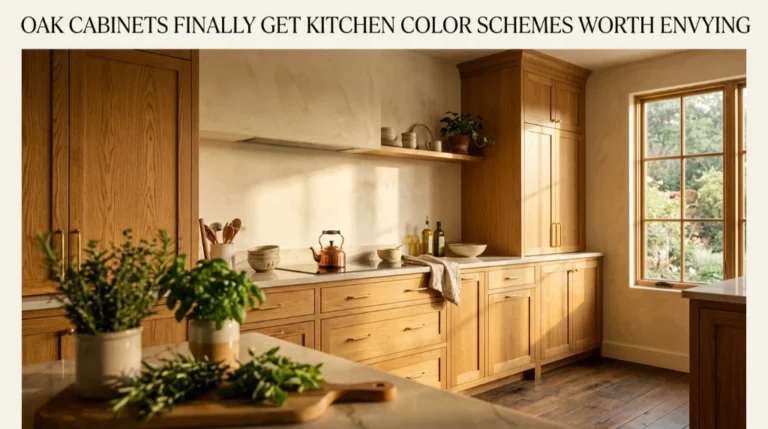
Think of cream kitchen cabinets paired with white oak cabinets for texture. This combination builds neutral kitchen warmth without feeling heavy. The result feels inviting, not sterile, and that balance matters more than people realize.
Why Greige Walls Are Quietly Rewriting Modern Kitchen Design Rules
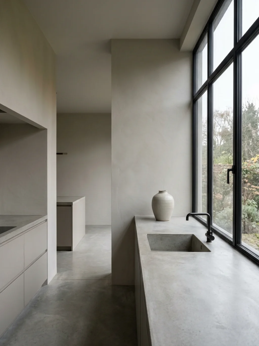
Greige kitchen cabinets blend gray’s calm with beige’s warmth. It’s the hybrid tone designers reach for when clients can’t decide between the two. Sherwin Williams greige shades have become a go-to across renovation projects nationwide.
This isn’t a passing fad. Neutral kitchen design trends keep pointing toward greige because it flatters nearly every countertop and floor. It creates tonal balance effortlessly, which is exactly why it keeps showing up in modern neutral kitchen builds.
The Hidden Trick Designers Use to Balance Light and Shadow in Neutral Spaces
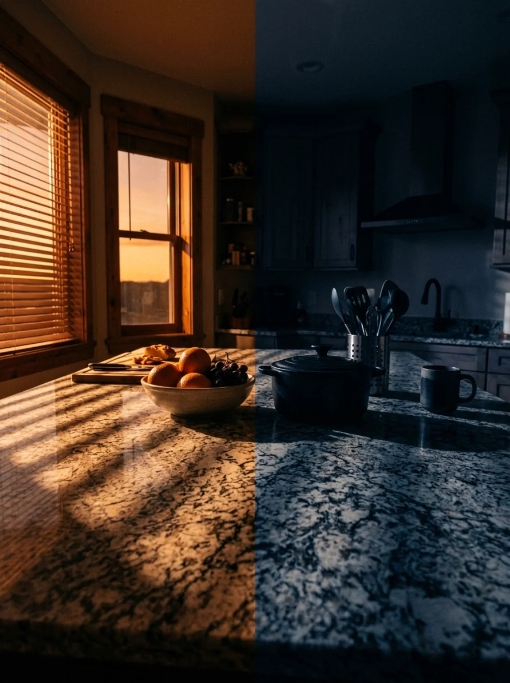
Professionals don’t just pick a color. They study how light moves across a room first. Neutral kitchen light and dark balance depends on window placement, ceiling height, and even flooring reflectivity throughout the day.
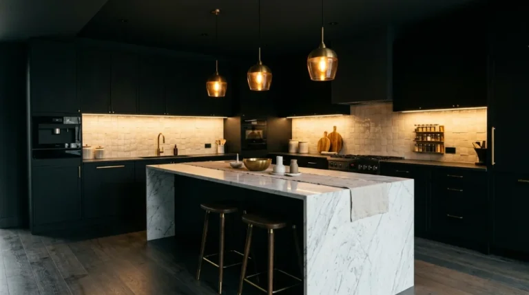
A darker island against pale walls creates depth instantly. This trick, rooted in interior color theory, prevents a neutral tone kitchen design from feeling flat. Shadows become part of the palette, not something to hide.
A Sand Toned Countertop Secret That Elevates Ordinary Kitchens Instantly
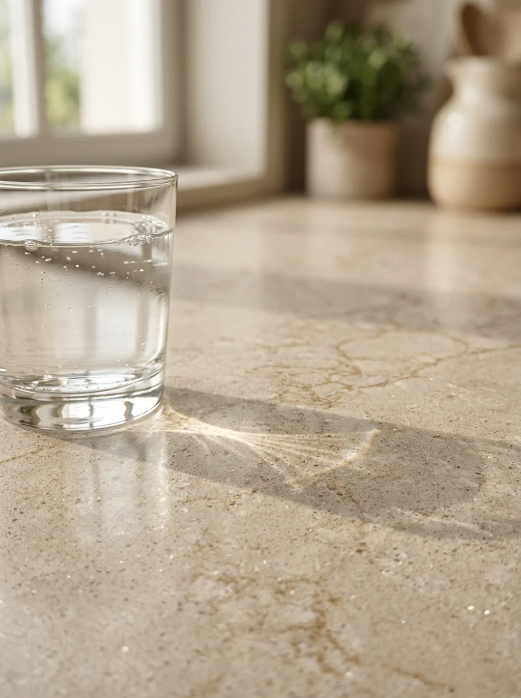
Sand color kitchen countertops carry warmth that stone alone rarely offers. Paired with neutral kitchen countertops in soft veining, they add movement without loud pattern. It’s a quiet upgrade many overlook.
Try pairing muted sand tones with matte black hardware for contrast. This pairing gives neutral kitchen countertops personality while keeping the overall space grounded and calm, never busy or overwhelming.
The Emotional Pull Behind Creamy Whites in High End Kitchen Interiors
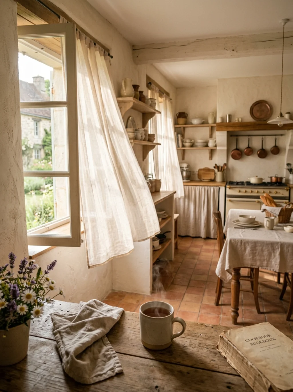
Creamy white walls trigger something almost nostalgic. They remind people of farmhouse kitchens and slow mornings. This emotional pull explains why off white kitchen design remains a top request among American homeowners today.
Behr neutral kitchen paint and Farrow and Ball neutral tones both offer creamy shades that avoid feeling cold. This supports genuine neutral kitchen color psychology, where warmth translates directly into comfort and welcome.
Stone Colored Cabinets Are Becoming the Signature of Effortless Luxury
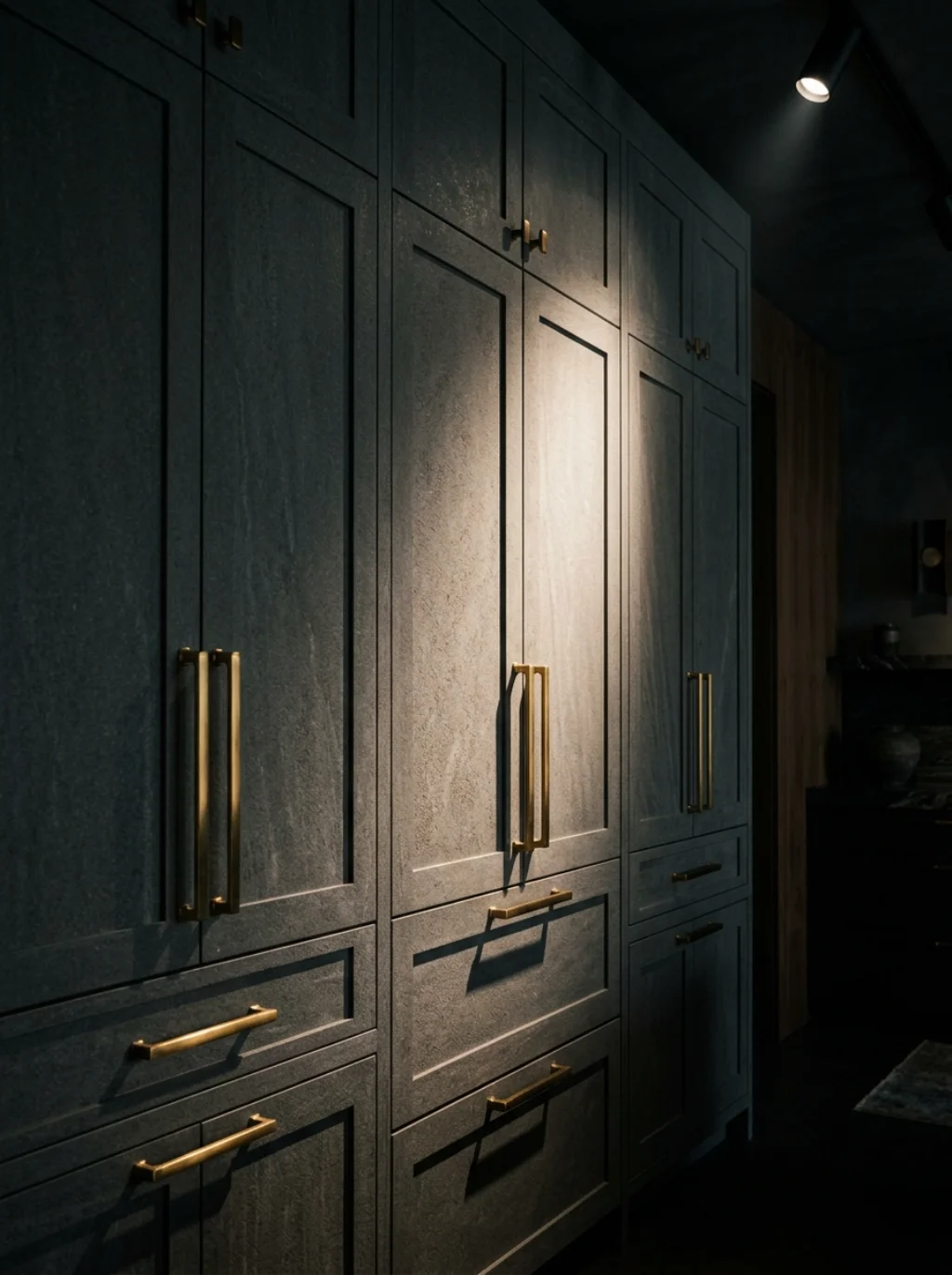
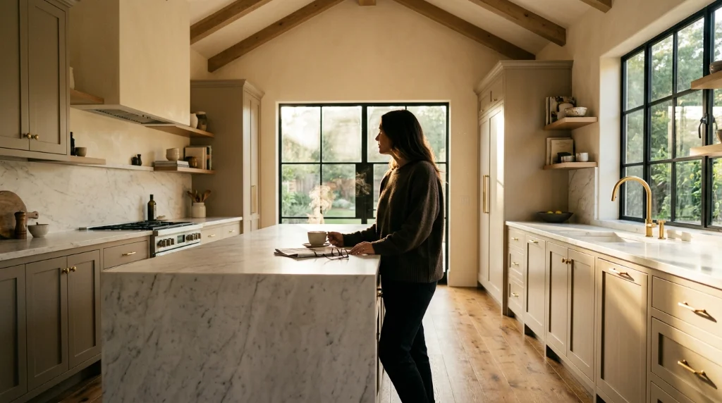
Stone color kitchen cabinets sit between gray and taupe, offering quiet sophistication. They photograph beautifully, which is partly why Architectural Digest kitchen design features keep spotlighting them in editorial spreads.
This shade pairs naturally with quartz countertops and brass fixtures. Together they build neutral kitchen sophistication without shouting for attention, proving restraint often reads as luxury more than boldness ever could.
The Undertone Mistake That Quietly Ruins Even the Prettiest Neutral Kitchen
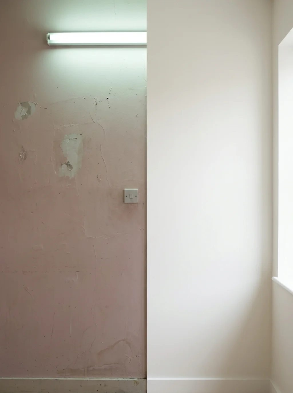
Undertones sabotage more kitchens than people admit. A neutral undertone that leans too pink or too green clashes badly with natural light. Suddenly your dream palette looks muddy instead of elegant.
you may also like this:17 Kitchen Bar Design Ideas to Upgrade Your Entertaining Space
Always test swatches at different times of day. This single habit prevents the most common error in choosing neutral kitchen colors, and it protects your neutral kitchen aesthetic from an expensive, frustrating redo.
Layered Textures Turn Flat Neutral Palettes Into Something Unforgettable
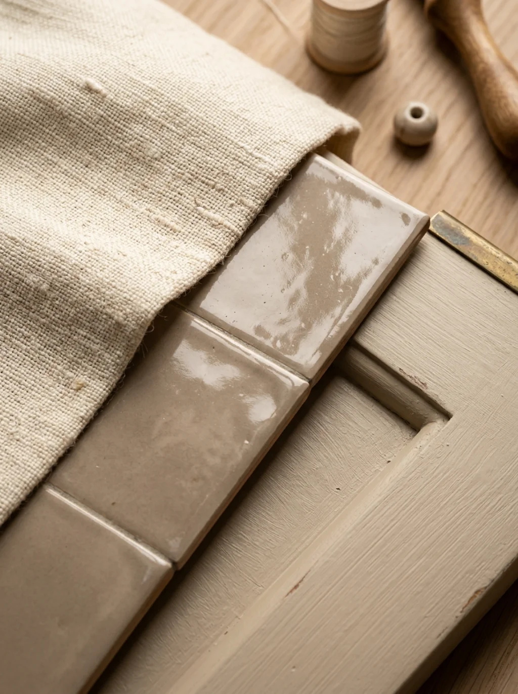
Color alone isn’t enough. Layered neutrals need texture to feel alive. Combine matte cabinets, glossy tile, and brushed metal for genuine depth. Without this layering, even good color choices fall flat fast.
This is where neutral kitchen texture pairing earns its reputation. A woven runner or linen curtain adds softness. Suddenly the room breathes, and the neutral kitchen ambiance feels intentional rather than accidental.
Why Taupe Continues to Dominate Every Premium Kitchen Renovation
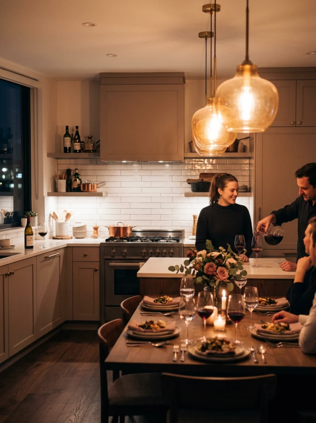
Taupe kitchen scheme choices remain a designer favorite for good reason. Taupe bridges brown and gray seamlessly. It reads sophisticated in daylight and cozy under evening lighting, a rare dual personality among paint colors.
Soft taupe works beautifully with subway tile backsplash designs. This combination keeps neutral kitchen trends feeling current while still respecting classic American kitchen sensibilities that never truly go out of style.
The Surprising Reason Matte Black Hardware Loves Soft Neutral Backdrops
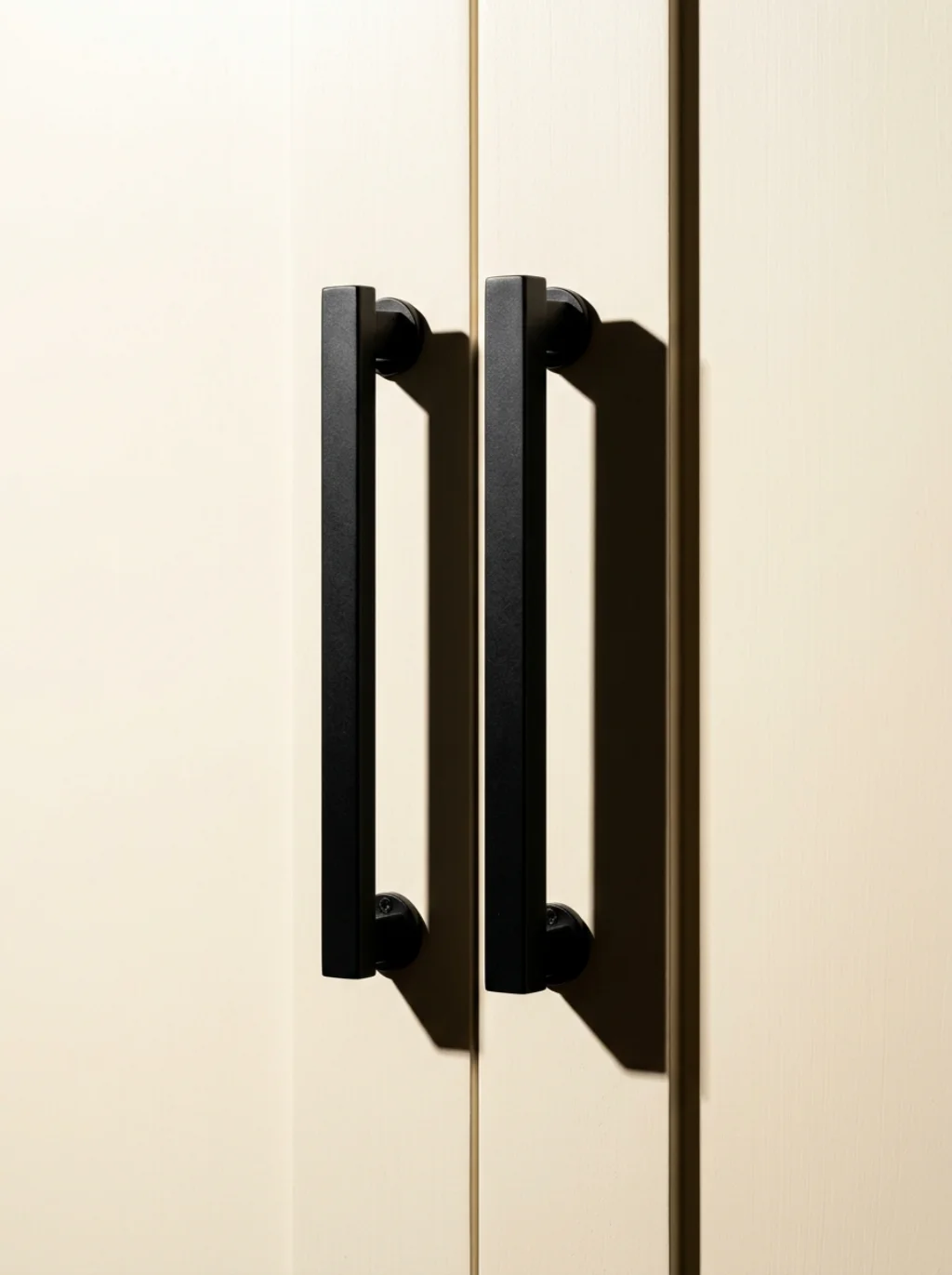
Hardware finishes make or break a palette. Matte black hardware against a soft neutral kitchen paint backdrop creates instant contrast without disrupting calm. It’s a small detail with outsized visual impact.
This pairing appears constantly in HGTV kitchen trends coverage. The dark accents act like punctuation marks across a neutral kitchen cohesive look, guiding the eye without ever overwhelming the softer surrounding tones.
Oatmeal Tones Are the Understated Star of Scandinavian Kitchen Design
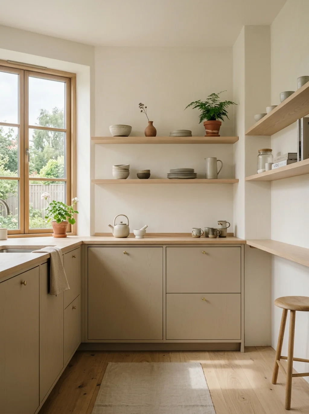
Oatmeal kitchen tones carry a raw, natural quality perfect for scandinavian kitchen palette builds. They feel unfussy, almost tactile, echoing the simplicity central to Nordic interiors and their calm, functional spirit.
This tone pairs effortlessly with natural wood accents in a Japandi kitchen style setup. The result supports genuine minimalist kitchen goals, proving quiet colors can still carry serious visual weight.
How Natural Light Transforms a Neutral Palette Into Pure Magic

Sunlight changes everything about color perception. A shade that looks beige at noon can shift ivory by dusk. This is why neutral kitchen brightness should always be judged across a full day cycle.
South facing kitchens handle cool gray beautifully. North facing rooms often need warm white kitchen paint instead to avoid feeling dim. Light exposure, more than trend charts, should guide your final decision.
The Backsplash Choice That Instantly Elevates Any Neutral Kitchen Scheme
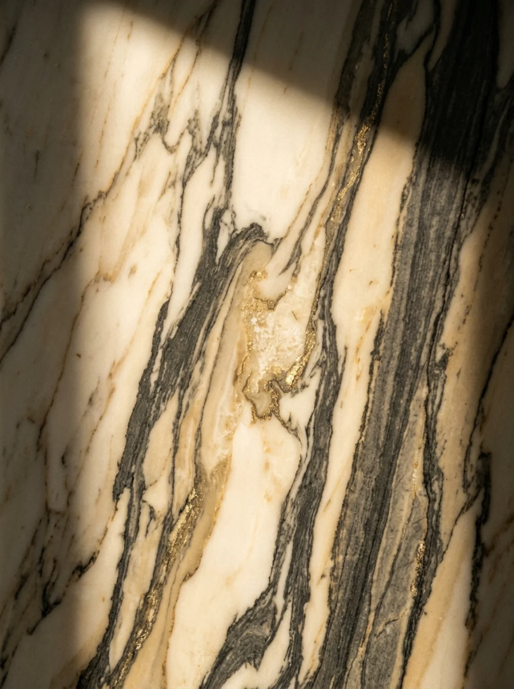
A neutral kitchen backsplash anchors the whole room visually. Marble backsplash surfaces bring subtle veining that photographs like art. It’s often the single feature guests comment on first when they walk in.
Pair it thoughtfully using kitchen finish coordination principles. Matching backsplash tone to countertop undertone avoids clashing. This careful neutral kitchen tone pairing is what separates polished kitchens from mismatched ones.
Mushroom Shades Are the Unexpected Favorite Among Interior Designers
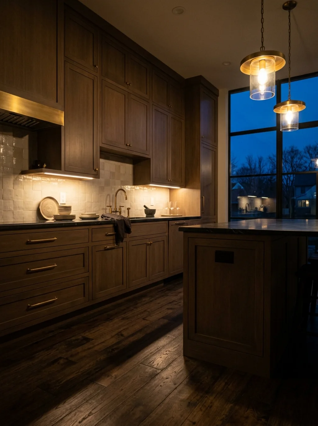
Mushroom color kitchen palettes have quietly surged among interior designer color picks this year. Earthy yet refined, mushroom tones split the difference between gray and brown without leaning fully into either camp.
This shade suits an organic modern kitchen beautifully. It’s part of the broader earthy kitchen colors movement gaining traction across home renovation trends 2026, especially among buyers seeking grounded, calming spaces.
A Contrast Rule That Keeps Neutral Kitchens From Feeling Flat or Boring
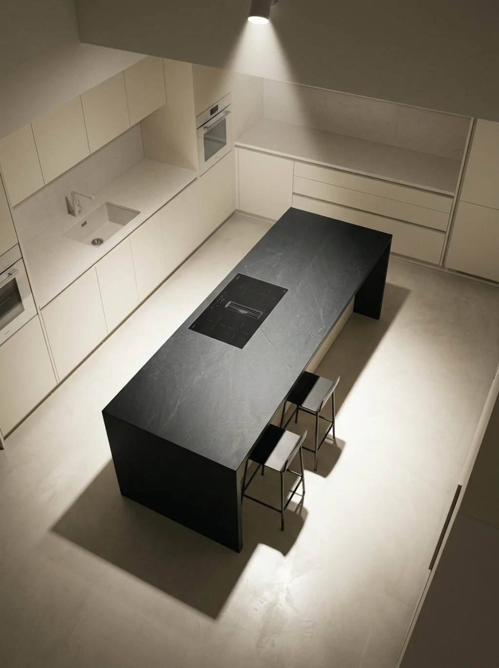
Too much sameness kills energy. Smart neutral kitchen contrast ideas rely on varying just one element, maybe cabinet against wall, or countertop against floor. That single shift prevents visual monotony instantly.
This is the foundation of solid cabinet and wall contrast strategy. Even a monochrome neutral kitchen needs one point of tension to keep neutral kitchen visual harmony from tipping into total blandness.
The Wood Tone Pairing That Makes Neutral Cabinets Feel Instantly Warmer
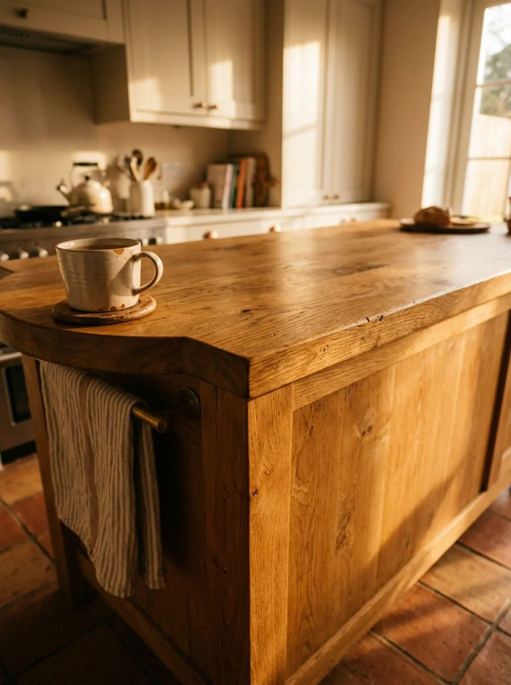
Wood grain softens even the coolest palette. Neutral kitchen material pairing with warm oak or walnut instantly adds richness. It’s a fast fix for kitchens that feel a bit too clinical or sterile.
Shaker style cabinets in a pale finish paired with a wood island work wonders. This combo supports transitional kitchen style goals, blending old world warmth with clean, contemporary transitional kitchen design lines.
Farmhouse Charm Meets Modern Calm in This Neutral Color Formula
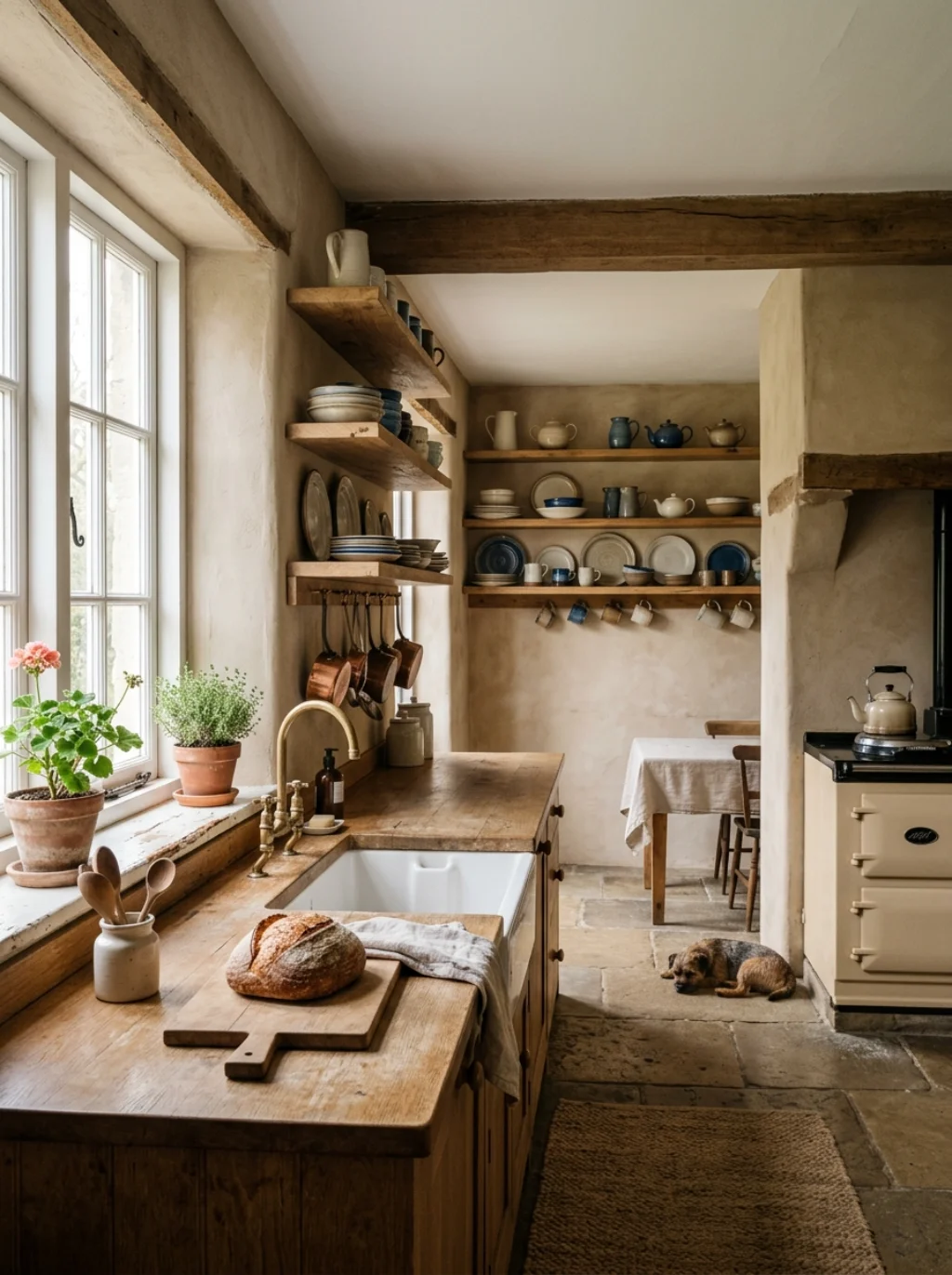
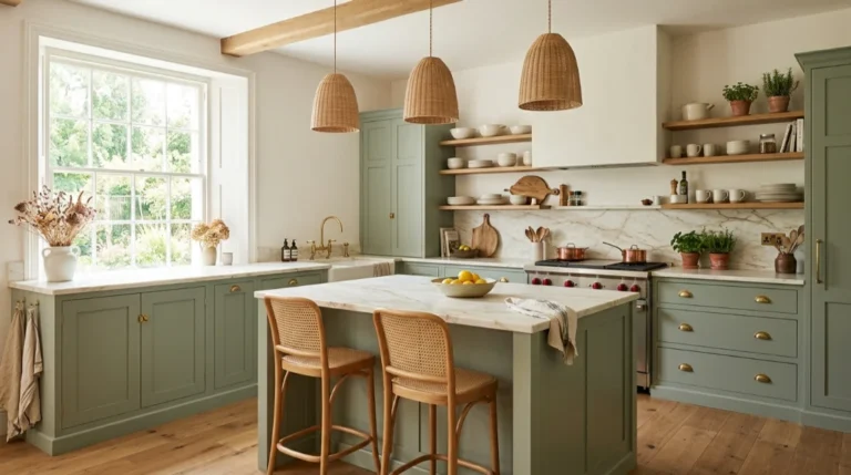
Farmhouse neutral kitchen design leans on beige kitchen walls, open shelving kitchen displays, and worn wood textures. It feels lived in, not staged, which is exactly the appeal for many American families.
Blend that charm with modern minimalist kitchen restraint for balance. This formula respects farmhouse kitchen style roots while avoiding clutter, giving you comfort and sophistication inside the very same room.
Frequently Asked Questions
What are the most popular neutral kitchen color schemes right now?
Greige, soft taupe, and warm white currently dominate American kitchen renovations, largely because they pair well with Pantone neutral shades and most natural stone countertops.
Do neutral kitchen colors increase home resale value?
Yes, real estate agents often note that neutral palettes appeal to a wider buyer pool. Timeless kitchen colors tend to photograph well for listings too.
How do I avoid a boring or flat neutral kitchen look?
Focus on neutral kitchen texture pairing, mixed finishes, and one strong contrast point like dark hardware or a bold light fixture.
What is the difference between warm and cool neutral tones?
Warm beige carries yellow or red undertones, while cool gray leans blue or green. Your room’s natural light should guide which direction you choose.
Which cabinet color pairs best with neutral kitchen walls?
Greige cabinets, soft white, and stone color kitchen cabinets all pair naturally with most neutral wall colors, creating cohesive kitchen color combinations throughout.
Conclusion
Good neutral kitchen paint colors never chase trends. They quietly outlast them. From greige cabinets to cream kitchen cabinets, from dusty stone countertops to pale greige walls, every choice inside a thoughtful neutral kitchen color schemes plan works toward one goal: a space that feels calm, warm, and genuinely yours. Whether you lean toward a farmhouse neutral kitchen or a sleek modern neutral kitchen, the right neutral kitchen paint ideas will carry your home for years, not just a single season.