
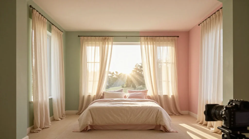
31 Spring Bedroom Color Schemes to Create a Fresh and Relaxing Retreat
Spring has a funny way of nudging you toward change. You open the curtains, feel the light shift, and suddenly your bedroom looks tired. That’s exactly why spring bedroom color schemes matter so much right now. They’re not just paint choices. They shape how you feel the moment you wake up. This guide walks through the shades, pairings, and small tricks that turn a flat room into something worth waking up for.
This Overlooked Sage Tone Quietly Steals Every Spring Bedroom Makeover
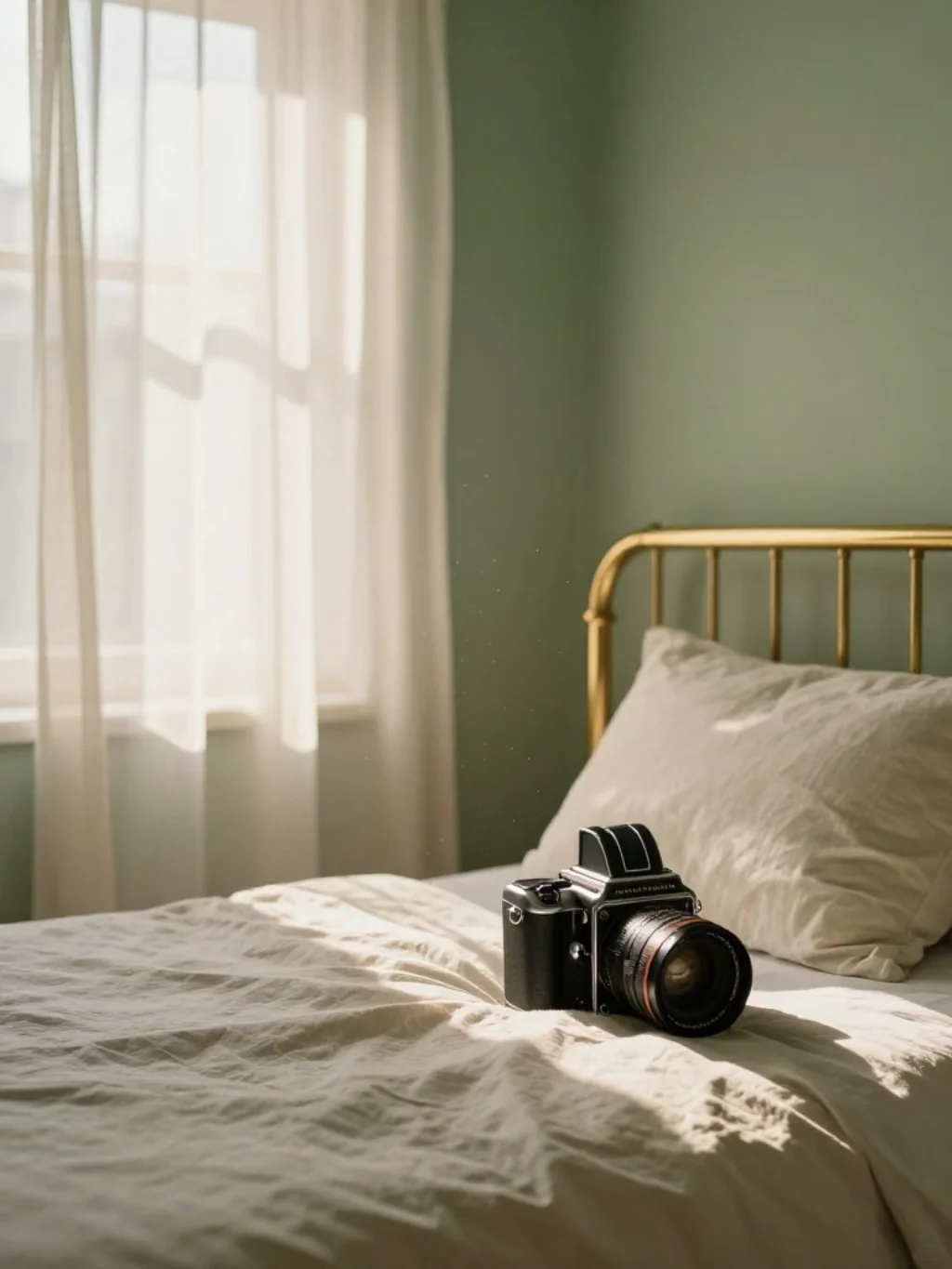
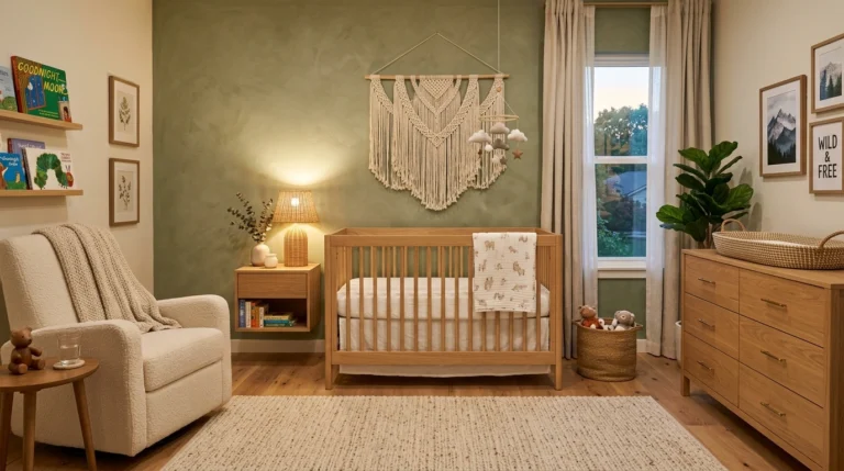
Sage green rarely gets the credit it deserves. It sits quietly between blue and green, and somehow flatters almost every skin tone and wood finish in the room. Designers keep reaching for sage green bedroom walls because the color feels grounded without turning heavy or dark.
What makes it work so well for a spring bedroom color scheme? It borrows from nature inspired bedroom colors, echoing new leaves and soft moss. Pair it with brushed brass hardware or linen bedding, and the whole space breathes. It’s subtle, but it changes everything.
The Blush Pink Mistake Designers Never Want You to Make This Season
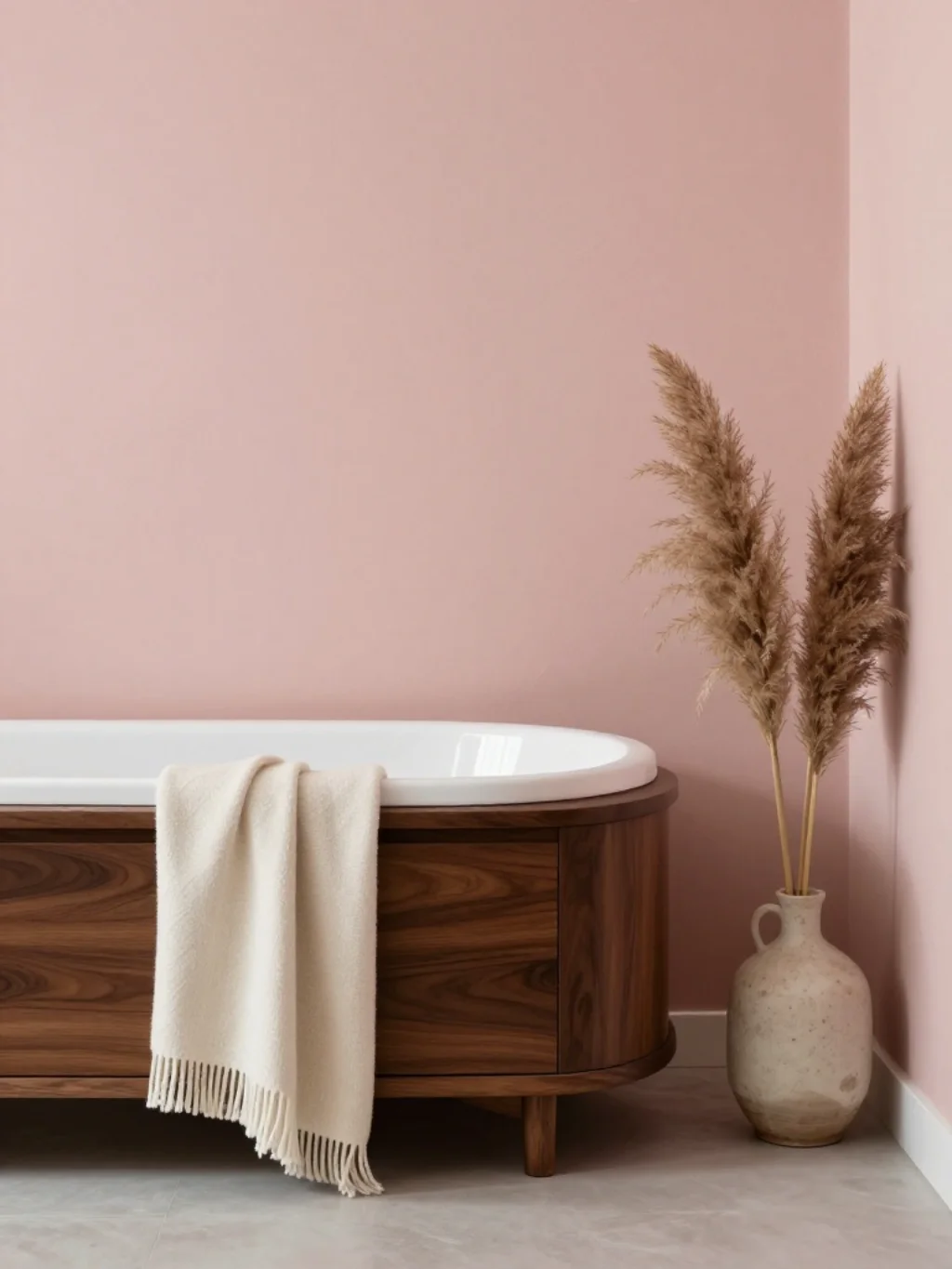
Blush pink can go wrong fast. Too much of it, and a bedroom starts looking like a nursery instead of an adult retreat. The trick with blush pink bedroom walls is restraint paired with contrast, not full saturation across every surface.
Instead, use blush as an accent against cream and white bedroom tones or a deep walnut headboard. This creates a harmonious color scheme rather than an overpowering one. Add a touch of gold trim, and the room instantly feels intentional, not accidental.
Why Lavender Walls Are Suddenly the Most Requested Bedroom Upgrade
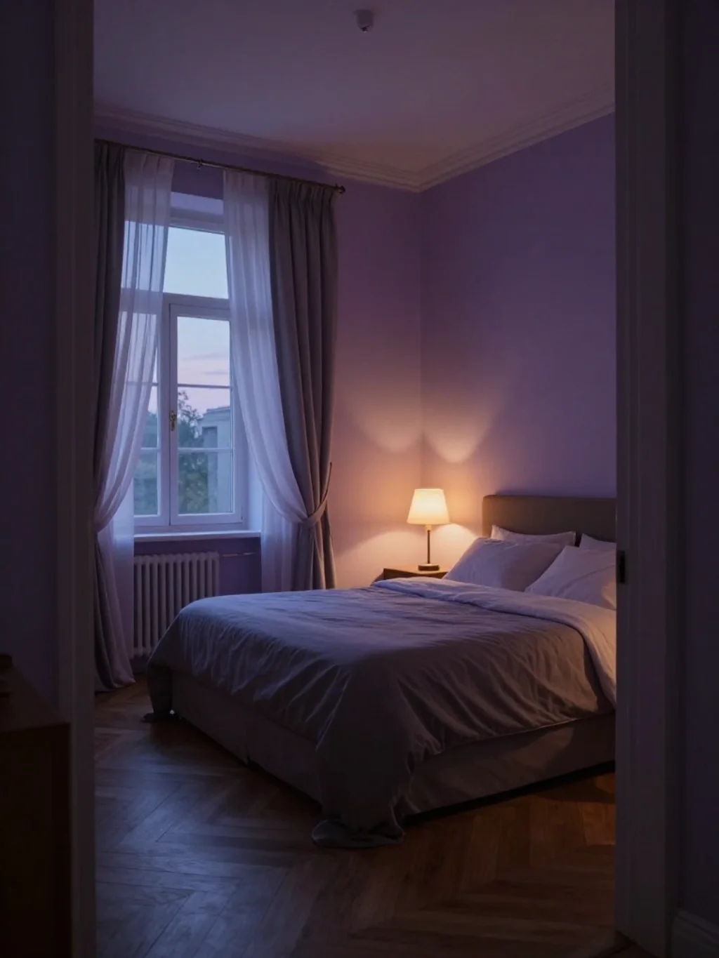
Lavender has quietly become one of the most requested shades among spring interior design trends this year. It carries a calming, almost meditative quality that suits bedrooms far better than louder colors ever could. Lavender bedroom tones work especially well in rooms with abundant natural light.
However, lavender needs balance. Pair it with warm wood tones or soft gray textiles to avoid a washed-out look. This kind of color pairing idea keeps the palette feeling elegant. Think of it as violet’s more sophisticated, understated cousin.
A Sky Blue Trick That Makes Small Bedrooms Feel Twice Their Size
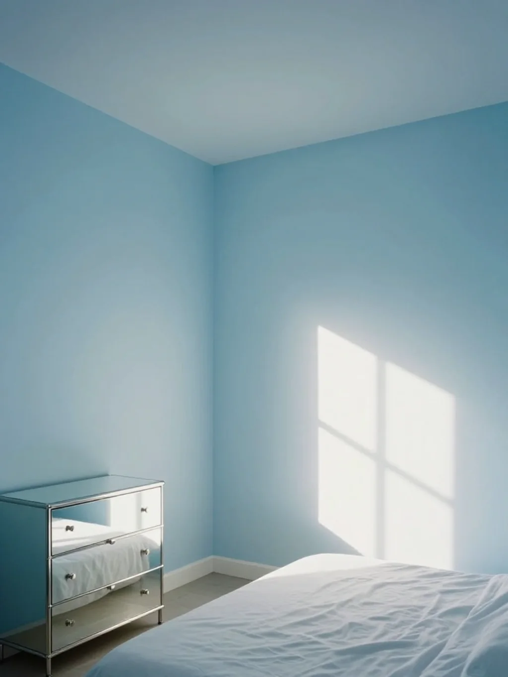
Small bedrooms often struggle visually, feeling boxed in no matter how you arrange furniture. Sky blue bedroom walls solve this in a surprisingly simple way. The color mimics open sky, tricking the eye into perceiving more depth than actually exists.
For best results, keep trim and ceiling in a lighter shade than the walls. This light color combination stretches the room upward. Add sheer curtains instead of heavy drapes, and you’ll notice the entire space feels airier within minutes.
The Buttery Yellow Combination Sunlight Actually Falls in Love With
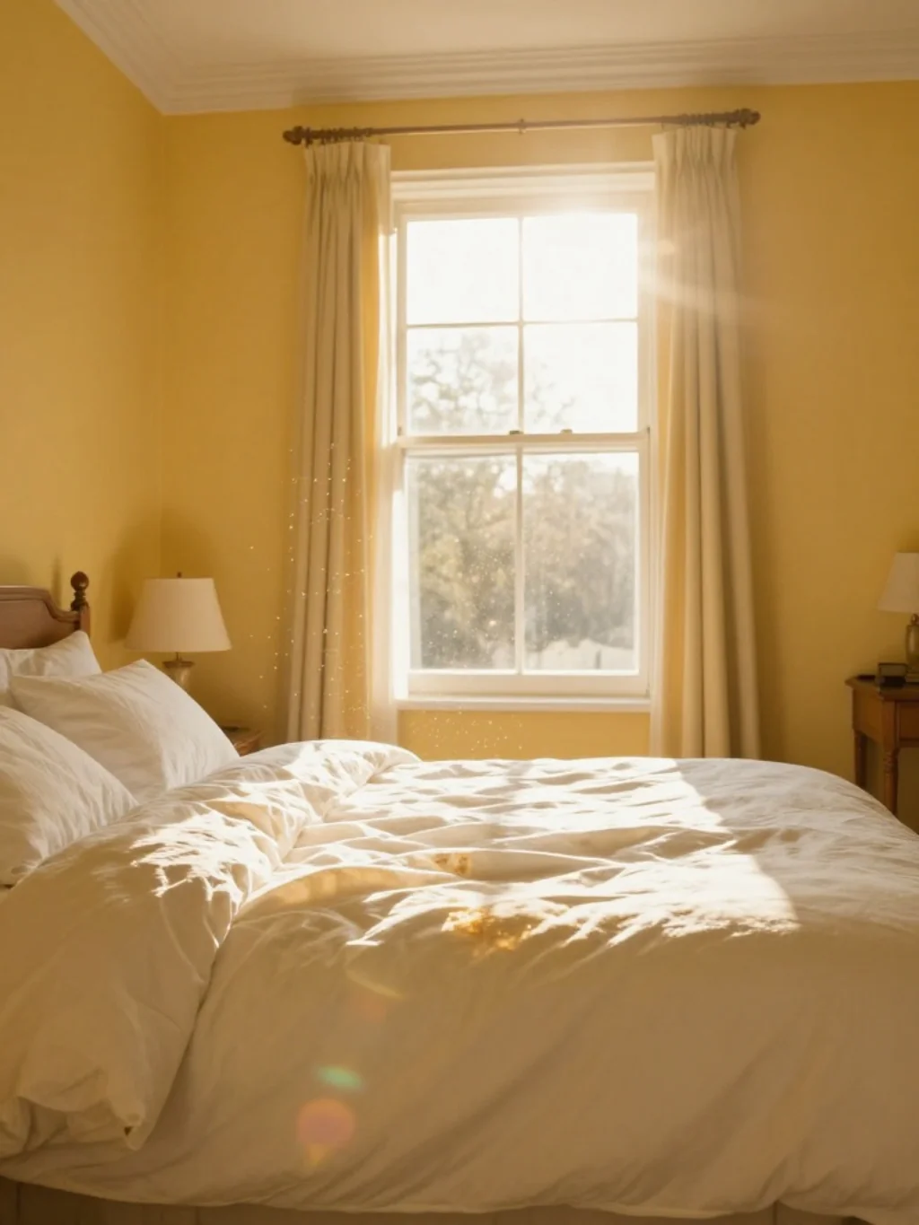
Yellow gets a bad reputation for being difficult to use indoors, but a muted, buttery version tells a different story entirely. Buttery yellow bedroom walls catch morning light beautifully, especially in rooms facing east.
This shade thrives as part of bright spring interiors, particularly when paired with white trim and natural fiber rugs. It’s one of those spring color palette choices that photographs well and feels even better in person. Sunlight practically dances across it by mid-morning.
Sage and Cream Together Create a Feeling Most Bedrooms Never Achieve
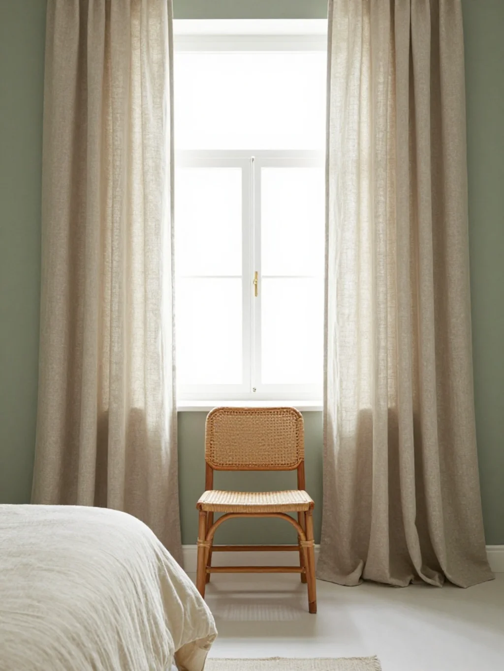
Some color combinations just click, and sage paired with cream is one of them. Together, they create a soothing color palette that feels neither too cold nor too warm. It’s the kind of balance most bedrooms chase but rarely find.
This duo also supports bedroom color psychology principles tied to calm and rest. Cream softens sage’s earthiness, while sage keeps cream from feeling flat. The result is a timeless color pairing that won’t feel dated once spring turns to summer.
This Coastal Palette Brings Ocean Air Into a Bedroom Without a Window View

Not everyone has an ocean view, but a coastal spring bedroom palette can fake it convincingly. Soft blues, sandy beiges, and driftwood browns work together to suggest salt air and open horizons, even landlocked far from any coastline.
Layer in woven textures like jute or rattan for extra authenticity. This approach borrows heavily from watercolor bedroom palette styling, where colors blend softly rather than clash. It’s relaxed, unpretentious, and surprisingly easy to recreate at home.
The Dusty Rose Trend Quietly Replacing Millennial Pink in Bedrooms
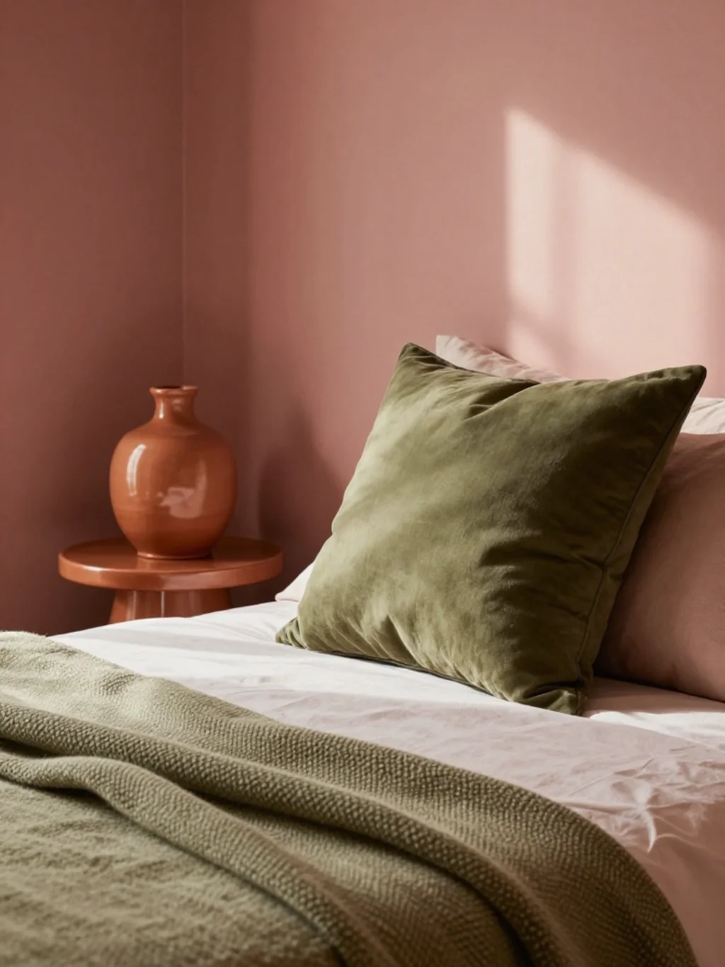
Millennial pink had its moment, but dusty rose has quietly taken its place in more sophisticated spaces. It carries similar warmth without feeling trendy or overly sweet. Designers favor it for its maturity and versatility across different bedroom styles.
Dusty rose pairs beautifully with earthy spring tones like terracotta and olive. Together, they create depth rather than flatness. This shade fits naturally into spring bedding color ideas, especially when layered with textured throws and mismatched pillow shapes.
Why Terracotta Accents Are the Unexpected Star of Spring Bedroom Color Schemes
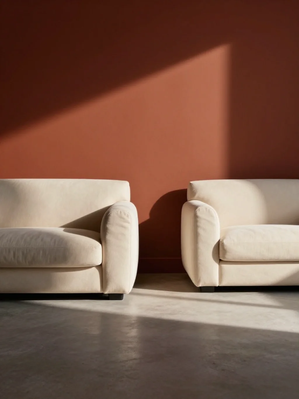
Terracotta doesn’t usually come to mind for spring, yet it’s becoming a favorite among fresh spring bedroom color schemes. Its warmth grounds cooler pastels, preventing a room from feeling too soft or sterile in tone.
Use terracotta sparingly, through a single accent wall or ceramic decor pieces. This restraint keeps the palette from tipping into autumn territory. Combined with bedroom accent wall ideas, terracotta adds unexpected richness without overwhelming the overall spring feel.
A Mint Green Wall Pairing That Feels Like Walking Into Spring Itself
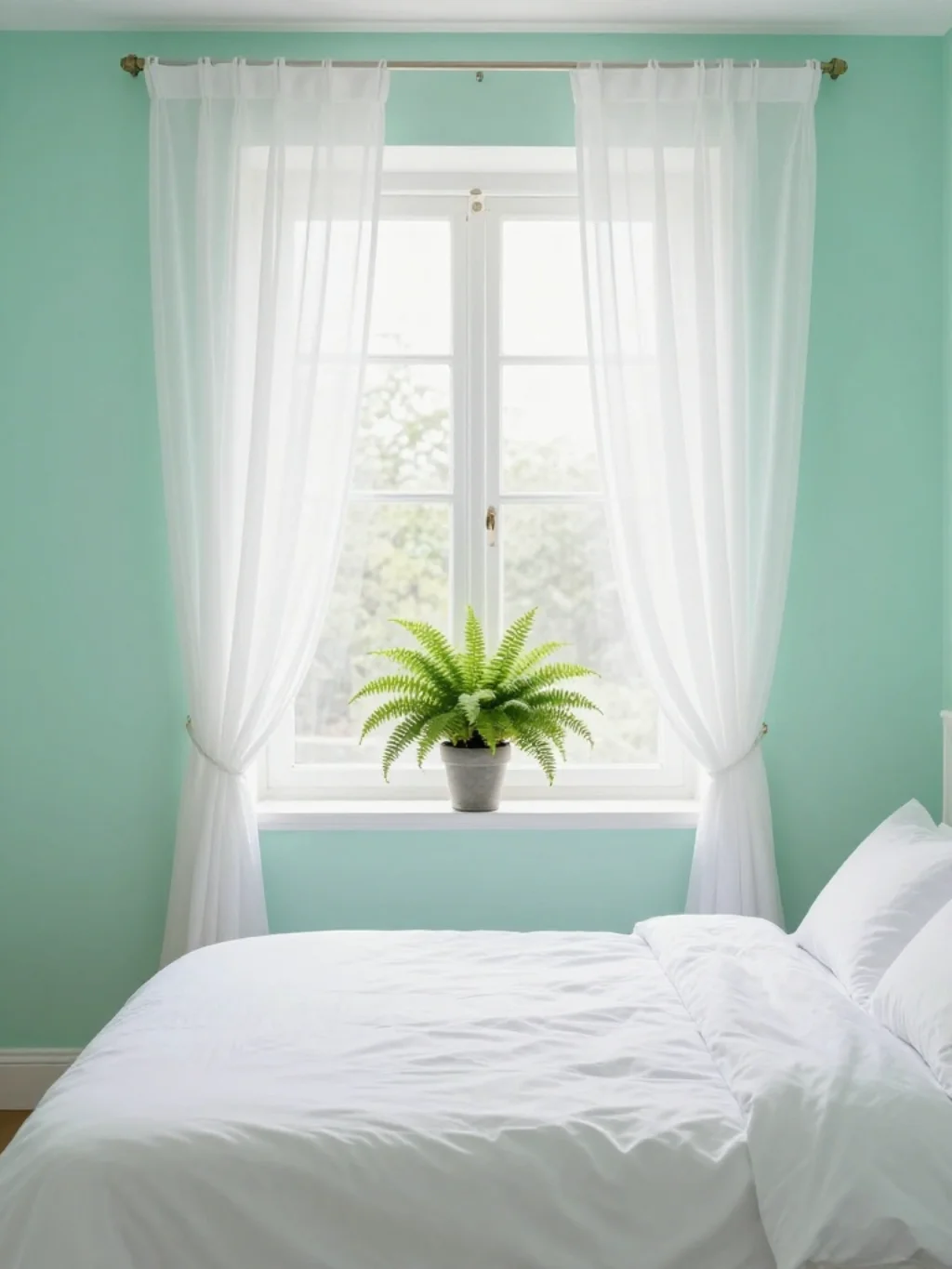
Mint green carries an almost literal freshness that few other shades manage to replicate. Mint green bedroom decor works particularly well in rooms that already feature plenty of natural greenery or botanical prints nearby.
Pair mint with crisp white bedding for a light and airy bedroom feel that never turns cold. This combination taps directly into fresh bedroom color ideas, evoking new growth and open windows. It’s youthful without feeling immature or overly playful.
The Greige Palette Designers Use When Bold Colors Feel Too Risky
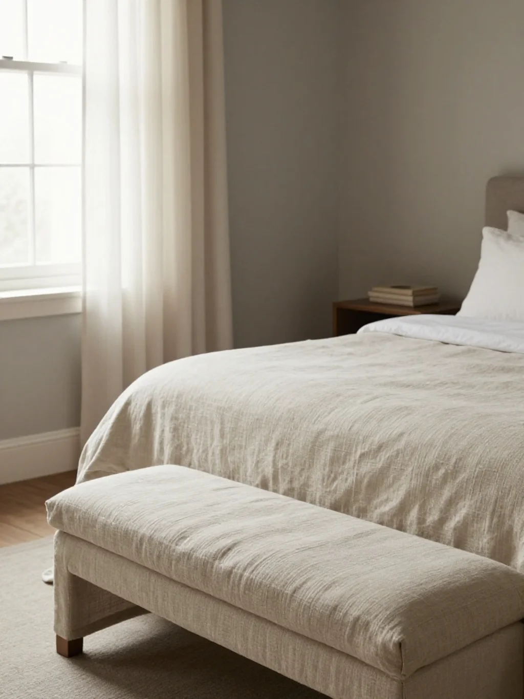
Not everyone wants a bold color commitment, and that’s perfectly fine. Greige, a blend of gray and beige, offers a safer entry point into spring refresh bedroom projects. It’s flexible, forgiving, and rarely goes out of style.
As a warm neutral bedroom palette, greige pairs effortlessly with almost any accent color you introduce later. Add sage pillows or lavender throws whenever you’re ready for more personality. This flexibility makes greige a smart long-term investment.
Soft Coral Bedding Does Something to a Room Most People Never Notice
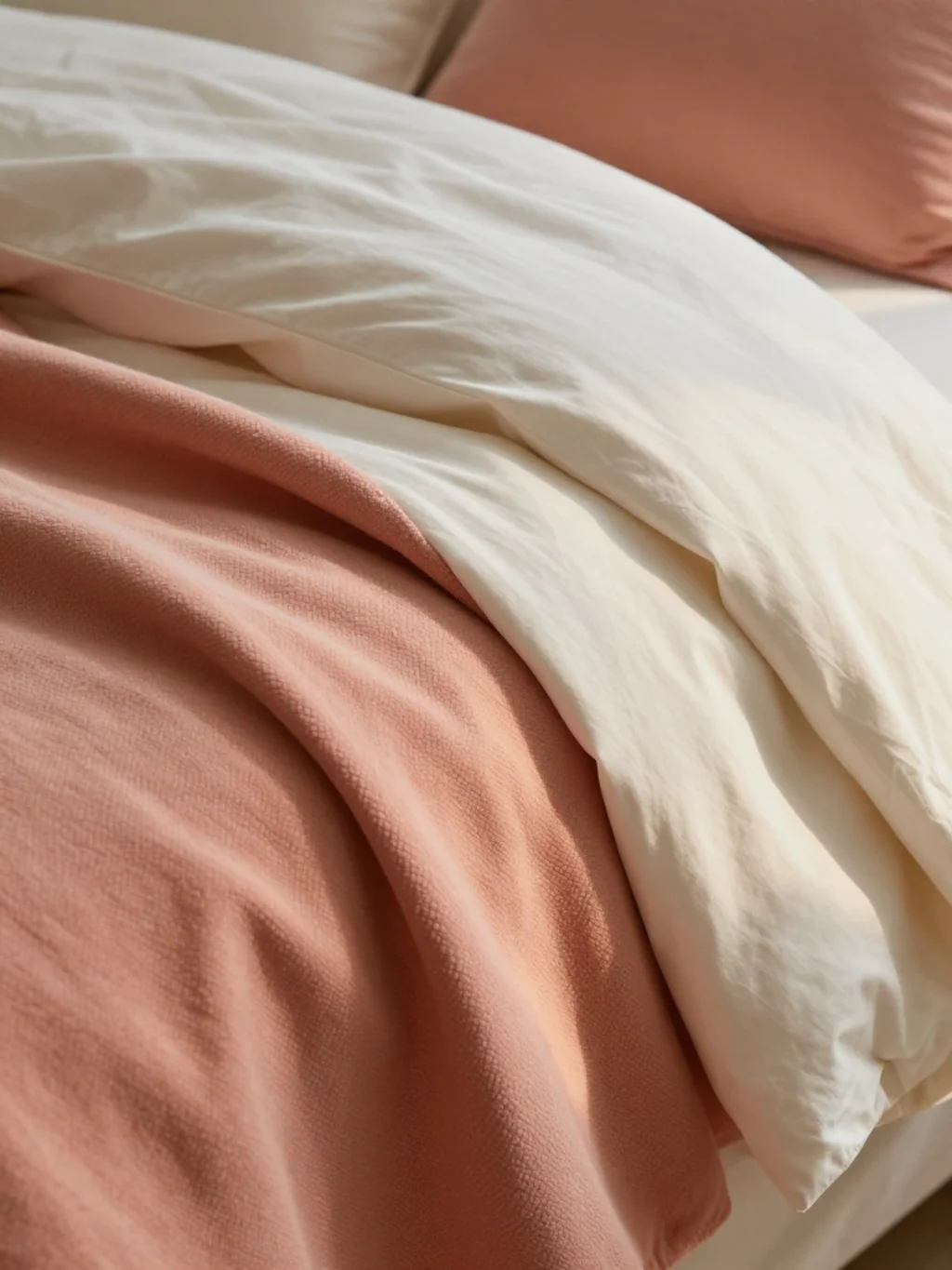
Coral rarely gets used on walls, but it shines through bedding and textiles instead. Soft coral throws or duvet covers introduce warmth without demanding a full repaint. It’s one of the easiest spring bedding color ideas to test before committing further.
you may also like this:31 Christmas Bedroom Decor Ideas to Make Your Space Feel Festive and Cozy
This shade also supports a bright airy palette, especially when layered against white or ivory sheets. Most people notice the room feels warmer, though they can’t always pinpoint why. That’s coral working quietly in the background.
This Ivory and Sage Combination Turns Ordinary Bedrooms Into Retreats
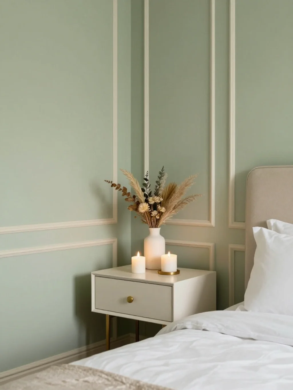
Ivory brings softness that sage alone can’t achieve on its own. Together, these two shades create something closer to a boutique hotel retreat than an ordinary bedroom. The pairing feels curated without requiring excessive decor or clutter.
This combination reflects broader spring interior design trends favoring simplicity over maximalism. Ivory trim against sage walls creates gentle contrast, forming a gentle color tone palette that photographs beautifully and ages gracefully over several seasons.
The Wisteria Purple Shade Bringing Old World Charm Into Modern Bedrooms
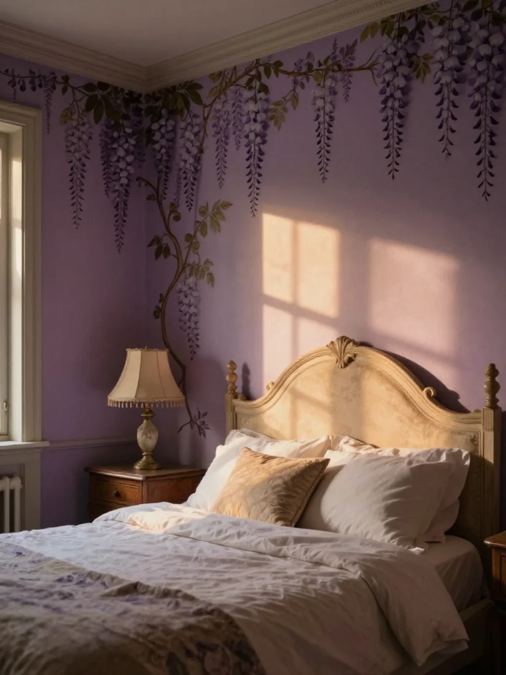
Wisteria offers a softer, more romantic alternative to standard lavender. This dusty purple shade carries old-world charm, reminiscent of European countryside cottages and climbing garden vines along stone walls.
In modern bedrooms, wisteria works best against neutral backdrops rather than competing colors. This keeps the bedroom color scheme cohesive instead of chaotic. As part of soft pastel wall colors, wisteria adds unexpected elegance most other purples simply can’t match.
Pale Peach Walls Create an Emotional Warmth No Other Color Matches
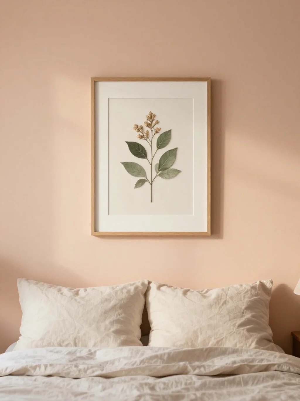
Peach sits in an interesting middle ground between pink and orange, carrying warmth without aggression. Pale peach walls create emotional comfort that feels nurturing rather than stimulating, ideal for bedrooms meant purely for rest.
This shade pairs naturally with botanical bedroom theme decor, especially dried florals or pressed leaf frames. As one of the more uplifting color scheme choices for spring, peach manages to feel both energizing and calm simultaneously.
The Seafoam Trend Bedroom Designers Are Quietly Obsessing Over

Seafoam sits somewhere between mint and sky blue, carrying qualities of both without fully committing to either. Designers have quietly gravitated toward this hybrid shade for its unusual versatility across different bedroom sizes and lighting conditions.
It complements soft bedroom hues exceptionally well, especially when layered with white linens. This shade also fits comfortably within cool spring colors trends, offering a fresher alternative to standard pastel blue without feeling predictable or overdone.
A Powder Blue and White Duo That Feels Like a Permanent Vacation
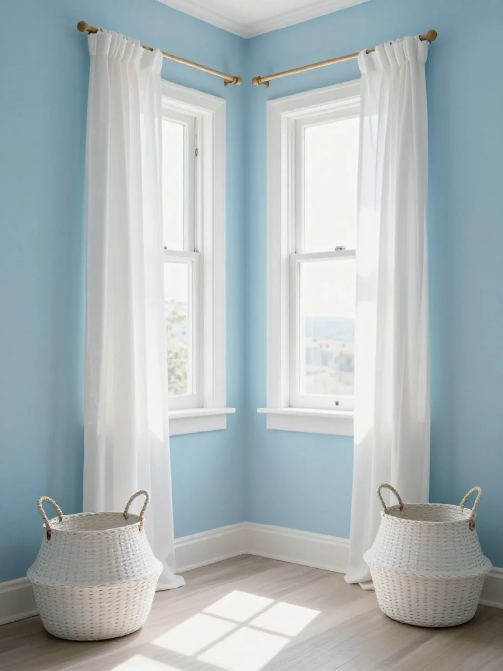
Powder blue and white together evoke something close to permanent vacation energy. This pairing feels crisp, clean, and endlessly refreshing, particularly in bedrooms that receive strong morning sunlight throughout the week.
The combination supports light color combinations that never feel visually heavy. Think coastal cottage rather than corporate hotel. This duo often anchors broader spring decorating theme concepts, especially when paired with woven baskets or driftwood accents nearby.
This Apricot Accent Wall Idea Nobody Talks About Enough
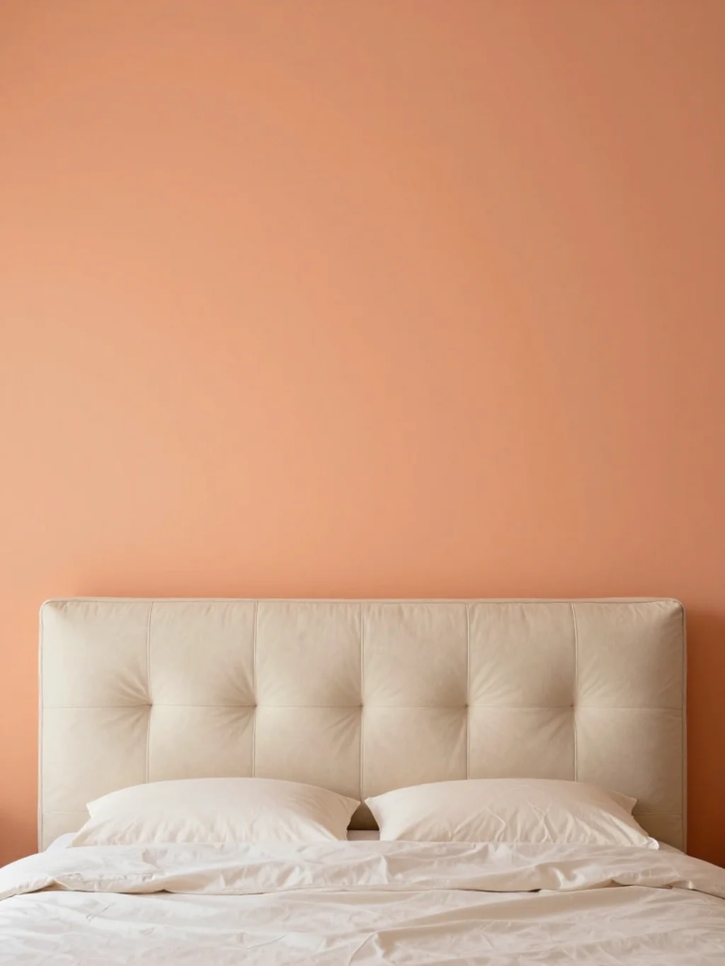
Apricot deserves more attention than it typically gets in bedroom design conversations. This warm, slightly muted orange-pink shade adds vibrancy without the intensity of true orange, making it approachable for even color-cautious homeowners.
As an accent wall choice, apricot pairs beautifully with cream and white bedroom furnishings. It supports a bright spring interiors feel while remaining sophisticated enough for adult bedrooms. Few people expect it, which is exactly why it works so well.
The Eggshell Finish Secret That Makes Spring Colors Glow Differently

Paint finish matters just as much as color choice, though it’s rarely discussed. Eggshell finish reflects light subtly, making spring bedroom colors appear richer and more dimensional compared to flat matte alternatives.
This finish works particularly well with soft pastel shades, preventing them from looking chalky or lifeless. Unlike glossy finishes, eggshell hides minor wall imperfections too. It’s a small technical detail that quietly elevates the entire spring color palette you choose.
Why Layered Neutrals Outperform Bold Color in Spring Bedroom Redesigns
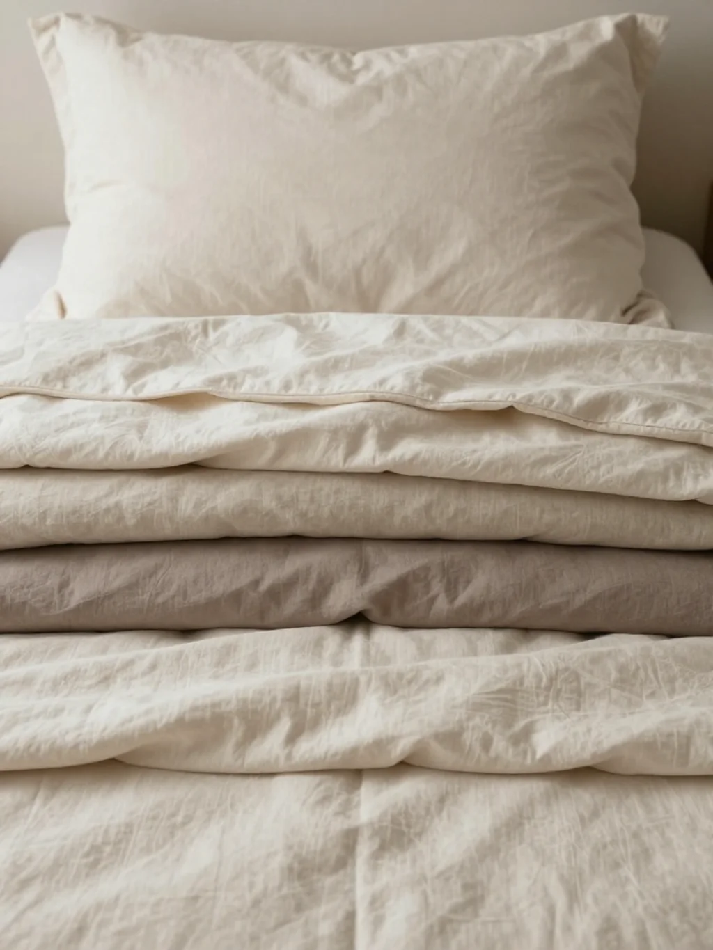
Sometimes restraint outperforms boldness entirely. Layered neutrals, think ivory, oatmeal, and soft taupe, create depth through texture rather than color contrast. This approach suits homeowners hesitant about committing to a single dominant shade.
This strategy aligns closely with muted color palette philosophy, favoring subtlety over statement. Add texture through linen, wool, or woven jute to keep the bedroom design inspiration interesting despite the limited color range being used.
The Chalky White Base That Makes Every Pastel Color Pop Harder
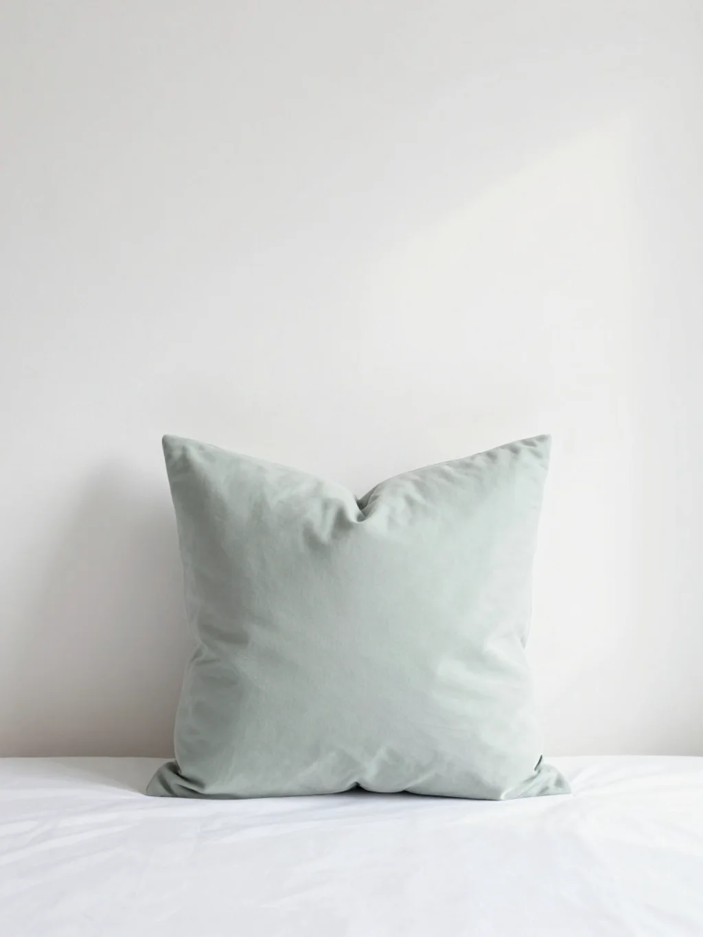
White might seem like the boring default, but chalky white specifically enhances every pastel placed against it. This particular white carries slightly warmer undertones than stark white, softening contrast rather than sharpening it.
As a base for soft toned bedroom designs, chalky white lets sage, blush, or lavender genuinely shine. It’s foundational to good wall color inspiration, acting almost like a blank canvas that never competes with the colors layered on top.
A Watercolor Inspired Palette Bringing Softness Into Rigid Bedroom Spaces
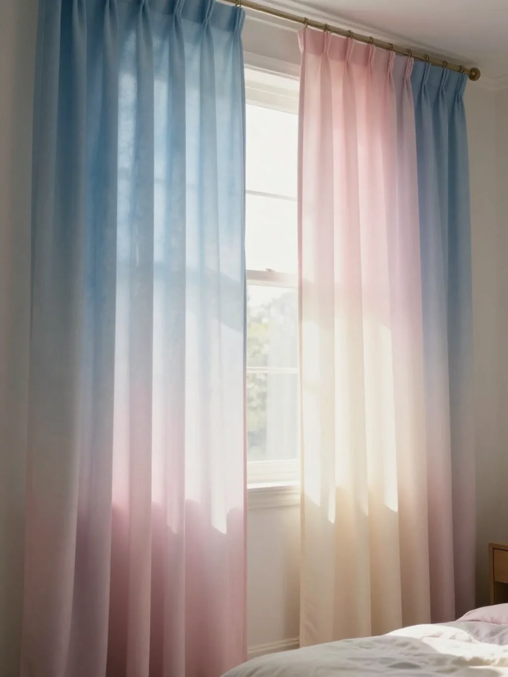
Watercolor-inspired palettes blend colors gradually rather than through hard edges or sharp lines. This technique softens bedrooms that otherwise feel rigid or overly structured, particularly those with strong architectural angles or minimal curves.
This approach draws directly from watercolor bedroom palette styling, mixing soft blues, pinks, and greens without harsh boundaries. It supports spring inspired decor beautifully, especially through ombré curtains or gradient bedding that mimics painted brushstrokes.
This Botanical Green and Blush Pairing Feels Straight Out of a Garden
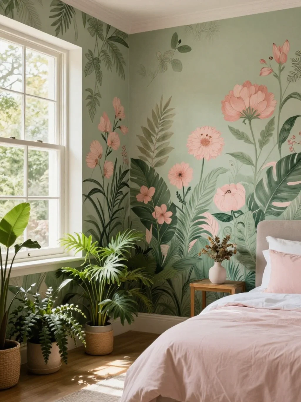
Botanical green paired with blush creates something that feels lifted directly from a garden in full bloom. This combination works particularly well in bedrooms featuring plants, floral art, or botanical print wallpaper nearby.
The pairing reinforces floral bedroom accents without requiring literal floral patterns everywhere. It’s one of the more romantic spring bedroom color schemes available, blending softness with organic energy that feels alive rather than static.
The Spring Bedroom Color Schemes Trend Interior Magazines Are Racing to Cover
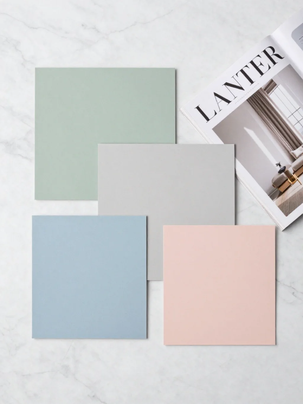
Major publications have taken notice of shifting seasonal palettes lately. Spring bedroom color schemes now dominate design coverage across platforms like Elle Decor, House Beautiful, and Architectural Digest, each highlighting slightly different regional interpretations.
Here’s a quick comparison of trending directions various sources have highlighted recently.
| Publication | Featured Trend | Signature Shade |
|---|---|---|
| Elle Decor | Botanical minimalism | Sage green |
| House Beautiful | Coastal revival | Powder blue |
| Architectural Digest | Warm neutrals | Greige |
| Better Homes and Gardens | Soft romance | Blush pink |
This kind of coverage confirms these palettes aren’t fleeting fads.
Why Muted Yellow Tones Quietly Fix a Gloomy North Facing Bedroom
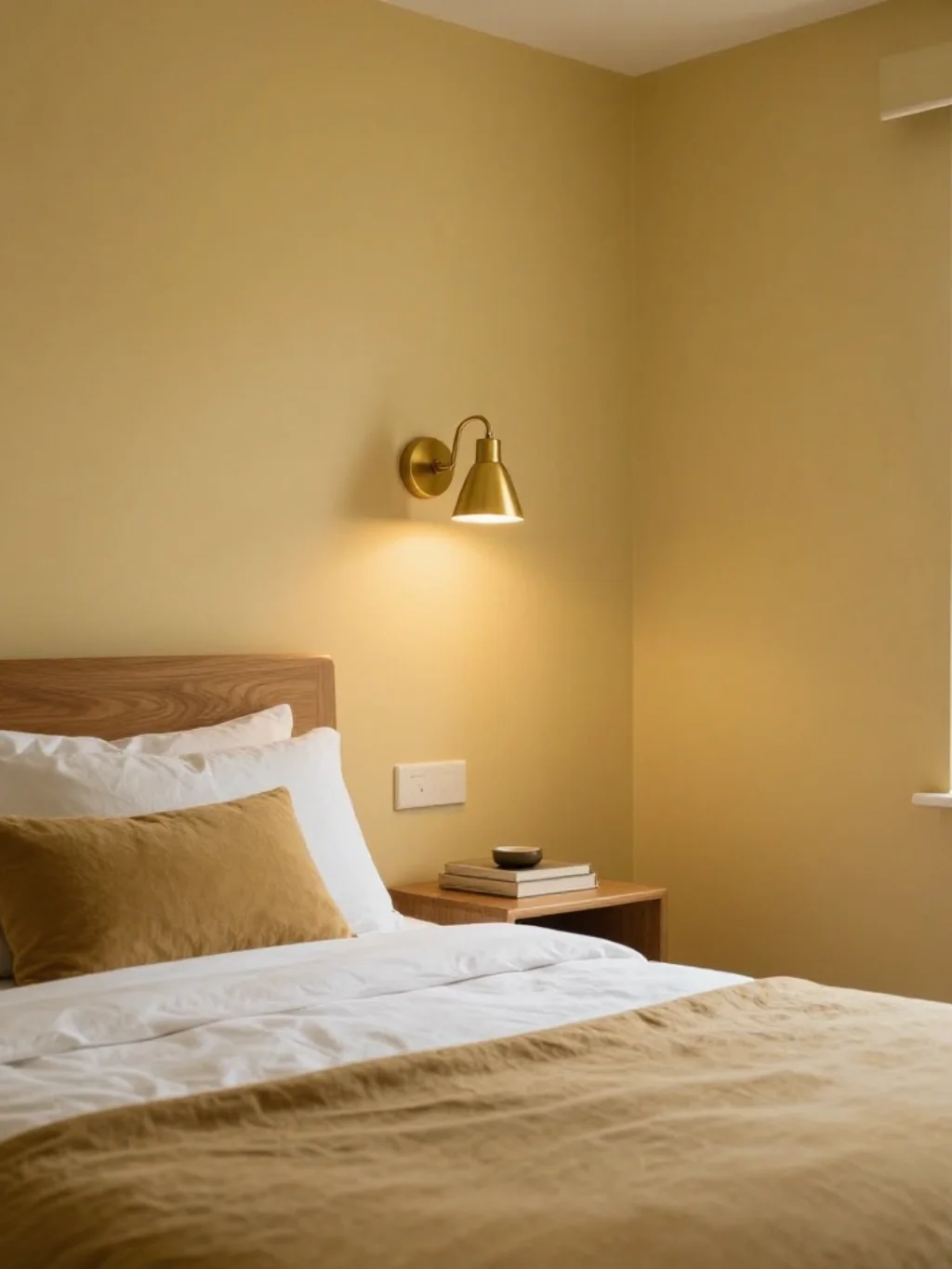
North-facing bedrooms often struggle with limited direct sunlight, leaving rooms feeling perpetually gray. Muted yellow tones counteract this effectively, injecting warmth even when natural light stays minimal throughout most of the day.
This shade fits well within broader warm spring colors strategies. Combined with brass fixtures and warm wood tones, muted yellow becomes a genuinely practical paint color idea, not just a decorative preference for brighter-facing rooms.
This Sunlit Cream Palette Makes Mornings Feel Entirely Different
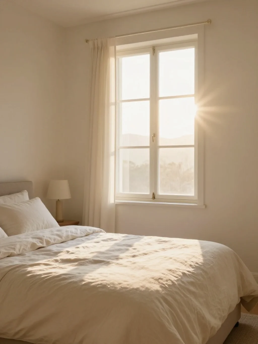
Cream carries a softness that stark white simply cannot replicate. A sunlit cream palette makes mornings feel gentler, easing the transition from sleep rather than jolting the senses with harsh brightness immediately upon waking.
This palette anchors many seasonal bedroom decor approaches, particularly paired with linen textiles. It supports a genuinely elegant spring palette, proving that neutral doesn’t have to mean boring when executed with intention and thoughtful layering.
The Dusty Lavender and Sage Combination Nobody Saw Coming This Year
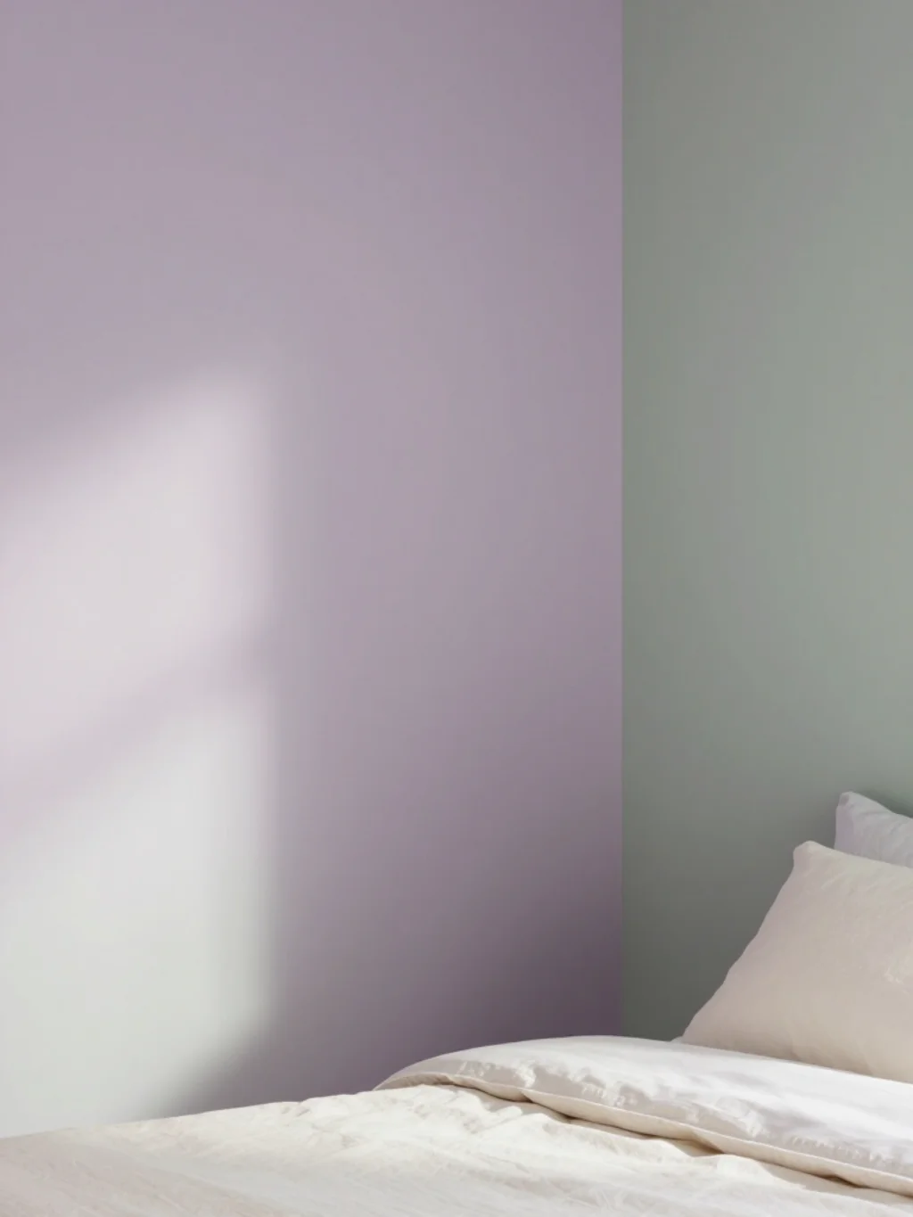
Few predicted dusty lavender and sage would pair so effortlessly, yet this combination has surprised even seasoned designers this season. Both shades carry muted, grayed-down qualities that prevent visual competition between them.
Together, they form a distinctly soft pastel wall color direction that feels fresh without appearing overly trendy. This pairing suits seasonal home decor projects aiming for something quietly unexpected rather than predictably safe or conventional.
A Bold Coral and Cream Mix That Breaks Every Spring Bedroom Rule
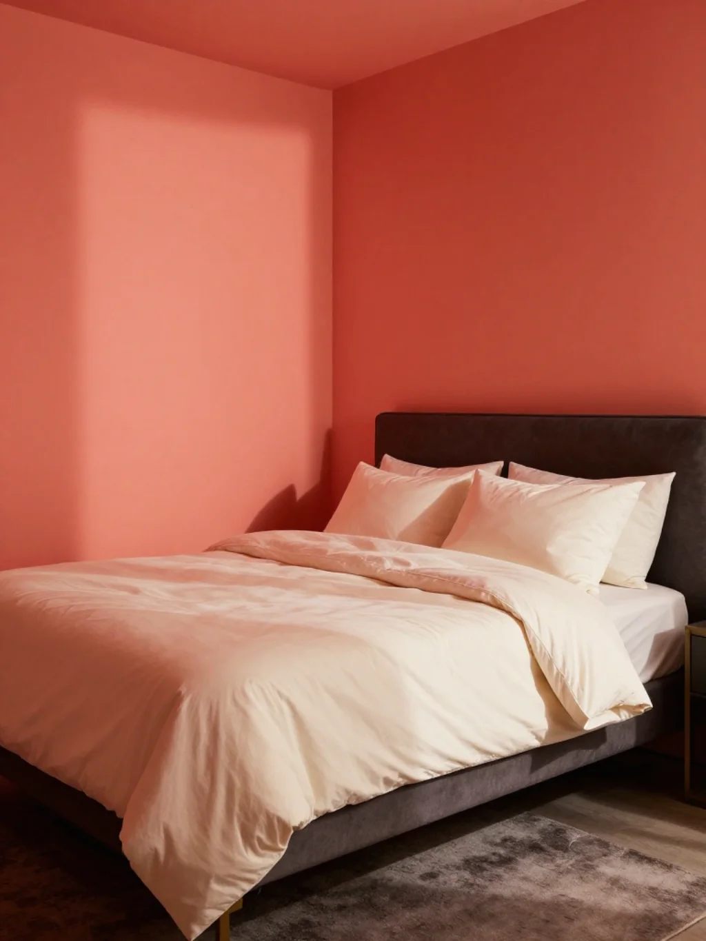
Most spring palettes lean soft and quiet, but bold coral against cream breaks that pattern entirely. This combination injects energy into bedrooms that otherwise risk feeling too subdued or sleepy throughout the season.
This unexpected pairing challenges typical color combination guide logic, proving rules exist to be occasionally broken. It works particularly well for bedrooms belonging to those who want spring freshness without sacrificing personality or visual excitement.
Why Spring Bedroom Color Schemes Depend on One Overlooked Undertone Rule
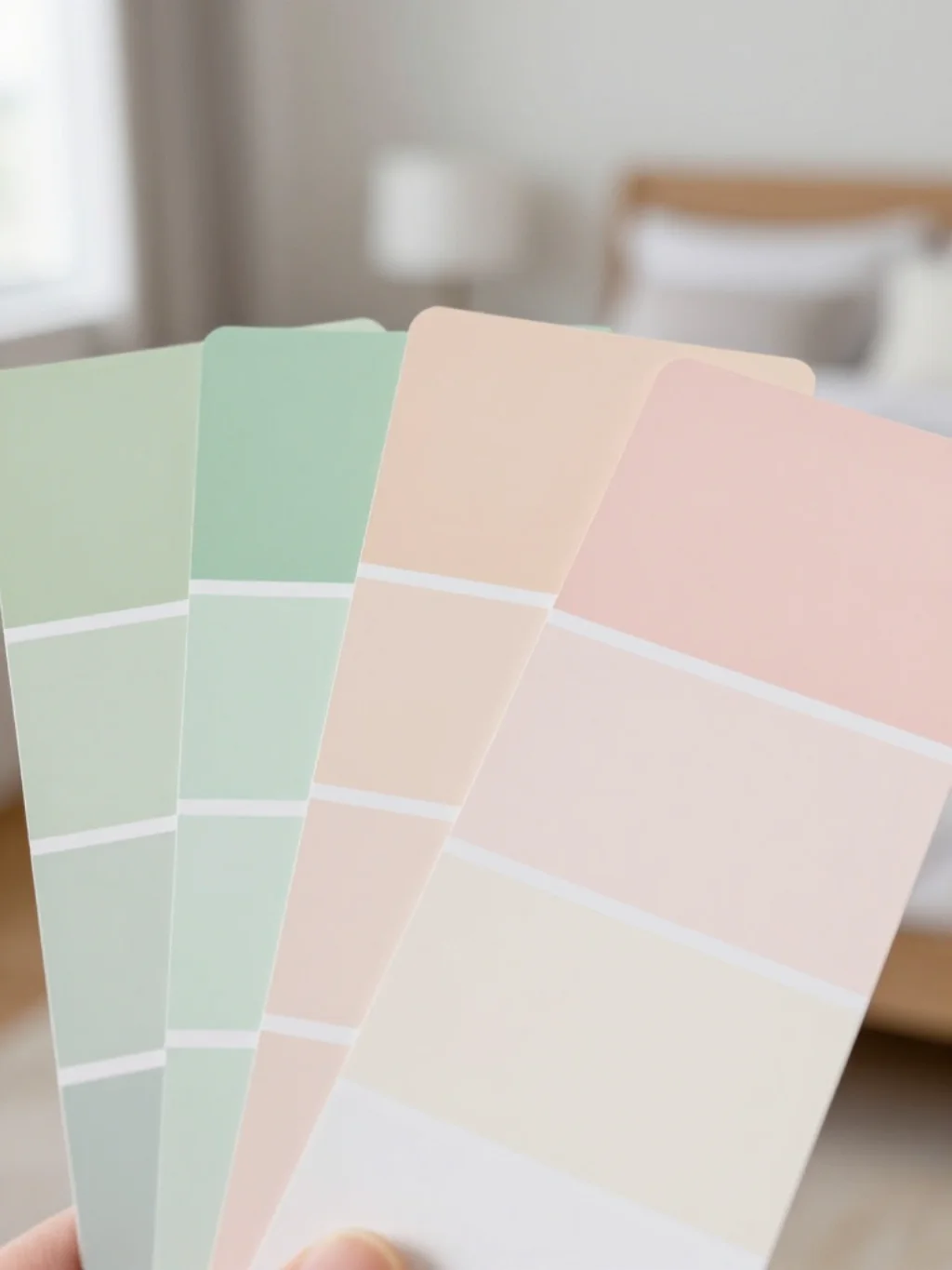
Undertones matter more than most homeowners realize when selecting paint. A color can look completely different depending on whether it carries warm or cool undertones beneath the surface shade shown on a swatch.
Testing samples directly on your wall remains essential before committing fully. This single step prevents costly mistakes across any spring bedroom color scheme, ensuring your chosen neutral color palette actually complements your room’s specific lighting conditions.
The Airy Blue Green Palette Making Bedrooms Feel Like Fresh Air
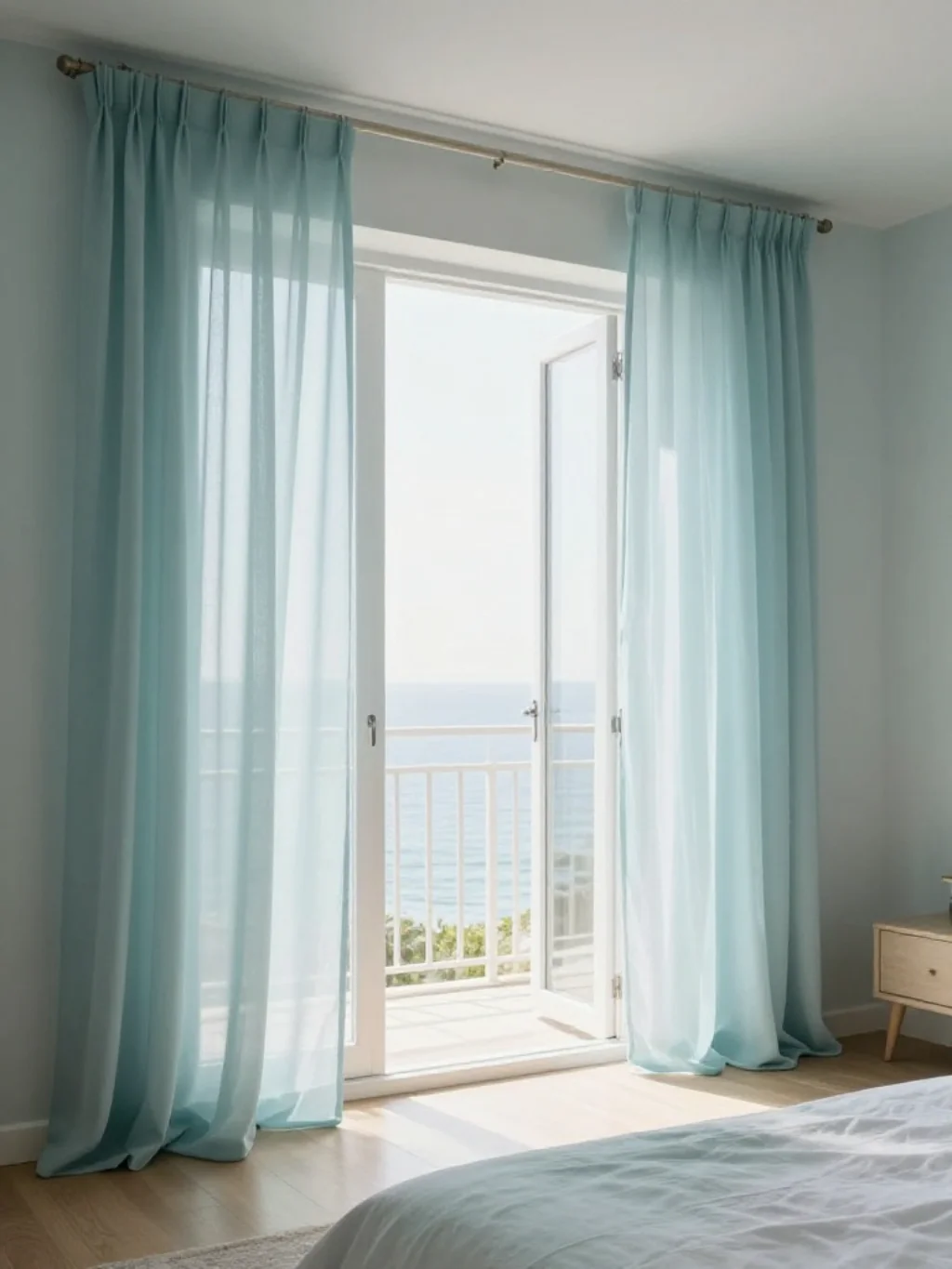
Blue-green sits at an interesting crossroads, borrowing calm from blue and freshness from green simultaneously. This hybrid shade creates an airy bedroom aesthetic that feels perpetually ventilated, even in rooms with limited actual airflow.
This palette pairs beautifully with Pantone Color of the Year selections in recent seasons, many of which have leaned toward similar blue-green territory. It’s a genuinely relaxing bedroom color choice worth serious consideration this spring.
This Peach and Ivory Duo Softens a Bedroom Without Losing Warmth
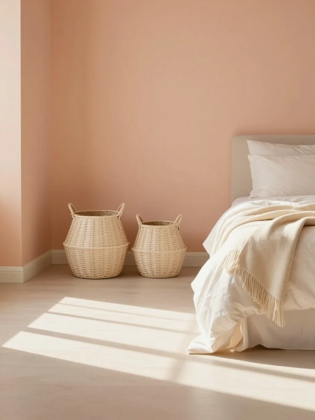
Peach and ivory together strike a rare balance, softening a room’s overall feel while still retaining genuine warmth throughout. Neither shade overwhelms the other, creating quiet harmony rather than visual tension between competing tones.
This duo works wonderfully as part of a broader bedroom styling idea, especially through textured throws and woven baskets. It closes out this exploration of spring bedroom color schemes on a genuinely soft, welcoming note.
Frequently Asked Questions
What colors are trending for spring bedroom color schemes this year?
Sage green, blush pink, and lavender currently lead the pack. Coastal blues and warm neutrals like greige also remain strong contenders across most regions.
Which colors make a small bedroom feel bigger in spring?
Light, cool tones like sky blue or seafoam expand visual space effectively. Keep ceilings lighter than walls for the best stretching effect possible.
Are pastel colors too soft for a bedroom accent wall?
Not at all. Pastels work well as accents when paired with deeper neutrals or natural wood tones for grounding contrast throughout the room.
What undertones work best with natural spring light?
Warm undertones typically suit north-facing rooms, while cooler undertones flatter south-facing rooms already receiving abundant natural sunlight daily.
How many colors should a spring bedroom palette include?
Three colors usually work best. One dominant shade, one supporting neutral, and one accent color keep things balanced without visual clutter.
Conclusion
Choosing the right spring bedroom color scheme doesn’t require perfection, just intention. Start with one shade that genuinely speaks to you, then build outward through neutrals and accents. Whether you lean toward sage, blush, or something bolder like coral, the goal stays the same. Create a room that feels like a true reset each morning.


One Comment